

 M+ M- ???
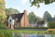
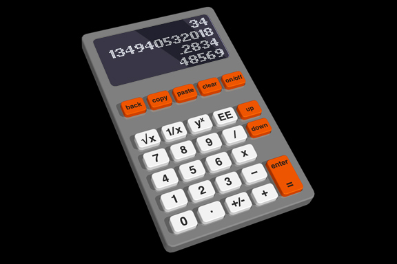
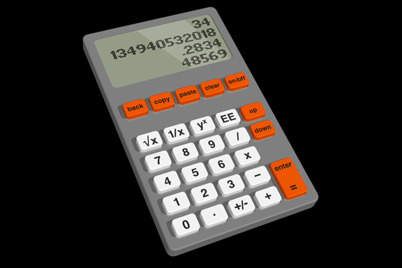
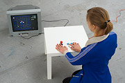
Redesignme.com is a website where designers are challenged to create new designs for certain products.Garton Jones used redesignme.com to search for a redesign of the Ativa 10 Digit Desk Calculator.
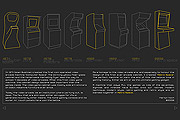
I'm always puzzled by the fact most calculators still function like the early 1970 designs. A time when chip logic was very expensive, and the amount of components was kept to a minimum. Today's standard micro controller is way more powerful. So my primary goal was to create a new set of basic functionality.
Which means I had to redesign the layout of the buttons first. The design itself continues proved ingredients like injection mould plastic, the perfect shape of PTT's Zurich telephone and modern white OLED matrix displays.
My own challenge was to make the design in one hour on a Friday afternoon.
The result: a top 3 note among 109 redesigns. "Your redesign was part of my top 3. Very well done! Yours sincerely, Charlie Garton-Jones"


 Lost in Navigation
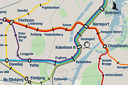
Tokyo is a breathtaking city. Most metropolises have 1 urban railway network. Easy. Tokyo, the biggest metropolis on Earth, is a lot more complex.The city has 2 official subway companies, the national railway operates several lines that can be considered metro lines as well, and there are tens of private operated railways that serve may areas just outside the central part of the city. Another problem is that many transfer stations use different station names on each line connected.
Creating a understandable subway map for this city is extremely complex. Should it be schematic, or geographic realistic? When is it easier to have a short walk than to switch lines?
This metro map for Tokyo only shows the most important lines for visitors of the city. That is already 25 lines! All distances are realistic, and the connections to Airports and Shinkansen trains are clearly visible. The parks that give a good orientation in the grey urban mass of Tokyo are visible. Icons show the most important landmarks. Matching the million neon lights the map is drawn in a night situation with the lines as glowing neon tubes.
The map is printed on 100x75 cm photo paper in a limited run, an can be ordered. Send an e-mail or call if you are interested to order.

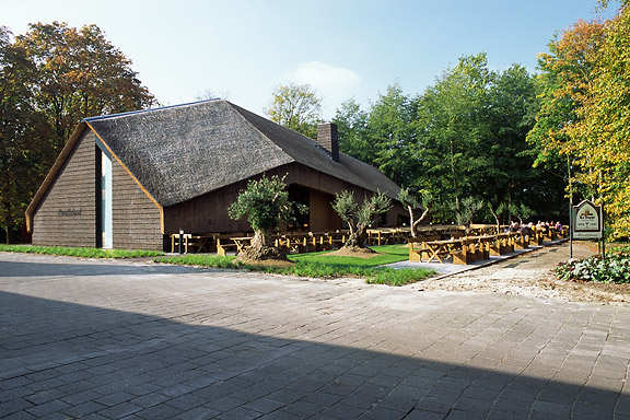
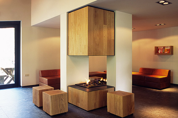
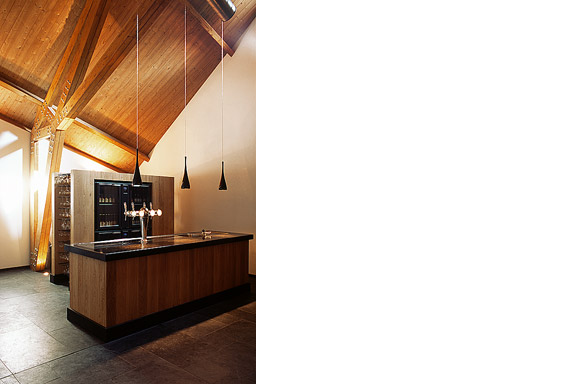
 Want some Beers?
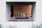
ZZEF asked me to photograph 2 projects designed by Johan van den Berkmortel for the architecture portfolio of ZZEF.One project is a beer cafe at the monk brewery Koningshoeve and the other is the Bavaria House in Helmond.

 Welcome to Andenne
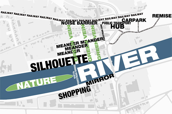
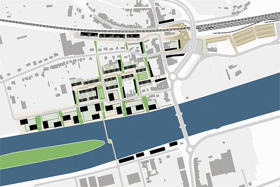
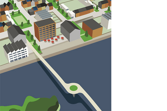
Andenne is a small town on the bank of the Meuse between Namur and Liège. When entering Andenne the city does not impress. The abandoned factory area on the north bank of the Meuse makes a chaotic impression and the river is ignored. In collaboration with Wendy van Rosmalen I designed a new plan for this Europan 9 location.With out plan we want to give Andenne a face. Between famous cities like Namur, Huy and Liège, Andenne is missing an inherent identity. We chose to multiply the nonchalant character of Belgian building and turn it into a specific typology. Our plan is a framework for development of the area in its own pace. A subtle guidance in building alignment and building heights delivers a varied public space that opens up towards the river Meuse.
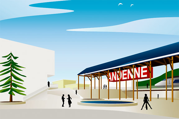
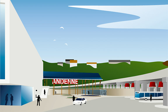
A specific part of the assignment was the redesign of Andenne station. Bad attainableness of the platforms, a weird logistic and the uncomfortable public space underneath the viaduct are creating a moody atmosphere. The size of Andenne does not allow a large scale intervention. We choose a very modest solution. We created a square below the tracks to connect al transportation streams. The viaduct is decorated to resemble a living room and is transformed into a roof covering the bus platforms. New buildings surrounding the square size the public space.
Every Belgian wants its own house. Ignoring this feat makes a plan implausible. We go one step further through making the buying of a house resemble the buying of a car. By using a smart basic layout for the houses, every house can suit the needs of very different groups of people. Future change is very easy too. The architecture is a caricature of traditional Belgian building methods, its execution is contemporary and flexible.

Ghost World
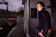
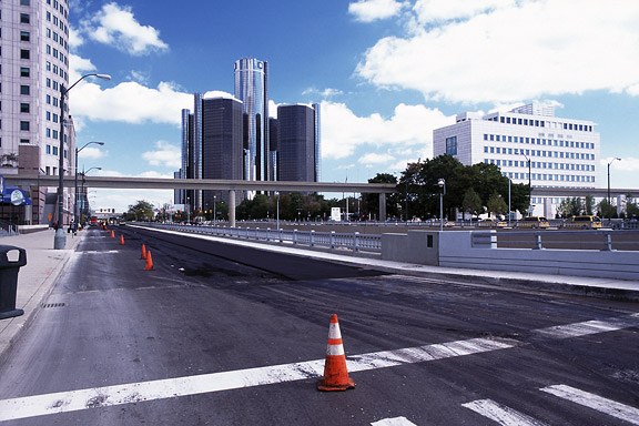
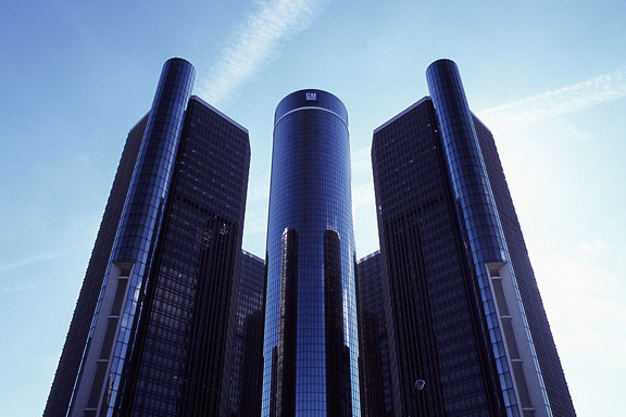
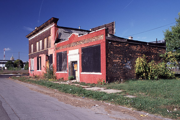
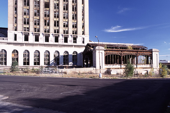
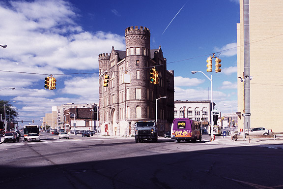
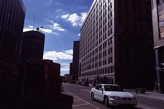
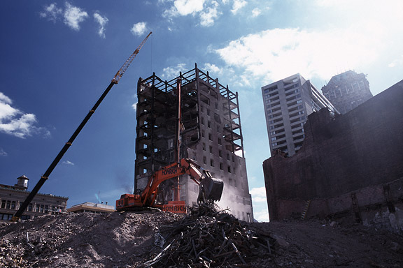
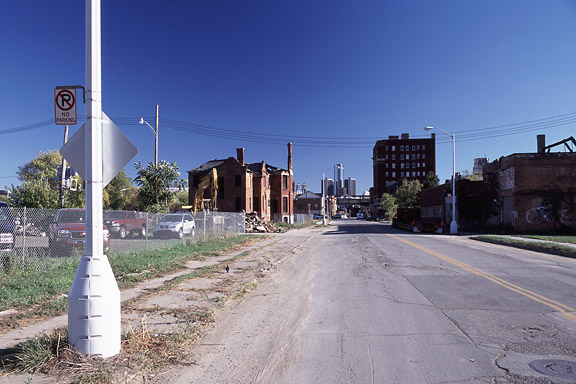
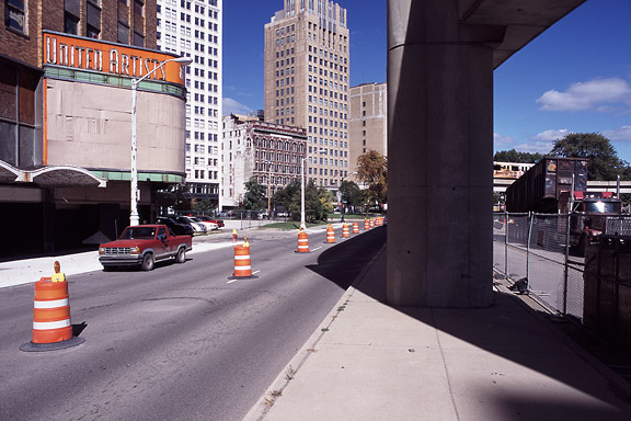
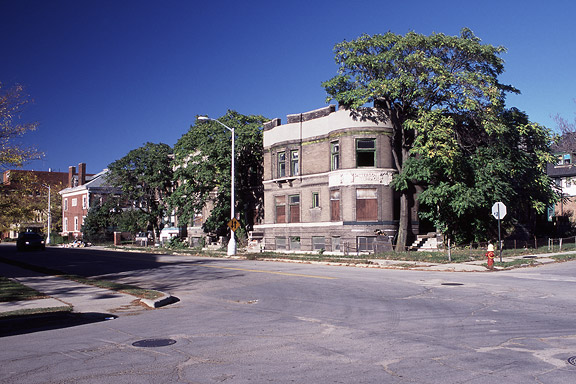
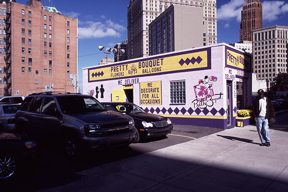
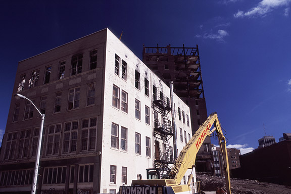
Detroit is a weird city. The city disappears slowly and turns back to nature. Not caused by war or disaster, it vanishes because of economic irrelevance. De automotive industry moved towards the Mexican border. Jobs are gone. The city renders useless. The General Motors headquarters still shine as a major highlight downtown. Perhaps as an icon for the glorious past.These photographs are taken during a trip of the USA and Canada in the autumn of 2005.
Fake Wanders
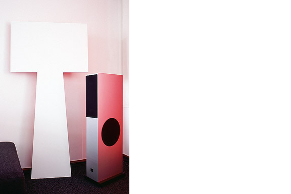
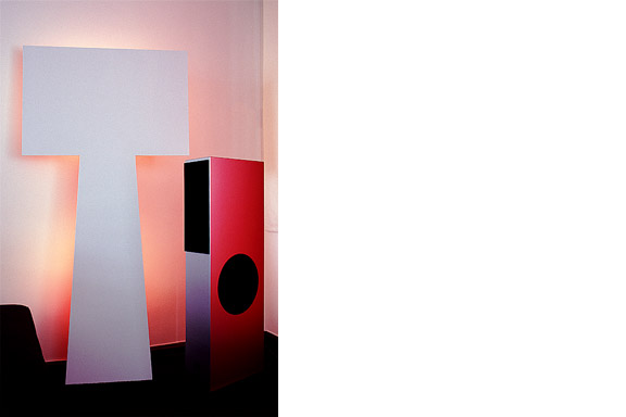
The lamp is a joke. I had no space to place the Big Shadow Lamp by Marcel Wanders. I also liked the idea of the Fake Lamp by Sophie Krier, but not its shape. I mixed them and created the Fake Wanders. Definitely not for sale.
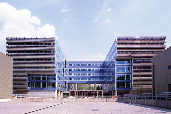
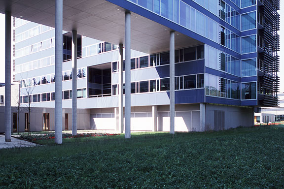
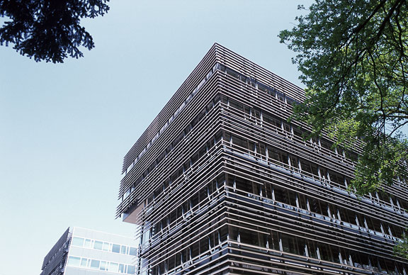
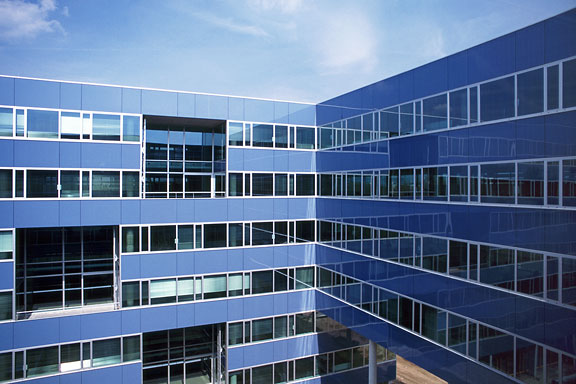
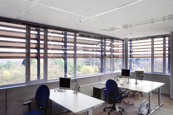
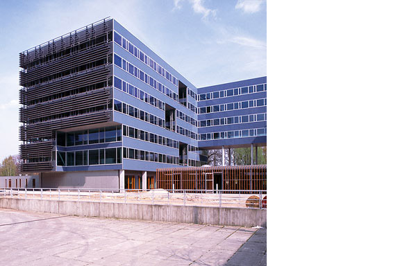
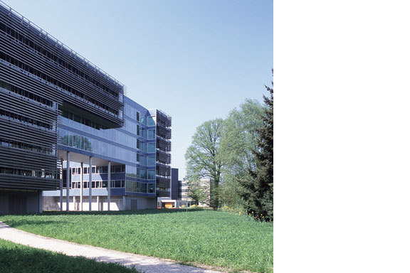
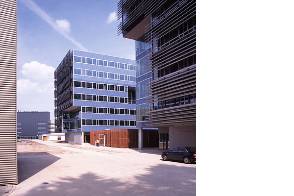
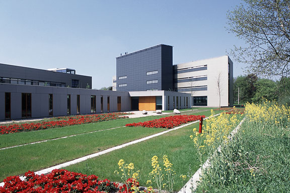
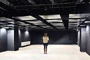
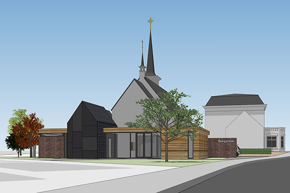
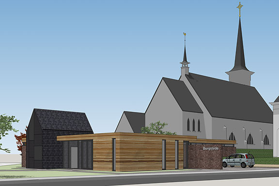
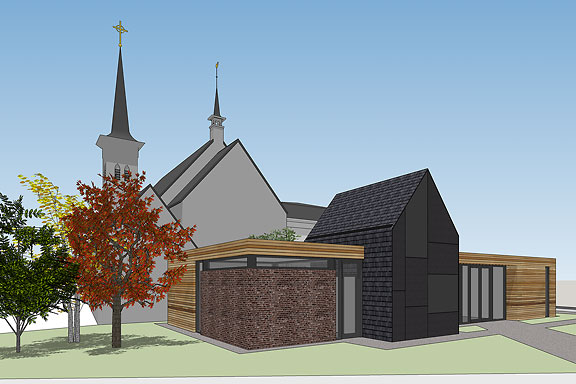
Blue Envelope
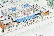
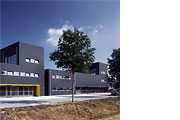
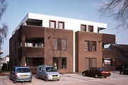
The Dutch Tax Administration feels like a family business. The atmosphere is open and relaxed. The organization is responsible for the total financial administration of The Netherlands Ltd. Dutch citizens expect professional civil servants. The office at the Quintax location in Apeldoorn expresses the two faces of the Dutch Tax Administration. The building looks severe and mimics the impregnability of Fort Knox. But internal, the building is totally transparent. Walls are exceptions, and voids open the floors to improve contact between employees.At JHK Architects, I was responsible for the concept of the building. I also worked out most of the technical details.