 80's T's
Denna text är inte översatt till svenska och endast tillgänglig på engelska.For my Youtube channel 2kB of Fun, I made several T-shirts based on logo graphics from 80's video games and electronic gadgets.
 2kB of Fun
Denna text är inte översatt till svenska och endast tillgänglig på engelska.Never has a consumer electronic product seen such an extravagant variety in case design as early handheld games from 1976-1985. Never have computer games been so beautifully reduced to their essence as these handhelds offered. Never did 2Kb of memory offer so much fun.
1983 was the best year with top titles like Amidar, Astro Thunder 7, Burger Time, Dig Dug, Ms. Pac-Man, Q*bert, Super-Cobra and Zaxxon.
Martijn Koch, architect from the Netherlands bought 180 of the best handheld games, photographed them, took them apart, analysed their tech, and put all the material together in this stunning book, a catalog like you never saw before.
 Brittisk Hyresvärd
Denna text är inte översatt till svenska och endast tillgänglig på engelska.Colaboration with bureau ZZEF
For more information check out:
 M+ M- ???
Denna text är inte översatt till svenska och endast tillgänglig på engelska.Redesignme.com is a website where designers are challenged to create new designs for certain products.
Garton Jones used redesignme.com to search for a redesign of the Ativa 10 Digit Desk Calculator.
I'm always puzzled by the fact most calculators still function like the early 1970 designs. A time when chip logic was very expensive, and the amount of components was kept to a minimum. Today's standard micro controller is way more powerful. So my primary goal was to create a new set of basic functionality.
Which means I had to redesign the layout of the buttons first. The design itself continues proved ingredients like injection mould plastic, the perfect shape of PTT's Zurich telephone and modern white OLED matrix displays.
My own challenge was to make the design in one hour on a Friday afternoon.
The result: a top 3 note among 109 redesigns. "Your redesign was part of my top 3. Very well done! Yours sincerely, Charlie Garton-Jones"
 Kreativfabrik
Denna text är inte översatt till svenska och endast tillgänglig på engelska.The Clock Building is a magnificent icon for Eindhoven. It is built as factory by Philips Electronics in 1928/1929. After having been used for years as office space by Philips, the building now transforms back to its original function: a factory.
This time no series production. Trudo turned the building into a creative factory. Architects, designers, musicians, photographers, creative consultants: a colourful aggregation of creative talent took over this icon of the city Eindhoven.
The building has been split into units of various proportions. They all share one common feature though. Huge window openings with delicate metal frames. The light that enters the building gives unity to the diversity of interiors.
I photographed numerous interiors of the Clock Building to give insight in the new use of the building. The transformation of the Clock Building is a starting point in the transformation of the city district Strijp-S, a new centre for the city of Eindhoven.
The pictured companies are from left to right: Architectuurcentrum Eindhoven, Little Mountain, Keukenconfessies (2x), Desque, FuturOn.net, De Boekenmakers, studio-OOK, Scherpontwerp, Lady Penelope, Dikgedrukt en PopEI
 Lost in Navigation
Denna text är inte översatt till svenska och endast tillgänglig på engelska.Tokyo is a breathtaking city. Most metropolises have 1 urban railway network. Easy. Tokyo, the biggest metropolis on Earth, is a lot more complex.
The city has 2 official subway companies, the national railway operates several lines that can be considered metro lines as well, and there are tens of private operated railways that serve may areas just outside the central part of the city. Another problem is that many transfer stations use different station names on each line connected.
Creating a understandable subway map for this city is extremely complex. Should it be schematic, or geographic realistic? When is it easier to have a short walk than to switch lines?
This metro map for Tokyo only shows the most important lines for visitors of the city. That is already 25 lines! All distances are realistic, and the connections to Airports and Shinkansen trains are clearly visible. The parks that give a good orientation in the grey urban mass of Tokyo are visible. Icons show the most important landmarks. Matching the million neon lights the map is drawn in a night situation with the lines as glowing neon tubes.
The map is printed on 100x75 cm photo paper in a limited run, an can be ordered. Send an e-mail or call if you are interested to order.
 XXL
XXL
Denna text är inte översatt till svenska och endast tillgänglig på engelska.Kingspan Netherlands wanted to expand their factory for insulation panels in Kesteren, and to combine it with their distribution facility and offices in Dodewaard.
At the new industrial zone Medel near Tiel the needed 700.000m2 plot was available. The area also allowed high risk production plants.
At the moment phase 1 is completed. The plot has room for expansion with 2 more production lines and 3 times the amount of distribution storage that is part of phase 1.
Kinspan asked construction and design firm Van Zeist to draw the design. As architect I was responsible for the design up to approval of the design by the urban supervisor and the local "beauty commission".
Notice: Undefined variable: tekst in /home/w1512188/domains/martijnkoch.com/public_html/index.php on line 285
 Burgstede
Notice: Undefined variable: tekst in /home/w1512188/domains/martijnkoch.com/public_html/index.php on line 296
 Öl?
Öl?
Denna text är inte översatt till svenska och endast tillgänglig på engelska.ZZEF asked me to photograph 2 projects designed by Johan van den Berkmortel for the architecture portfolio of ZZEF.
One project is a beer cafe at the monk brewery Koningshoeve and the other is the Bavaria House in Helmond.
 Svart låda
Denna text är inte översatt till svenska och endast tillgänglig på engelska.Painter Bert de Haas and salesman in business outfits Chris Hendriks both wanted a new business building in Kesteren. Because of fire regulations it was best to combine the two buildings. Otherwise a big part of the plot was useless.
To preserve each ones identity and to answer the request for a good cantina, both parts of the building were accented by a small tower. These towers contain a special room looking out over the polders of the Betuwe.
The building is clad with anthracite profile sheets to ease the implementation of the detailing and to maximise the abstraction of the black boxes.
I made this design as employer of Bouwkundig ontwerp en adviesburo Van Zeist BV in Opheusden.
 Låg bandbredd
Denna text är inte översatt till svenska och endast tillgänglig på engelska.When the design of Retro Space was finished, we needed a matching website.
Because of the presumption that Retro Space could become a hit on the internet, we tried to make the website as small as possible. We did not want the website to crash on bandwidth problems.
Matching the style of the retro games, the website is designed in pixel art. All elements except some product shots are GIF images in 4 colours. It's just like the early years of internet when bandwidth was scarce.
 Retro Space
Denna text är inte översatt till svenska och endast tillgänglig på engelska.In 1971 the first coin-op video gaming system was built: Computer Space.
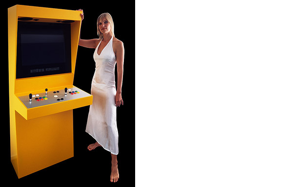
Soon the video arcade as hangout was born. Many famous games as Pac-Man, Space Invaders, Streetfighter and Donkey Kong were filled with our quarters. Today the last arcades are closing down. The Wii, the Playstation and owner "mr. Counchpotato" have won. As an homage to this era and to keep all the classics playable Retro Space was created.
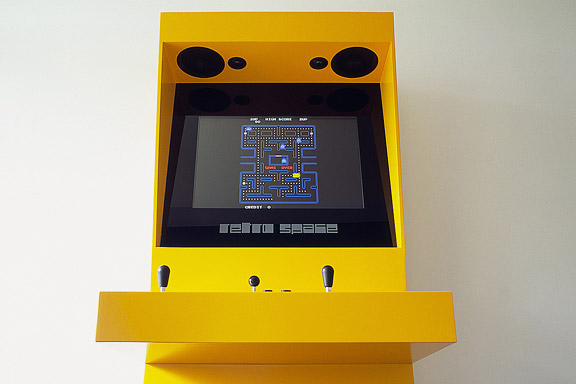
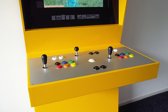
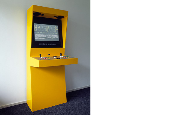
Retro Space is a modern arcade machine for at home or at work. It plays both all the arcade classics from Space Invaders up and all the console titles for your Nintendo, Sega or Atari. The system is made using modern technology and is flexible for future innovations. The system also is a perfect multimedia jukebox. Next to your favourite games, you can load Retro Space with your favourite music and movies. A full HD screen and a high quality speaker system ensure you to enjoy the best image and sound. And quarters are no longer needed.
Thanks to model Lara Verlaat for the imitation of the original Computer Space poster.
 BBQ XL
Denna text är inte översatt till svenska och endast tillgänglig på engelska.Frank en Chantal van den Eijnden asked Johan van der Berkmortel and me to design an extension to their house in Beek en Donk. It was supposed to replace a decrepit shed and to add a new veranda with a fireplace. Two L-shaped entities frame the view into the deep garden. The brick element contains the chimney and acts as a bench. The wooden part contains the new shed, a log storage and a tool shed, and continues into the ceiling of the veranda.
This assignment is done in collaboration with Johan van den Berkmortel.
 Falska Wanders
Denna text är inte översatt till svenska och endast tillgänglig på engelska.The lamp is a joke. I had no space to place the Big Shadow Lamp by Marcel Wanders. I also liked the idea of the Fake Lamp by Sophie Krier, but not its shape. I mixed them and created the Fake Wanders. Definitely not for sale.
 Leksakerstad
Denna text är inte översatt till svenska och endast tillgänglig på engelska.Brandevoort is one of the big suburban extensions according to the governmental document Vinex. Under supervision of Rob Krier, the city of Helmond tried to mimic the classic Dutch canal city for its big extension. Modern legislation on parking and the fact that a family in a suburban plan like this needs 2 cars to reach all daily facilities, resulted in weird interiors for the urban blocks. The gardens are petite, and most space is used for the cars.
 Blå kuvert
Denna text är inte översatt till svenska och endast tillgänglig på engelska.The Dutch Tax Administration feels like a family business. The atmosphere is open and relaxed. The organization is responsible for the total financial administration of The Netherlands Ltd. Dutch citizens expect professional civil servants. The office at the Quintax location in Apeldoorn expresses the two faces of the Dutch Tax Administration. The building looks severe and mimics the impregnability of Fort Knox. But internal, the building is totally transparent. Walls are exceptions, and voids open the floors to improve contact between employees.
At JHK Architects, I was responsible for the concept of the building. I also worked out most of the technical details.


