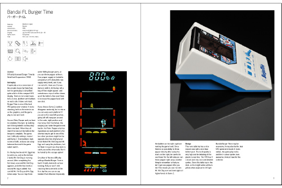
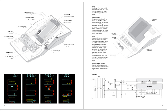
 2kB of Fun
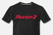
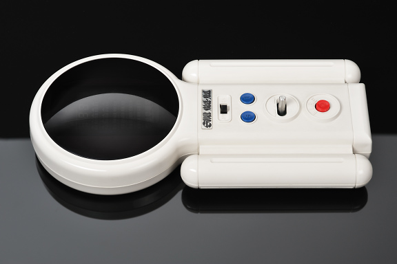
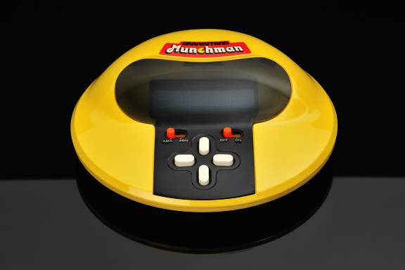
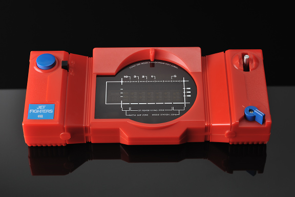
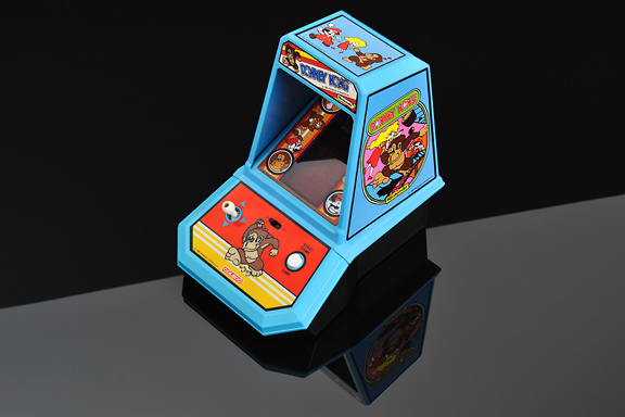
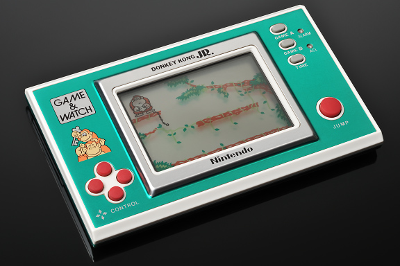
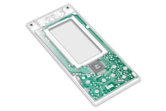
Never has a consumer electronic product seen such an extravagant variety in case design as early handheld games from 1976-1985. Never have computer games been so beautifully reduced to their essence as these handhelds offered. Never did 2Kb of memory offer so much fun.1983 was the best year with top titles like Amidar, Astro Thunder 7, Burger Time, Dig Dug, Ms. Pac-Man, Q*bert, Super-Cobra and Zaxxon.
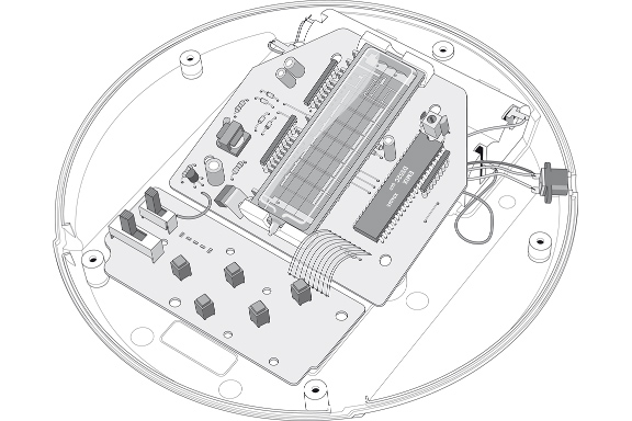
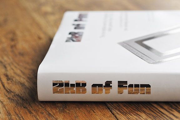
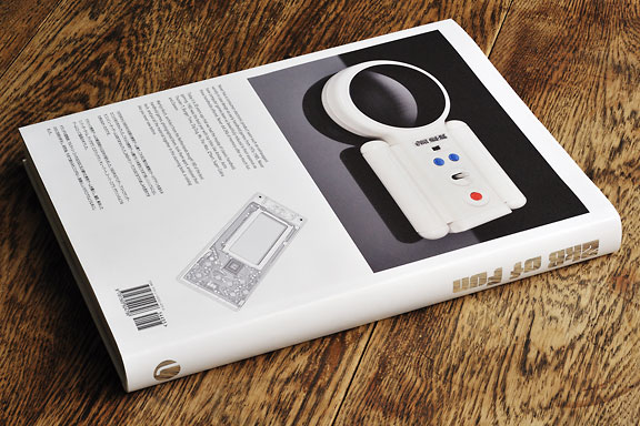
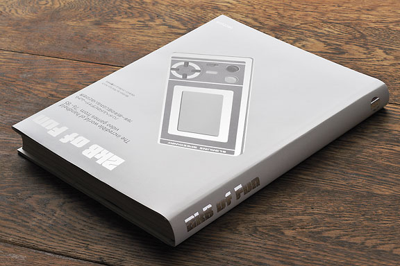
Martijn Koch, architect from the Netherlands bought 180 of the best handheld games, photographed them, took them apart, analysed their tech, and put all the material together in this stunning book, a catalog like you never saw before.
 M+ M- ???
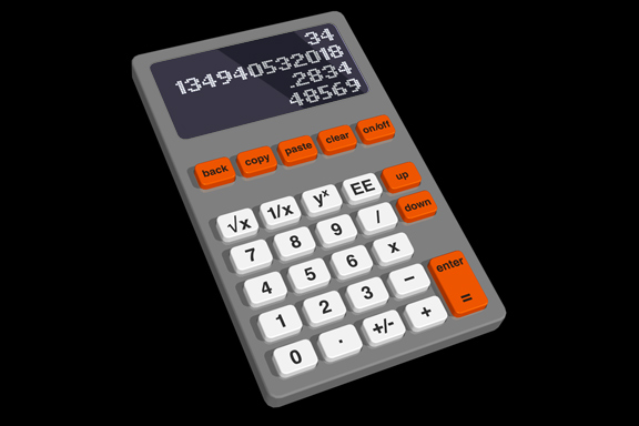
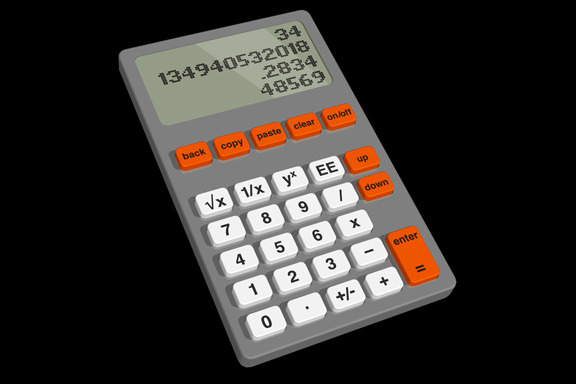
Redesignme.com is a website where designers are challenged to create new designs for certain products.Garton Jones used redesignme.com to search for a redesign of the Ativa 10 Digit Desk Calculator.
I'm always puzzled by the fact most calculators still function like the early 1970 designs. A time when chip logic was very expensive, and the amount of components was kept to a minimum. Today's standard micro controller is way more powerful. So my primary goal was to create a new set of basic functionality.
Which means I had to redesign the layout of the buttons first. The design itself continues proved ingredients like injection mould plastic, the perfect shape of PTT's Zurich telephone and modern white OLED matrix displays.
My own challenge was to make the design in one hour on a Friday afternoon.
The result: a top 3 note among 109 redesigns. "Your redesign was part of my top 3. Very well done! Yours sincerely, Charlie Garton-Jones"
 Lost in Navigation
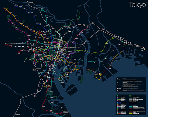
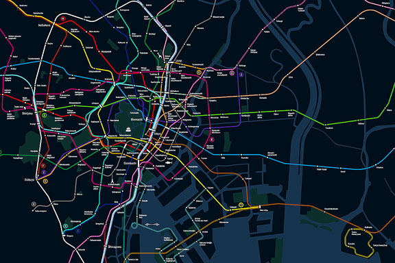
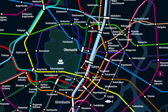
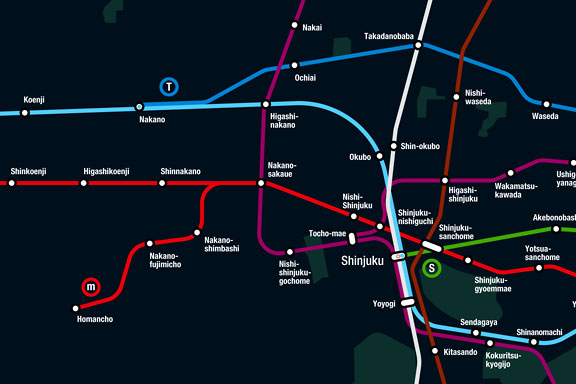
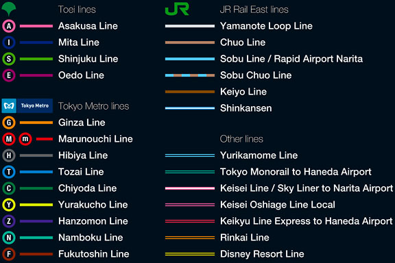
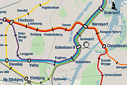
Tokyo is a breathtaking city. Most metropolises have 1 urban railway network. Easy. Tokyo, the biggest metropolis on Earth, is a lot more complex.The city has 2 official subway companies, the national railway operates several lines that can be considered metro lines as well, and there are tens of private operated railways that serve may areas just outside the central part of the city. Another problem is that many transfer stations use different station names on each line connected.
Creating a understandable subway map for this city is extremely complex. Should it be schematic, or geographic realistic? When is it easier to have a short walk than to switch lines?
This metro map for Tokyo only shows the most important lines for visitors of the city. That is already 25 lines! All distances are realistic, and the connections to Airports and Shinkansen trains are clearly visible. The parks that give a good orientation in the grey urban mass of Tokyo are visible. Icons show the most important landmarks. Matching the million neon lights the map is drawn in a night situation with the lines as glowing neon tubes.
The map is printed on 100x75 cm photo paper in a limited run, an can be ordered. Send an e-mail or call if you are interested to order.
 Black Box
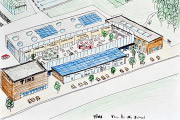
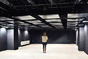
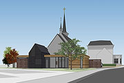
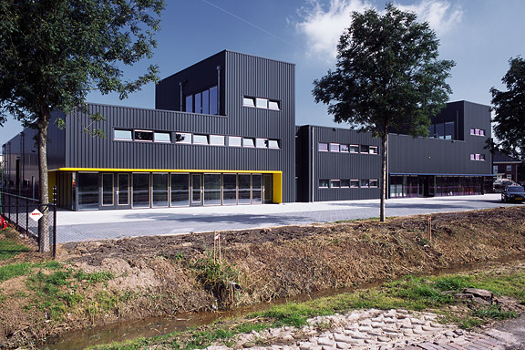
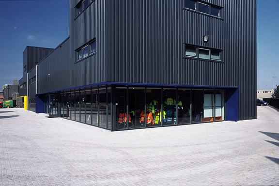
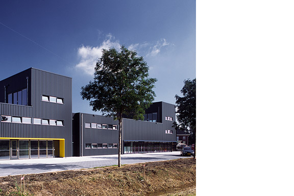
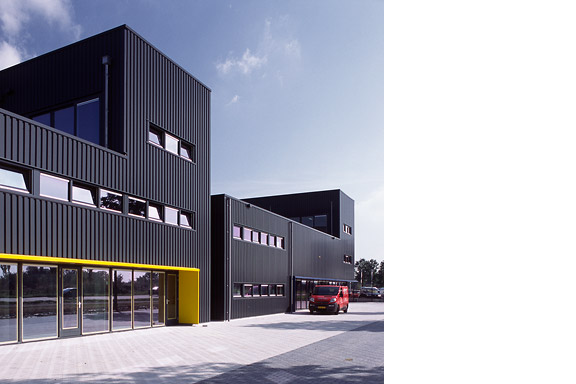
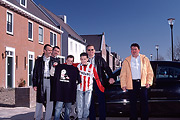
Painter Bert de Haas and salesman in business outfits Chris Hendriks both wanted a new business building in Kesteren. Because of fire regulations it was best to combine the two buildings. Otherwise a big part of the plot was useless.To preserve each ones identity and to answer the request for a good cantina, both parts of the building were accented by a small tower. These towers contain a special room looking out over the polders of the Betuwe.
The building is clad with anthracite profile sheets to ease the implementation of the detailing and to maximise the abstraction of the black boxes.
I made this design as employer of Bouwkundig ontwerp en adviesburo Van Zeist BV in Opheusden.
 Low Bandwith
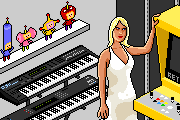
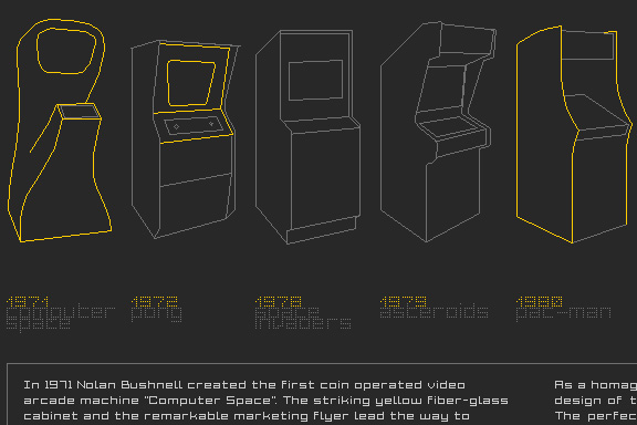
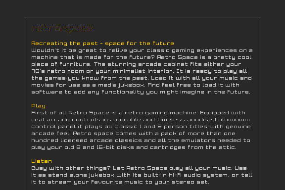
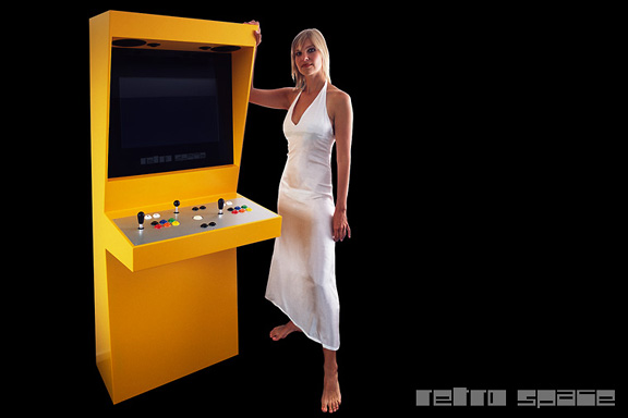
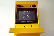
When the design of Retro Space was finished, we needed a matching website.Because of the presumption that Retro Space could become a hit on the internet, we tried to make the website as small as possible. We did not want the website to crash on bandwidth problems.
Matching the style of the retro games, the website is designed in pixel art. All elements except some product shots are GIF images in 4 colours. It's just like the early years of internet when bandwidth was scarce.
 Cinderella
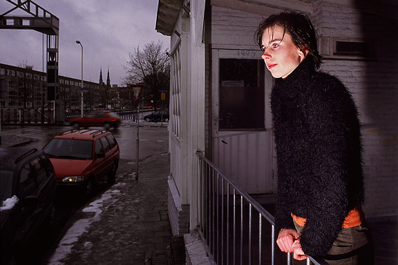
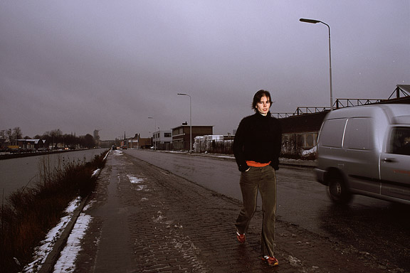
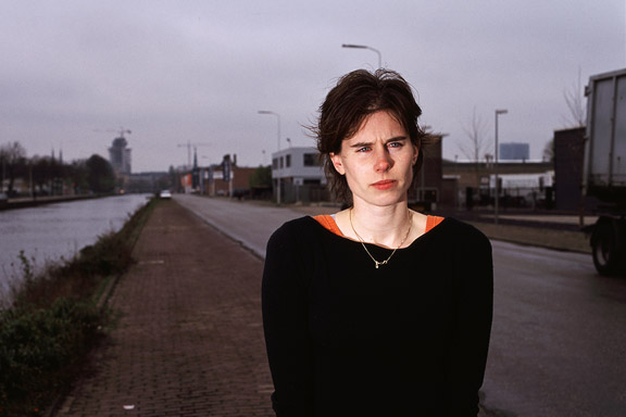
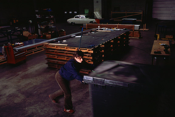
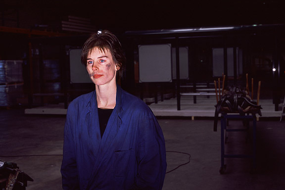
While doing a creative portfolio course at the CKE in Eindhoven I worked on a new interpretation of the story of Cinderella.Thanks to model Christine Nabuurs, to Jeroen Roxs for the workshop location, and to John Körmeling for using his veranda.
 Unknown Modernism
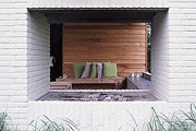
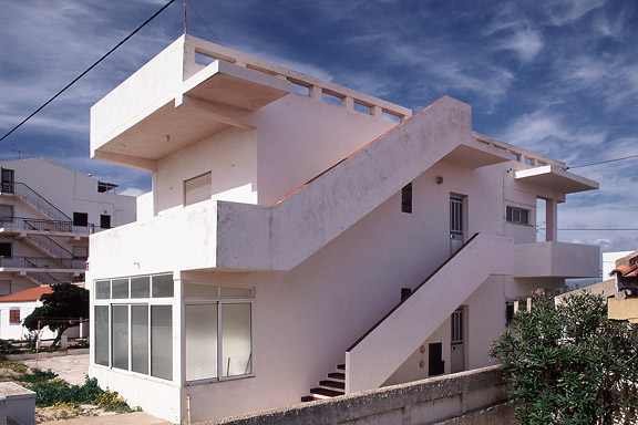
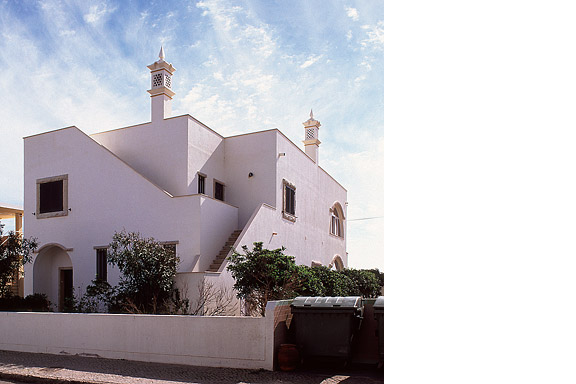
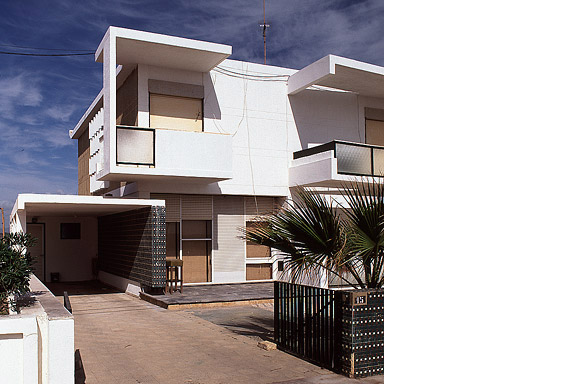
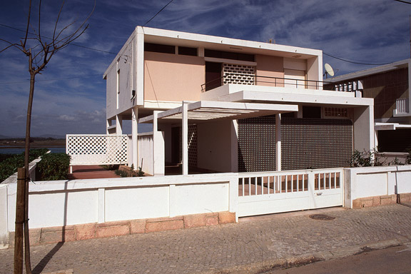
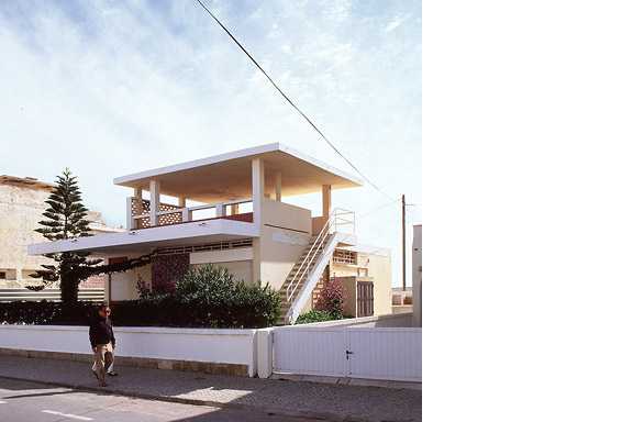
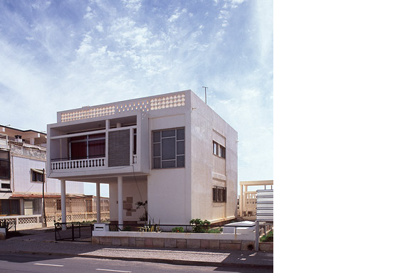
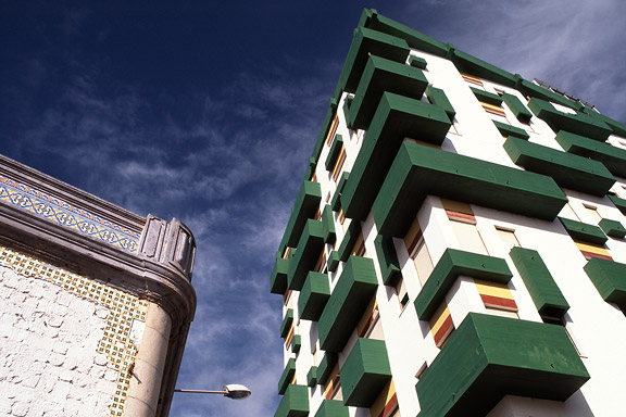
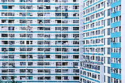
For most tourists the city of Faro in southern Portugal is nothing more than an entrance by plane to the Algarve. Which is a pity. The biggest city of southern Portugal is probably the only one giving room to creativity. You will not see kitsch appartment blocks for Dutch and Germans, but subtile shaped private houses for the Portugese themselves. You will see images that remind of modernists like Gerrit Rietveld, Adolf Loos and Le Corbusier. You will wonder wheter MVRDV got inspiration here, or if Portugese architects checked out work of the Durch architecture firm. Blue Envelope
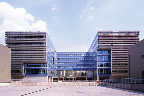
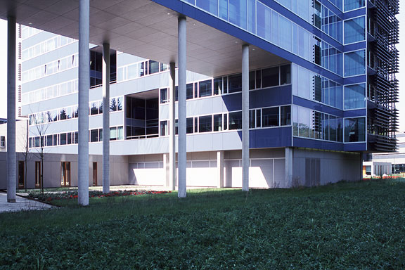
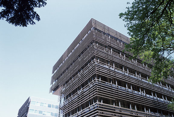
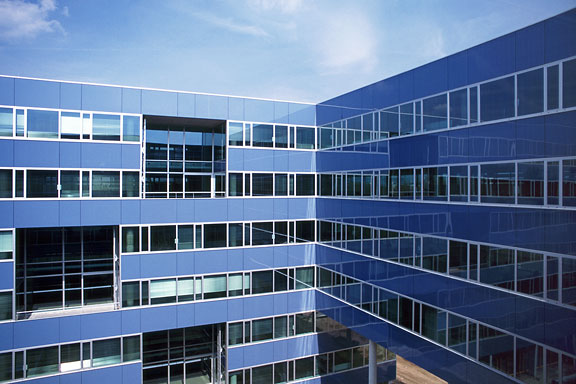
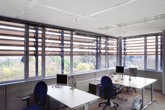
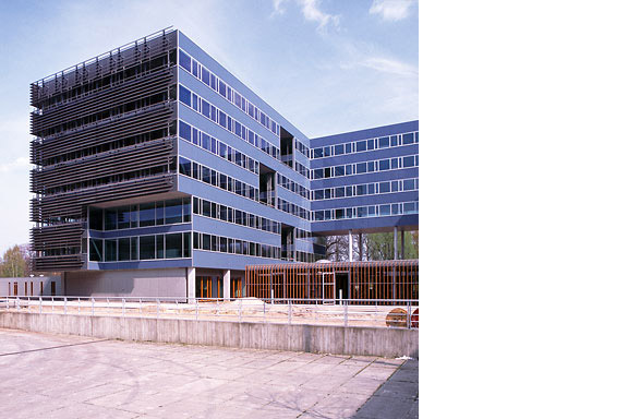
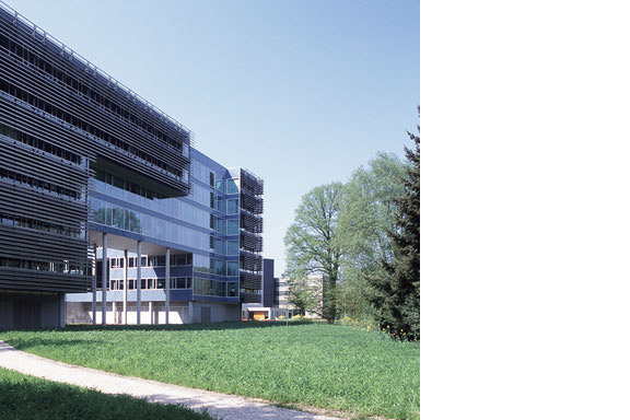
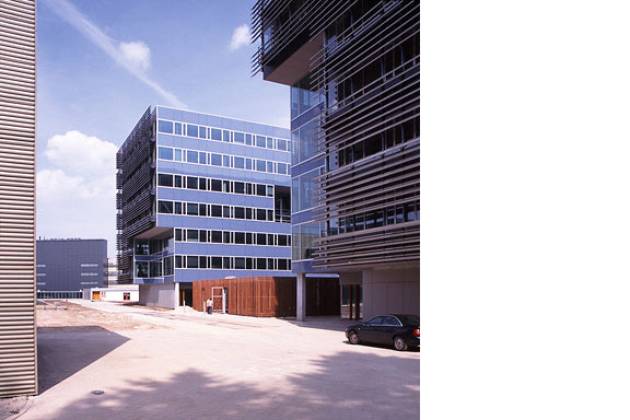
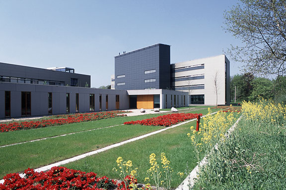
The Dutch Tax Administration feels like a family business. The atmosphere is open and relaxed. The organization is responsible for the total financial administration of The Netherlands Ltd. Dutch citizens expect professional civil servants. The office at the Quintax location in Apeldoorn expresses the two faces of the Dutch Tax Administration. The building looks severe and mimics the impregnability of Fort Knox. But internal, the building is totally transparent. Walls are exceptions, and voids open the floors to improve contact between employees.At JHK Architects, I was responsible for the concept of the building. I also worked out most of the technical details.
