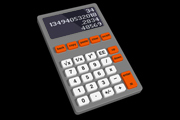
 80's T's
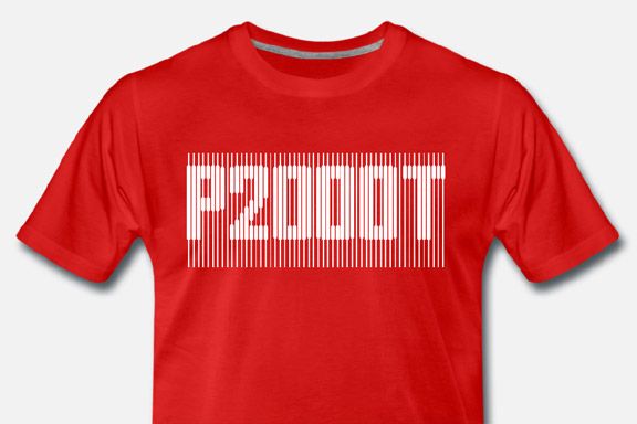
For my Youtube channel 2kB of Fun, I made several T-shirts based on logo graphics from 80's video games and electronic gadgets.


 Lost in Navigation
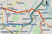
Tokyo is a breathtaking city. Most metropolises have 1 urban railway network. Easy. Tokyo, the biggest metropolis on Earth, is a lot more complex.The city has 2 official subway companies, the national railway operates several lines that can be considered metro lines as well, and there are tens of private operated railways that serve may areas just outside the central part of the city. Another problem is that many transfer stations use different station names on each line connected.
Creating a understandable subway map for this city is extremely complex. Should it be schematic, or geographic realistic? When is it easier to have a short walk than to switch lines?
This metro map for Tokyo only shows the most important lines for visitors of the city. That is already 25 lines! All distances are realistic, and the connections to Airports and Shinkansen trains are clearly visible. The parks that give a good orientation in the grey urban mass of Tokyo are visible. Icons show the most important landmarks. Matching the million neon lights the map is drawn in a night situation with the lines as glowing neon tubes.
The map is printed on 100x75 cm photo paper in a limited run, an can be ordered. Send an e-mail or call if you are interested to order.

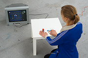
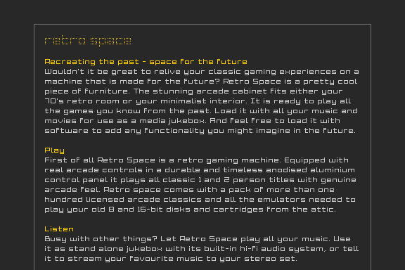
Low Bandwith
When the design of Retro Space was finished, we needed a matching website.Because of the presumption that Retro Space could become a hit on the internet, we tried to make the website as small as possible. We did not want the website to crash on bandwidth problems.
Matching the style of the retro games, the website is designed in pixel art. All elements except some product shots are GIF images in 4 colours. It's just like the early years of internet when bandwidth was scarce.


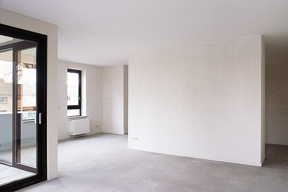
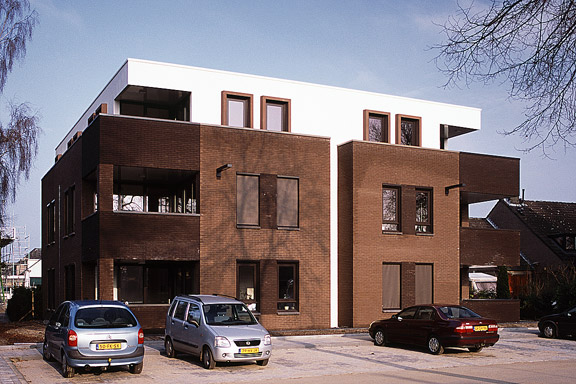
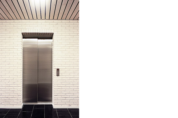
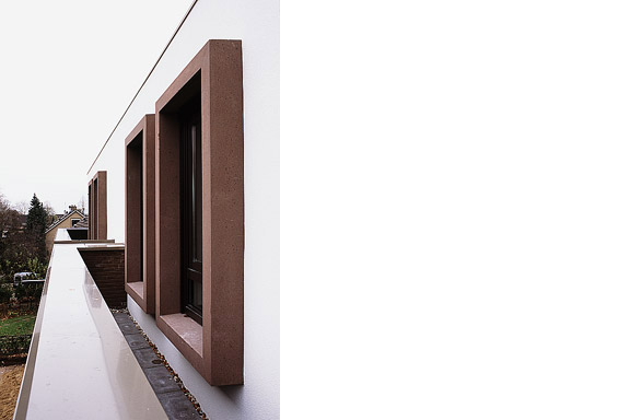
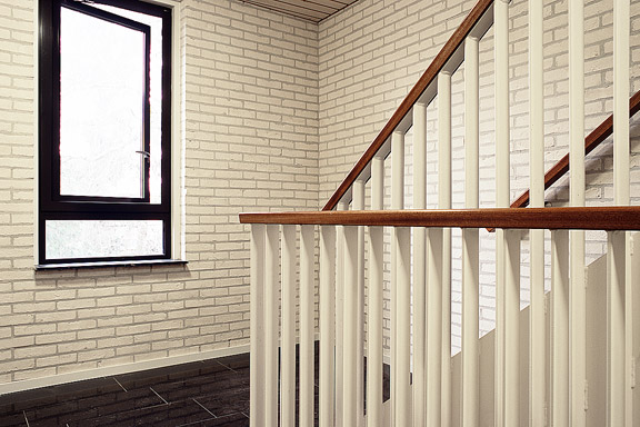
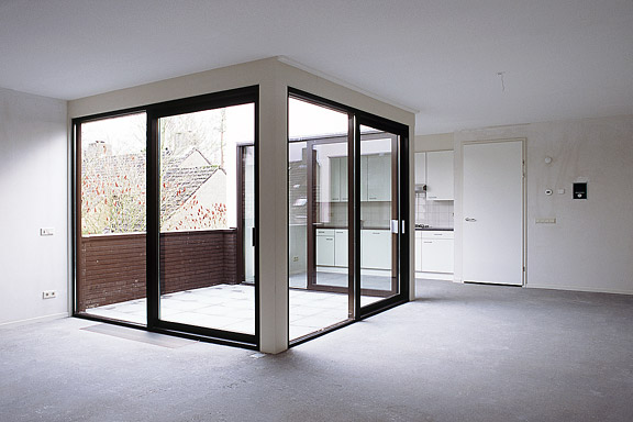
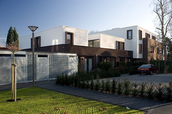
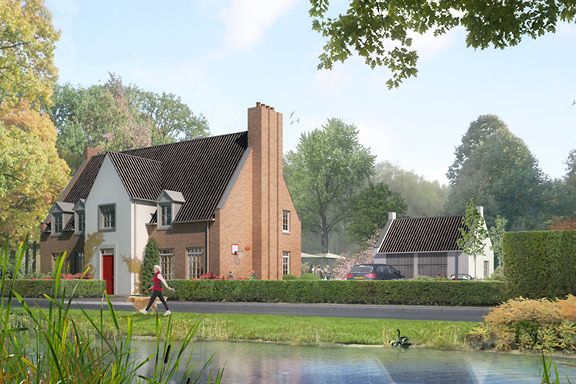
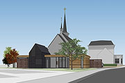
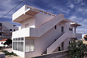
 I never promised you a rosegarden
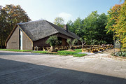
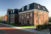
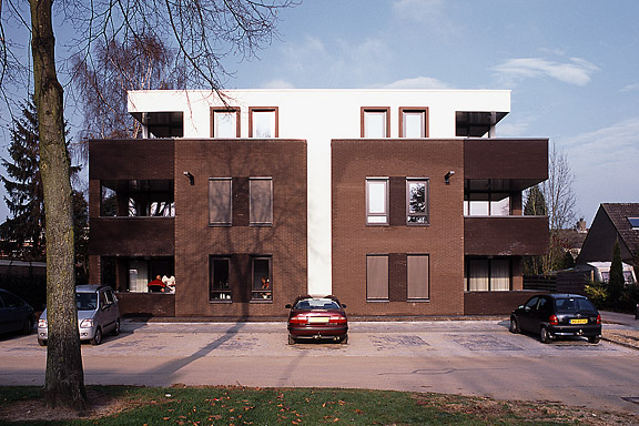
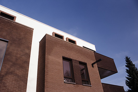
An abandoned commercial plot in the centre of Heteren had to be filled with 19 apartments. Contractor Kuijpers had moved to the city limits and the housing corporation "Woningstichting Heteren" had 4 outdated senior-citizen houses on the adjacent plot at the Rozenpad street. The combined plot connects a traditional village street with a seventies extension to Heteren. The housing coorporation asked me to design the modernist block fitting the seventies area.I designed this appartment block as employer of Bouwkundig ontwerp- en adviesburo van Zeist BV

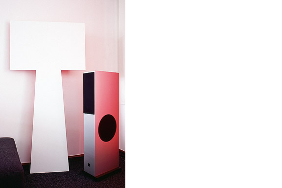
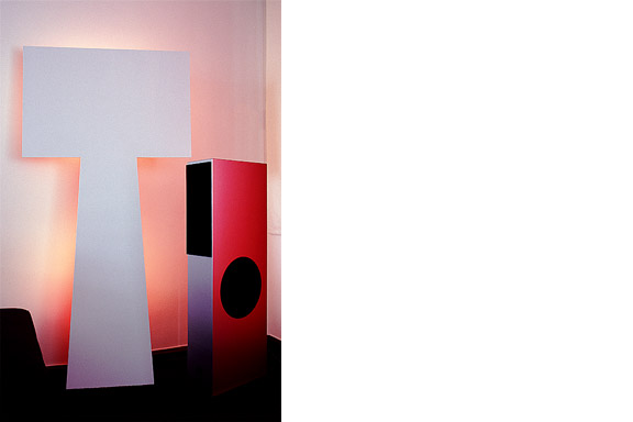
Fake Wanders
The lamp is a joke. I had no space to place the Big Shadow Lamp by Marcel Wanders. I also liked the idea of the Fake Lamp by Sophie Krier, but not its shape. I mixed them and created the Fake Wanders. Definitely not for sale.
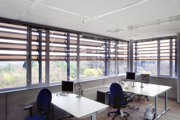
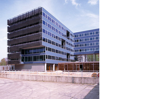
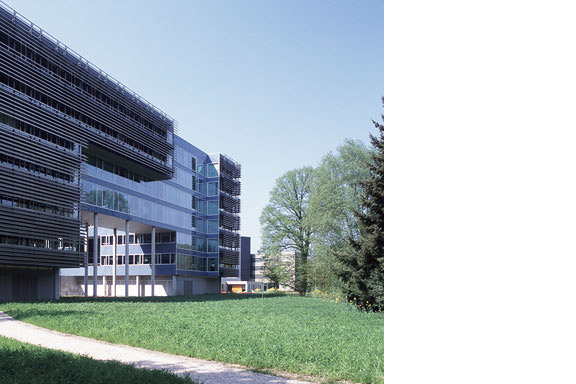
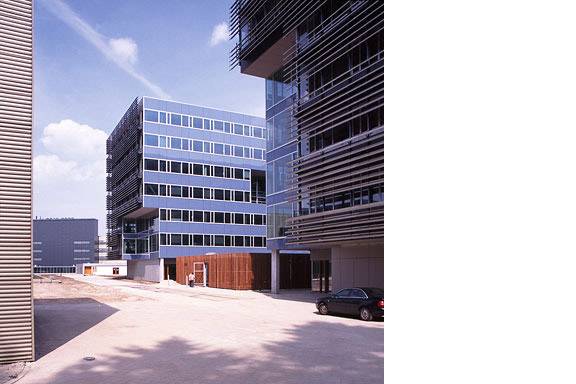
Blue Envelope
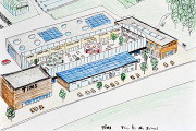
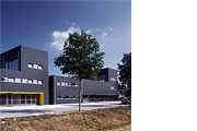
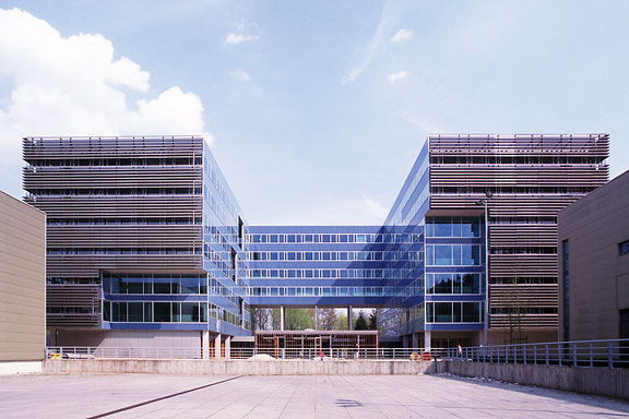
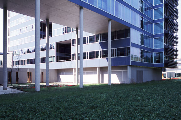
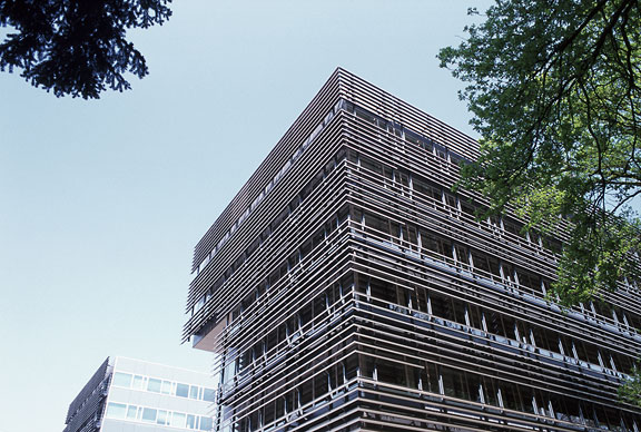
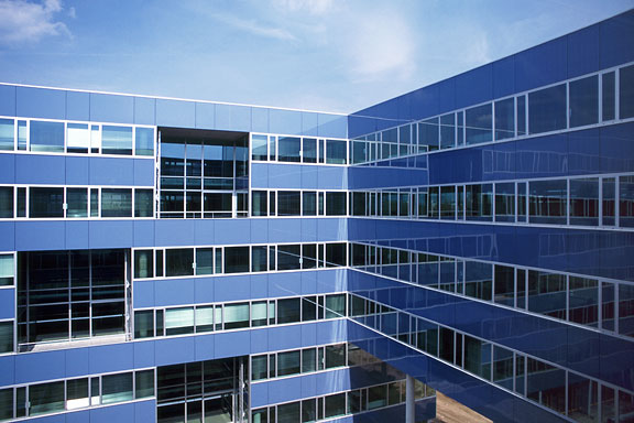
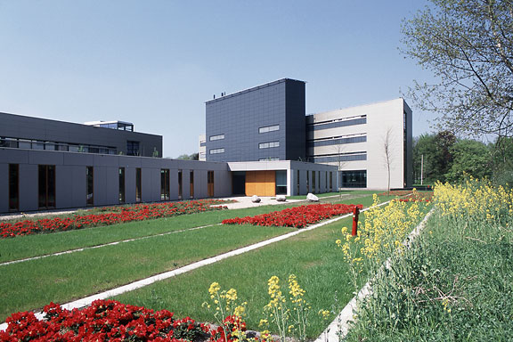
The Dutch Tax Administration feels like a family business. The atmosphere is open and relaxed. The organization is responsible for the total financial administration of The Netherlands Ltd. Dutch citizens expect professional civil servants. The office at the Quintax location in Apeldoorn expresses the two faces of the Dutch Tax Administration. The building looks severe and mimics the impregnability of Fort Knox. But internal, the building is totally transparent. Walls are exceptions, and voids open the floors to improve contact between employees.At JHK Architects, I was responsible for the concept of the building. I also worked out most of the technical details.