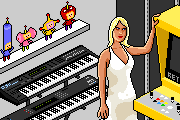

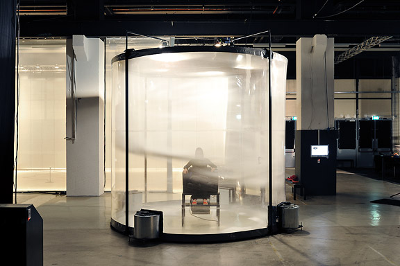
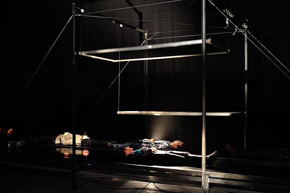
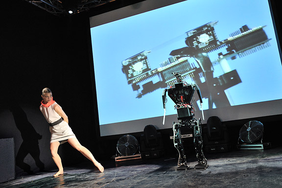
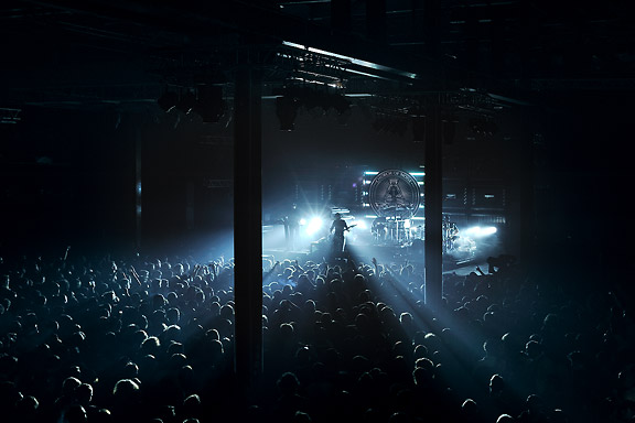
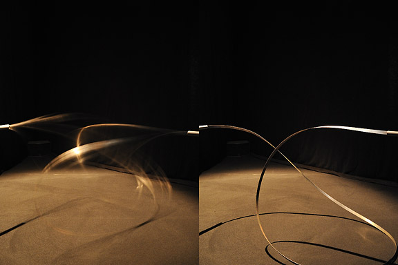
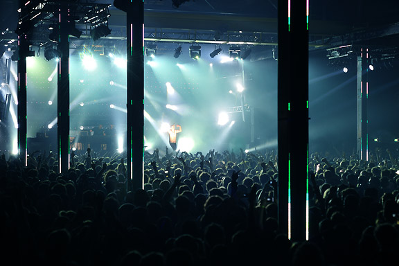
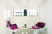
 STRPフェスティバル2010
ミック・ヴィッセルによる撮影マルタイン・コッホによる画像操作
左から右へ:
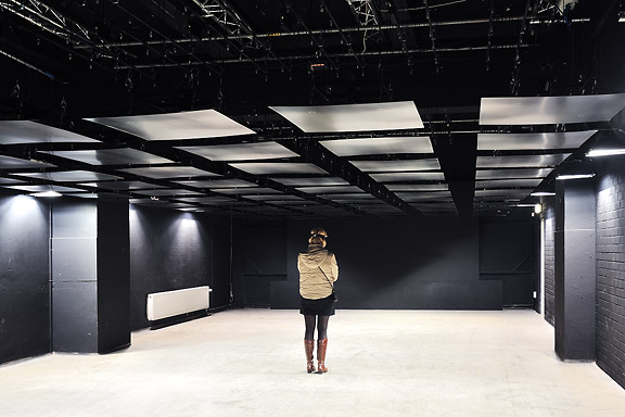
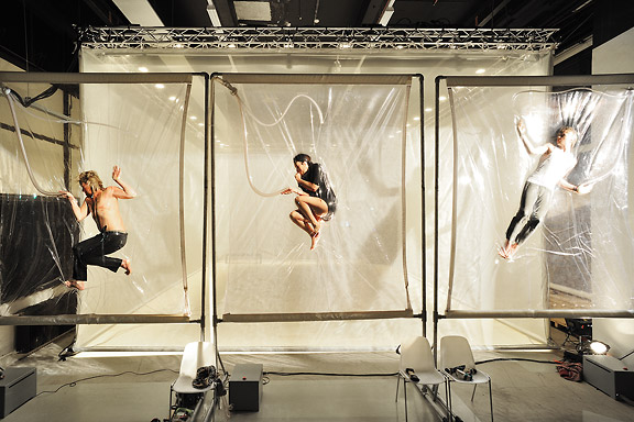
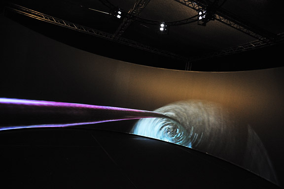
クリストフ・デ・ボエック、鋼の天井
ローレンス・マルスタフ、縮む
ジャン・ミッシェル・ブリュイエール、息子の分散
ローレンス・マルスタフ、ネモ天文台
ローレンス・マルスタフ、トランスポーター
ローズ・ファン・ベルケル&チューリップ、一種の2
ブラッディ·ビートルーツデスクルー77
ローレンス・マルスタフ、結び目
ローレンス・マルスタフ、ミスト
マルコム・マッキーバー&マルレーナ・ノバック&ジェイ・アラン・ジム、スケール
ローレンス・マルスタフ、領土
アンダーワールド
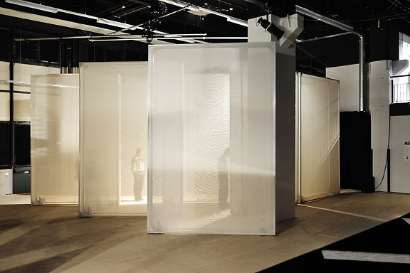
 M+ M- ???
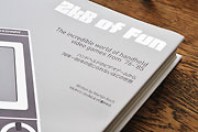
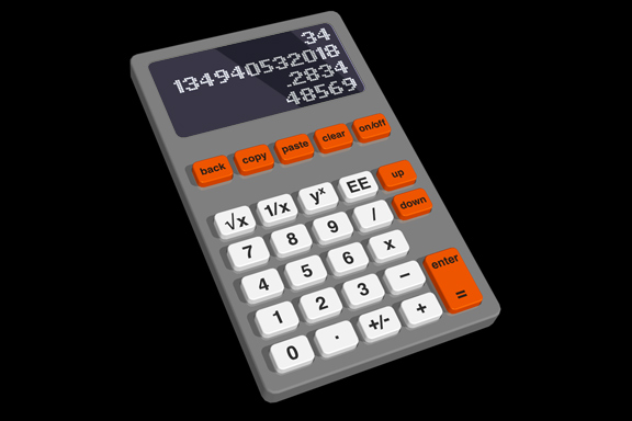
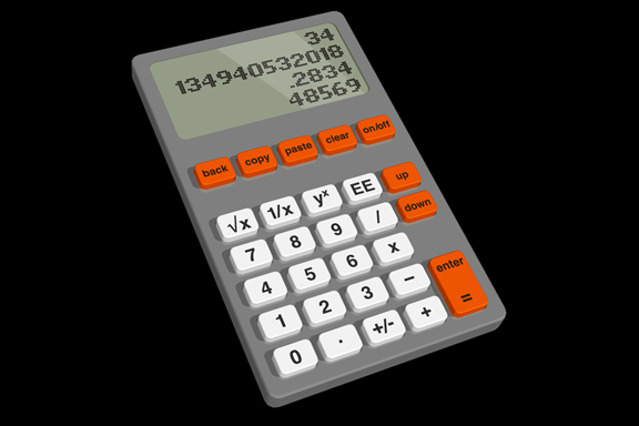
英語のみでの詳細Redesignme.com is a website where designers are challenged to create new designs for certain products.
Garton Jones used redesignme.com to search for a redesign of the Ativa 10 Digit Desk Calculator.
I'm always puzzled by the fact most calculators still function like the early 1970 designs. A time when chip logic was very expensive, and the amount of components was kept to a minimum. Today's standard micro controller is way more powerful. So my primary goal was to create a new set of basic functionality.
Which means I had to redesign the layout of the buttons first. The design itself continues proved ingredients like injection mould plastic, the perfect shape of PTT's Zurich telephone and modern white OLED matrix displays.
My own challenge was to make the design in one hour on a Friday afternoon.
The result: a top 3 note among 109 redesigns. "Your redesign was part of my top 3. Very well done! Yours sincerely, Charlie Garton-Jones"


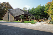
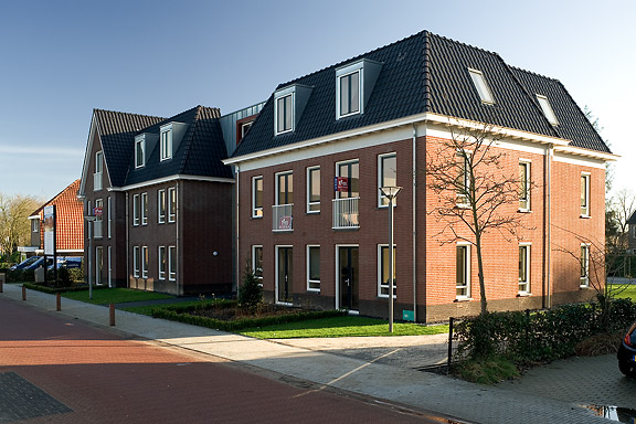
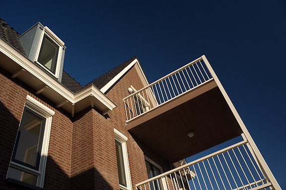
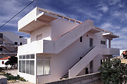
 僧接着
僧接着
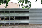
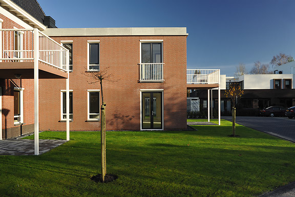
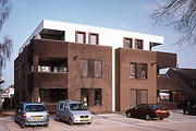
英語のみでの詳細When I started working at "bouwkundig ontwerp- en adviesburo Van Zeist" the preliminary design for these 8 apartments had been made already. I drew up the technical detailing.
One of the challenges was to draw the brickwork in monk bond, just like the classic houses in the same street.
To show the appartments are built in 2008, many details are modernized. The balconies for example look like old wooden porches, but in fact they are made of brown concrete and steel.
 低帯域幅
低帯域幅
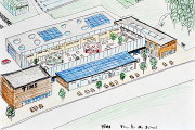
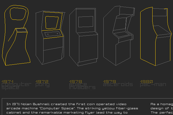
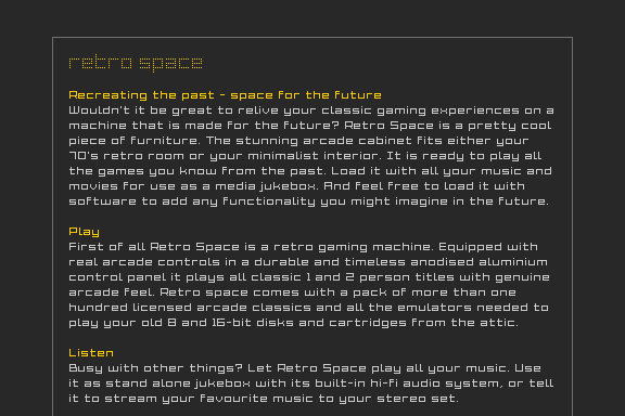
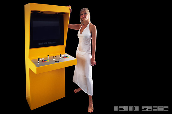
英語のみでの詳細When the design of Retro Space was finished, we needed a matching website.
Because of the presumption that Retro Space could become a hit on the internet, we tried to make the website as small as possible. We did not want the website to crash on bandwidth problems.
Matching the style of the retro games, the website is designed in pixel art. All elements except some product shots are GIF images in 4 colours. It's just like the early years of internet when bandwidth was scarce.

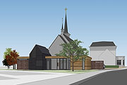
アンデンネでの歓迎します
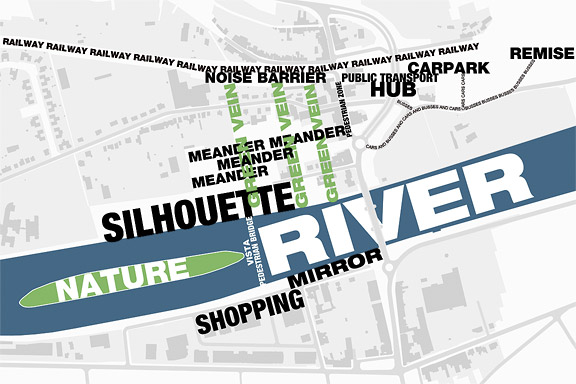
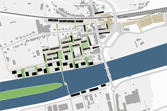
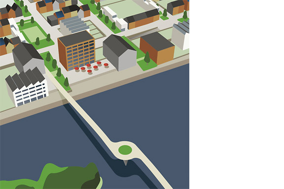
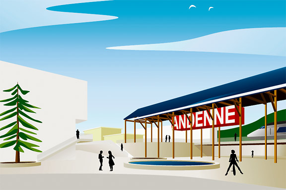
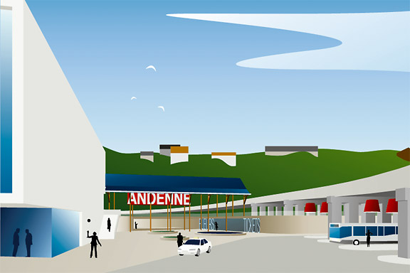
英語のみでの詳細Andenne is a small town on the bank of the Meuse between Namur and Liège. When entering Andenne the city does not impress. The abandoned factory area on the north bank of the Meuse makes a chaotic impression and the river is ignored. In collaboration with Wendy van Rosmalen I designed a new plan for this Europan 9 location.
With out plan we want to give Andenne a face. Between famous cities like Namur, Huy and Liège, Andenne is missing an inherent identity. We chose to multiply the nonchalant character of Belgian building and turn it into a specific typology. Our plan is a framework for development of the area in its own pace. A subtle guidance in building alignment and building heights delivers a varied public space that opens up towards the river Meuse.
A specific part of the assignment was the redesign of Andenne station. Bad attainableness of the platforms, a weird logistic and the uncomfortable public space underneath the viaduct are creating a moody atmosphere. The size of Andenne does not allow a large scale intervention. We choose a very modest solution. We created a square below the tracks to connect al transportation streams. The viaduct is decorated to resemble a living room and is transformed into a roof covering the bus platforms. New buildings surrounding the square size the public space.
Every Belgian wants its own house. Ignoring this feat makes a plan implausible. We go one step further through making the buying of a house resemble the buying of a car. By using a smart basic layout for the houses, every house can suit the needs of very different groups of people. Future change is very easy too. The architecture is a caricature of traditional Belgian building methods, its execution is contemporary and flexible.
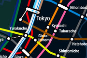
人鱼姫
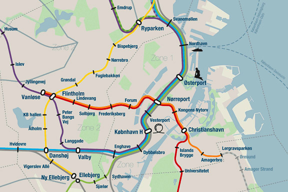
英語のみでの詳細When we visited Copenhagen, I was surprised by the complex metro map for the very small network. It should be possible to draw a map easier to understand and graphically more appealing to visitors.
I designed a new metro map that shows the relation with the city. It combines all trains with different schedules on similar routes to bring back overview.
Autonomous work
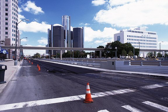
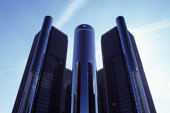
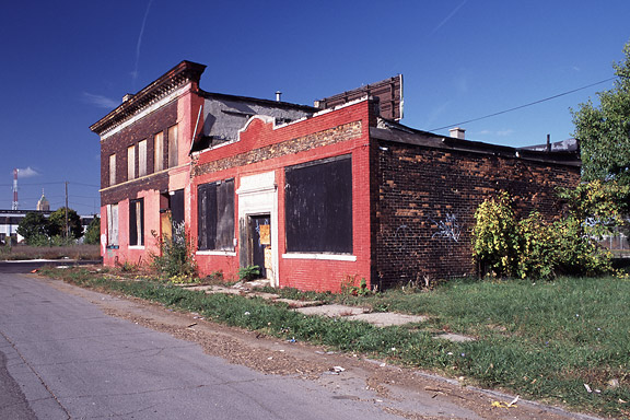
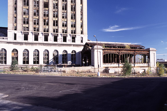
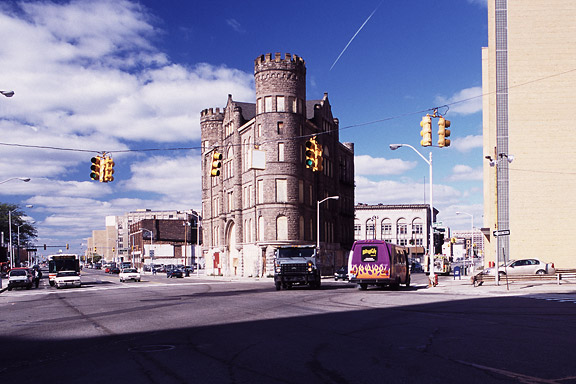
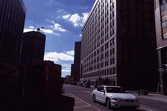
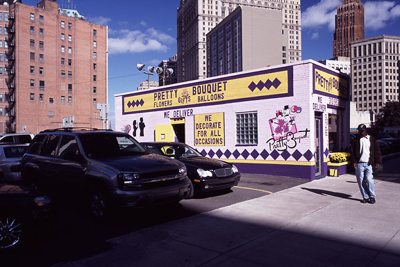
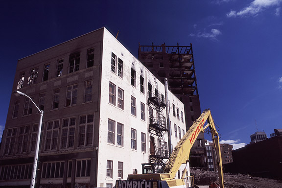
お化けの世界
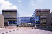
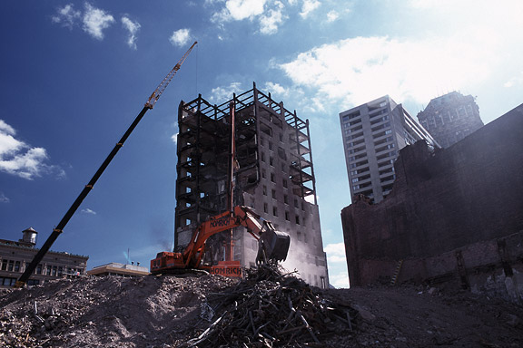
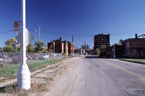
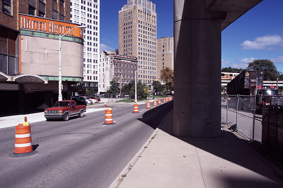
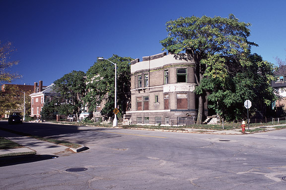
英語のみでの詳細Detroit is a weird city. The city disappears slowly and turns back to nature. Not caused by war or disaster, it vanishes because of economic irrelevance. De automotive industry moved towards the Mexican border. Jobs are gone. The city renders useless. The General Motors headquarters still shine as a major highlight downtown. Perhaps as an icon for the glorious past.
These photographs are taken during a trip of the USA and Canada in the autumn of 2005.
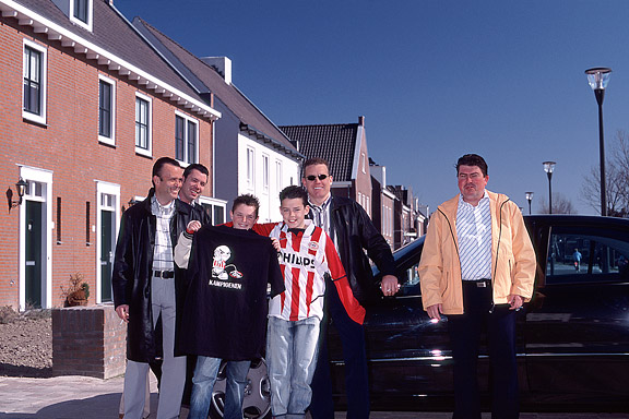
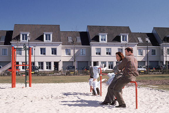
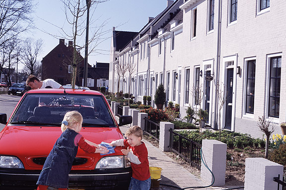
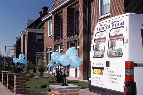
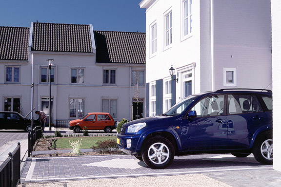
ミニチュア都市
英語のみでの詳細Brandevoort is one of the big suburban extensions according to the governmental document Vinex. Under supervision of Rob Krier, the city of Helmond tried to mimic the classic Dutch canal city for its big extension. Modern legislation on parking and the fact that a family in a suburban plan like this needs 2 cars to reach all daily facilities, resulted in weird interiors for the urban blocks. The gardens are petite, and most space is used for the cars.