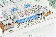
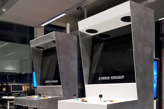
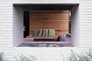
 Retro Space 4.0
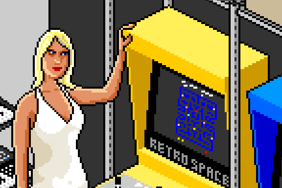
英語のみでの詳細Sound and Vision in Hilverum was interested in buying Retro Space arcade cabinets for their museum.
This request demanded an extra durable version of the Retro Space cabinets.
The new cabinet is fully re-engineered in folded aluminium sheets. The cab is fully modular, perfectly recyclable and gets prettier from a little use.
Notice: Undefined variable: tekst in /home/w1512188/domains/martijnkoch.com/public_html/index.php on line 281
ピクセルアート
Notice: Undefined variable: tekst in /home/w1512188/domains/martijnkoch.com/public_html/index.php on line 292


 ナビゲーションに失われた
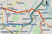
英語のみでの詳細Tokyo is a breathtaking city. Most metropolises have 1 urban railway network. Easy. Tokyo, the biggest metropolis on Earth, is a lot more complex.
The city has 2 official subway companies, the national railway operates several lines that can be considered metro lines as well, and there are tens of private operated railways that serve may areas just outside the central part of the city. Another problem is that many transfer stations use different station names on each line connected.
Creating a understandable subway map for this city is extremely complex. Should it be schematic, or geographic realistic? When is it easier to have a short walk than to switch lines?
This metro map for Tokyo only shows the most important lines for visitors of the city. That is already 25 lines! All distances are realistic, and the connections to Airports and Shinkansen trains are clearly visible. The parks that give a good orientation in the grey urban mass of Tokyo are visible. Icons show the most important landmarks. Matching the million neon lights the map is drawn in a night situation with the lines as glowing neon tubes.
The map is printed on 100x75 cm photo paper in a limited run, an can be ordered. Send an e-mail or call if you are interested to order.

Notice: Undefined variable: tekst in /home/w1512188/domains/martijnkoch.com/public_html/index.php on line 281
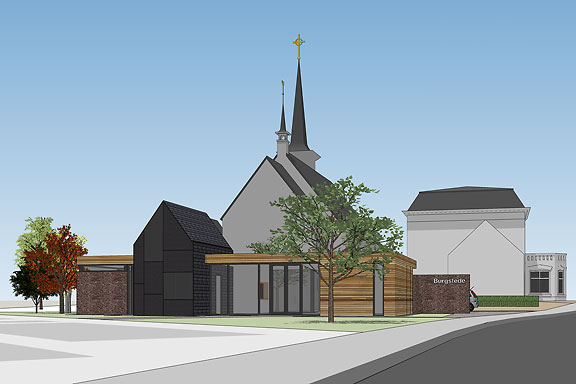
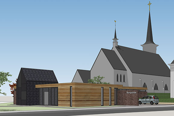
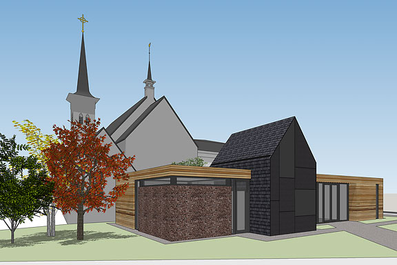
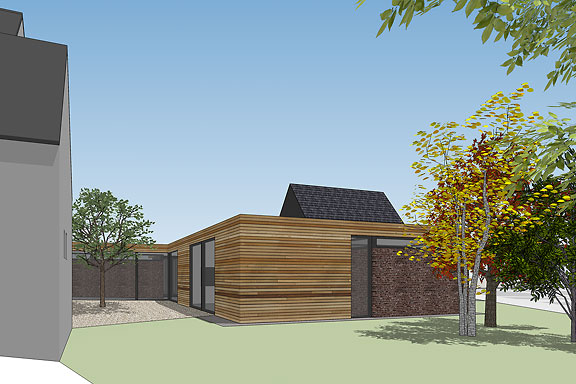
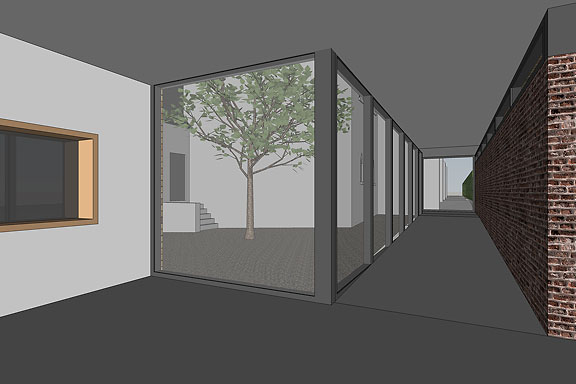
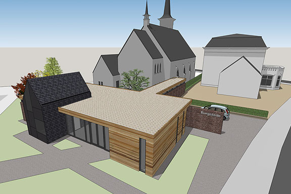
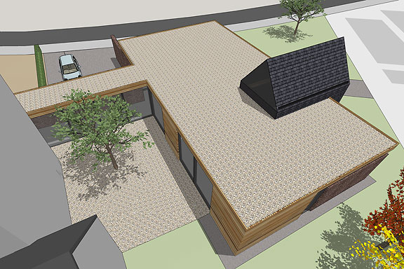
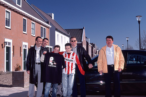
 ブルグステデ
Notice: Undefined variable: tekst in /home/w1512188/domains/martijnkoch.com/public_html/index.php on line 292
僧接着
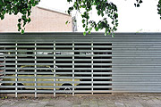
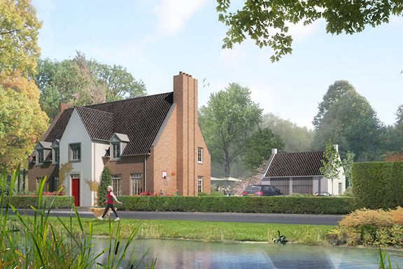
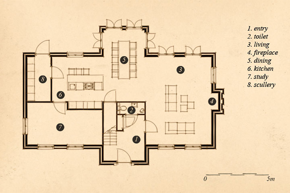
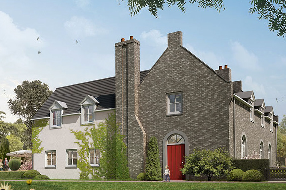
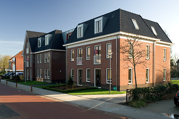
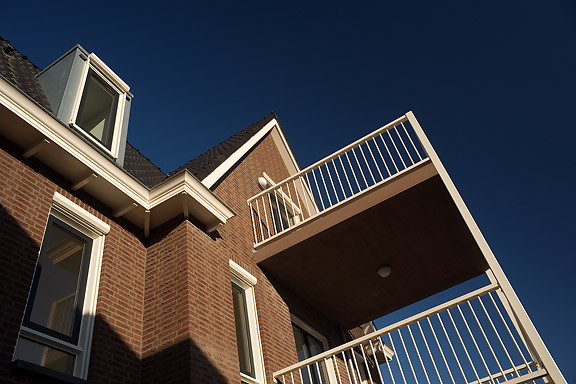
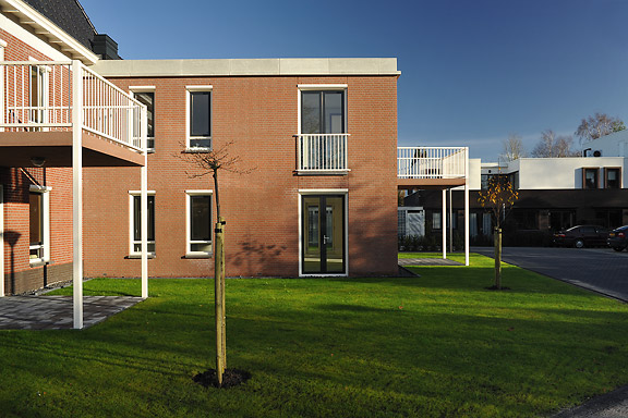
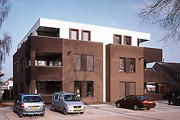
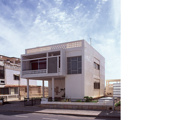
英語のみでの詳細When I started working at "bouwkundig ontwerp- en adviesburo Van Zeist" the preliminary design for these 8 apartments had been made already. I drew up the technical detailing.
One of the challenges was to draw the brickwork in monk bond, just like the classic houses in the same street.
To show the appartments are built in 2008, many details are modernized. The balconies for example look like old wooden porches, but in fact they are made of brown concrete and steel.
黒箱
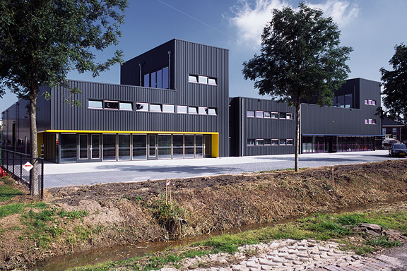
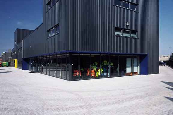
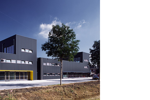
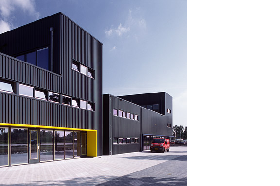
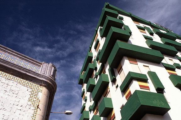
英語のみでの詳細Painter Bert de Haas and salesman in business outfits Chris Hendriks both wanted a new business building in Kesteren. Because of fire regulations it was best to combine the two buildings. Otherwise a big part of the plot was useless.
To preserve each ones identity and to answer the request for a good cantina, both parts of the building were accented by a small tower. These towers contain a special room looking out over the polders of the Betuwe.
The building is clad with anthracite profile sheets to ease the implementation of the detailing and to maximise the abstraction of the black boxes.
I made this design as employer of Bouwkundig ontwerp en adviesburo Van Zeist BV in Opheusden.
低帯域幅
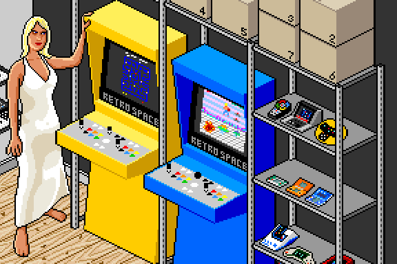
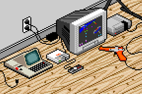
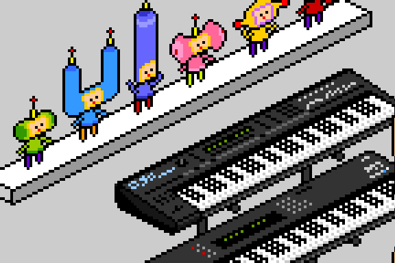
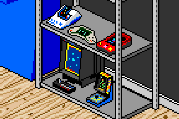
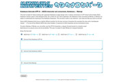
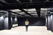
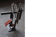
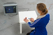
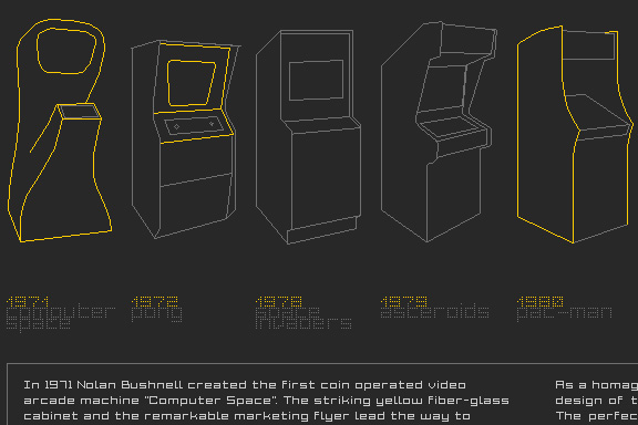
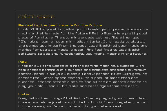
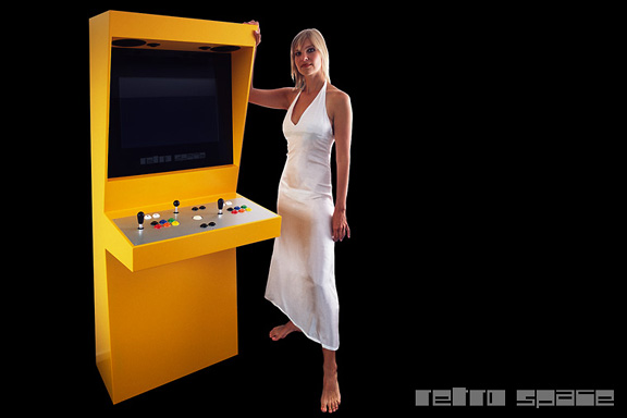
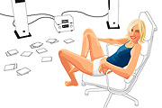
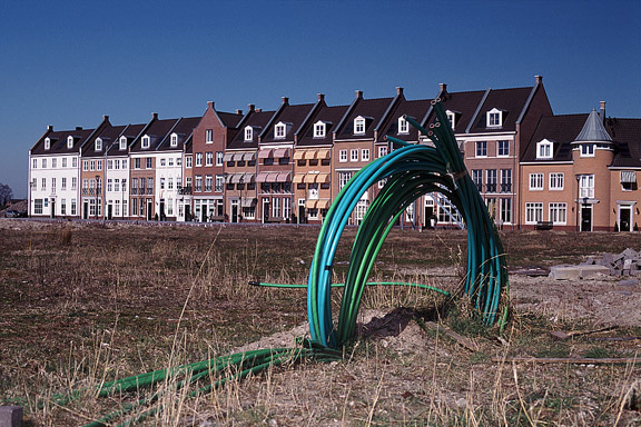
英語のみでの詳細When the design of Retro Space was finished, we needed a matching website.
Because of the presumption that Retro Space could become a hit on the internet, we tried to make the website as small as possible. We did not want the website to crash on bandwidth problems.
Matching the style of the retro games, the website is designed in pixel art. All elements except some product shots are GIF images in 4 colours. It's just like the early years of internet when bandwidth was scarce.

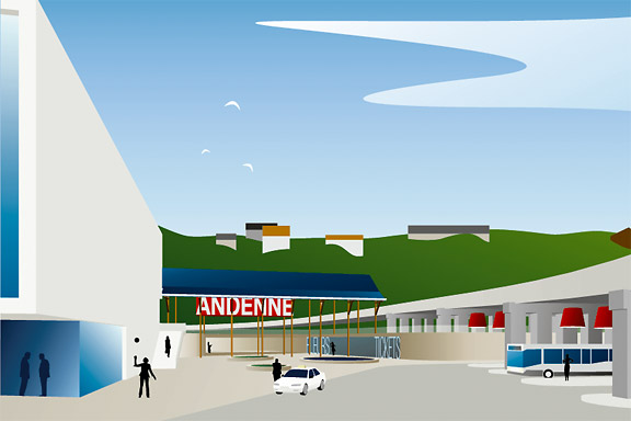
アンデンネでの歓迎します
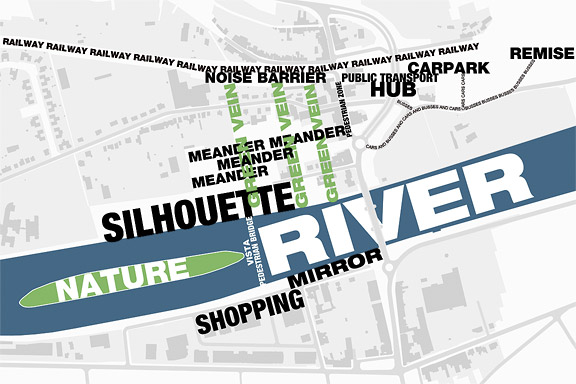
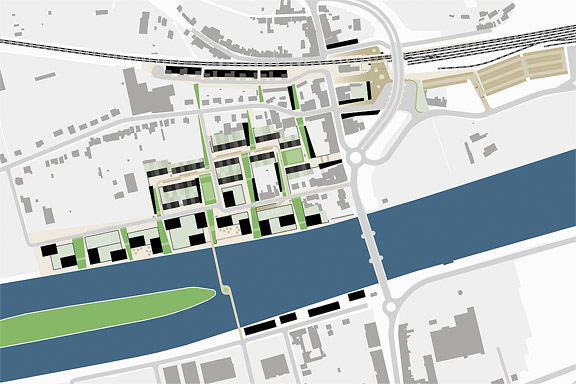
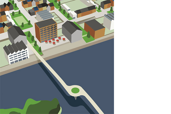
英語のみでの詳細Andenne is a small town on the bank of the Meuse between Namur and Liège. When entering Andenne the city does not impress. The abandoned factory area on the north bank of the Meuse makes a chaotic impression and the river is ignored. In collaboration with Wendy van Rosmalen I designed a new plan for this Europan 9 location.
With out plan we want to give Andenne a face. Between famous cities like Namur, Huy and Liège, Andenne is missing an inherent identity. We chose to multiply the nonchalant character of Belgian building and turn it into a specific typology. Our plan is a framework for development of the area in its own pace. A subtle guidance in building alignment and building heights delivers a varied public space that opens up towards the river Meuse.
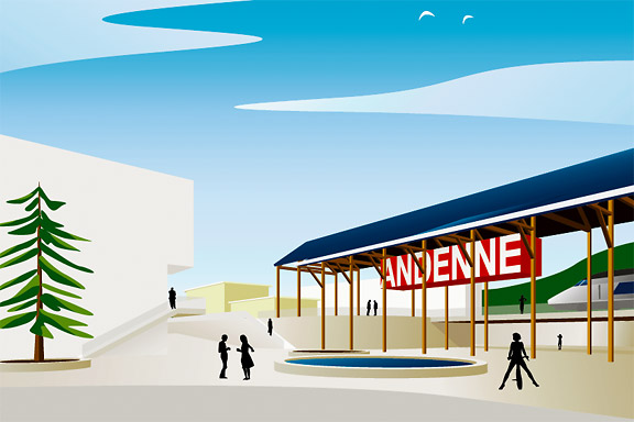
A specific part of the assignment was the redesign of Andenne station. Bad attainableness of the platforms, a weird logistic and the uncomfortable public space underneath the viaduct are creating a moody atmosphere. The size of Andenne does not allow a large scale intervention. We choose a very modest solution. We created a square below the tracks to connect al transportation streams. The viaduct is decorated to resemble a living room and is transformed into a roof covering the bus platforms. New buildings surrounding the square size the public space.
Every Belgian wants its own house. Ignoring this feat makes a plan implausible. We go one step further through making the buying of a house resemble the buying of a car. By using a smart basic layout for the houses, every house can suit the needs of very different groups of people. Future change is very easy too. The architecture is a caricature of traditional Belgian building methods, its execution is contemporary and flexible.
 不明なモダニズム
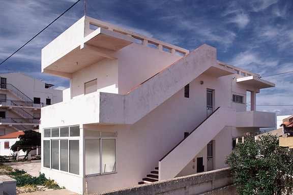
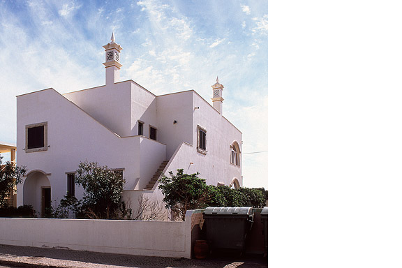
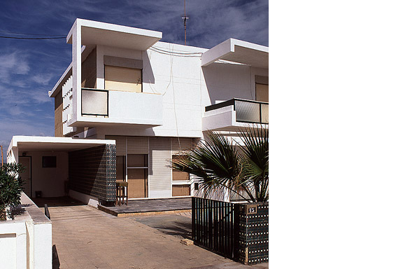
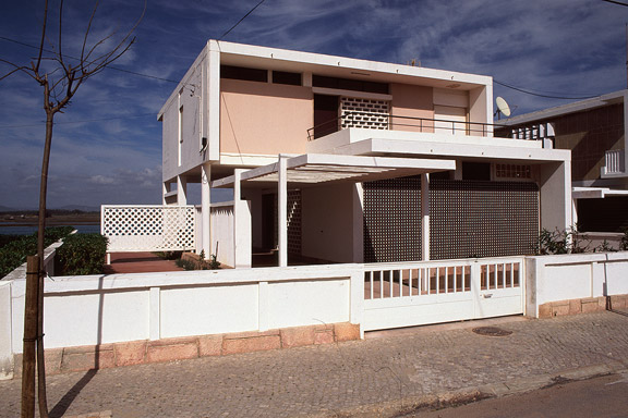
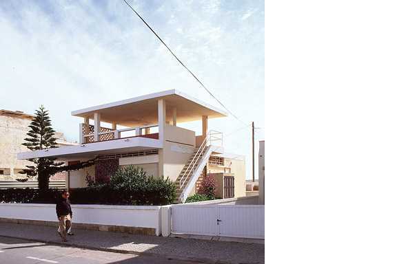
英語のみでの詳細For most tourists the city of Faro in southern Portugal is nothing more than an entrance by plane to the Algarve. Which is a pity. The biggest city of southern Portugal is probably the only one giving room to creativity. You will not see kitsch appartment blocks for Dutch and Germans, but subtile shaped private houses for the Portugese themselves. You will see images that remind of modernists like Gerrit Rietveld, Adolf Loos and Le Corbusier. You will wonder wheter MVRDV got inspiration here, or if Portugese architects checked out work of the Durch architecture firm.
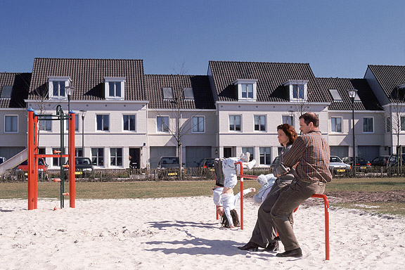
ミニチュア都市
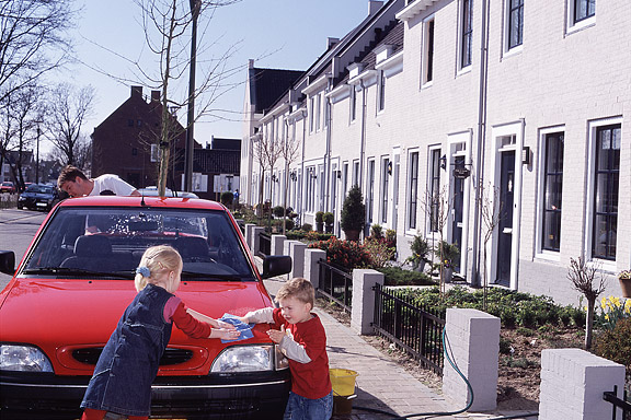
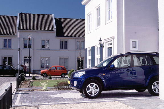
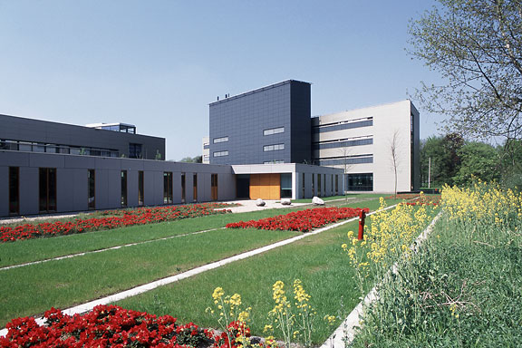
英語のみでの詳細Brandevoort is one of the big suburban extensions according to the governmental document Vinex. Under supervision of Rob Krier, the city of Helmond tried to mimic the classic Dutch canal city for its big extension. Modern legislation on parking and the fact that a family in a suburban plan like this needs 2 cars to reach all daily facilities, resulted in weird interiors for the urban blocks. The gardens are petite, and most space is used for the cars.
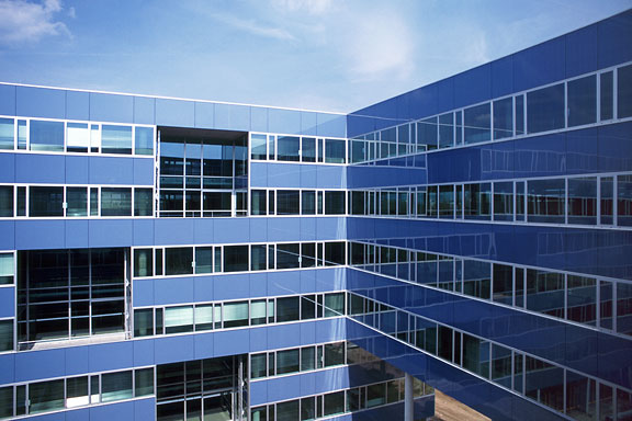
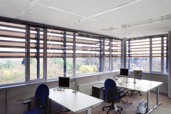
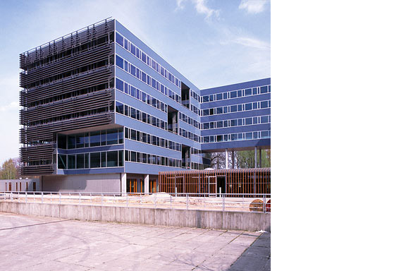
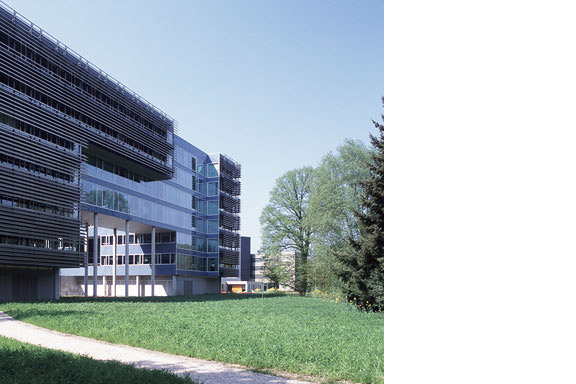
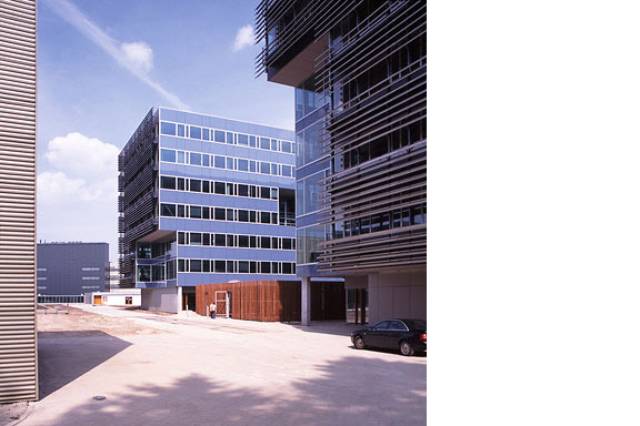
青い封筒
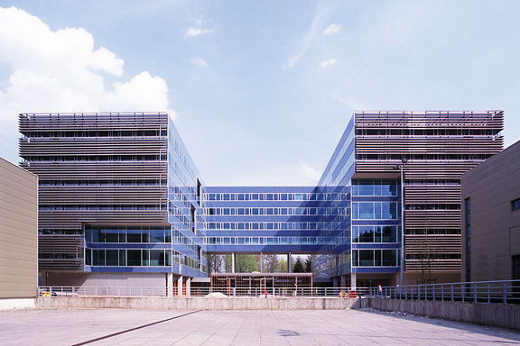
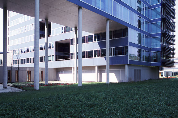
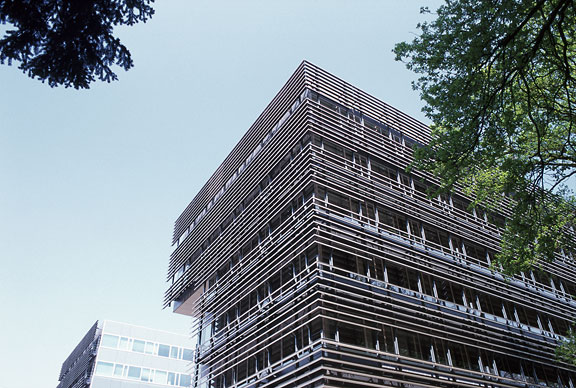
英語のみでの詳細The Dutch Tax Administration feels like a family business. The atmosphere is open and relaxed. The organization is responsible for the total financial administration of The Netherlands Ltd. Dutch citizens expect professional civil servants. The office at the Quintax location in Apeldoorn expresses the two faces of the Dutch Tax Administration. The building looks severe and mimics the impregnability of Fort Knox. But internal, the building is totally transparent. Walls are exceptions, and voids open the floors to improve contact between employees.
At JHK Architects, I was responsible for the concept of the building. I also worked out most of the technical details.