Notice: Undefined variable: tekst in /home/w1512188/domains/martijnkoch.com/public_html/index.php on line 281
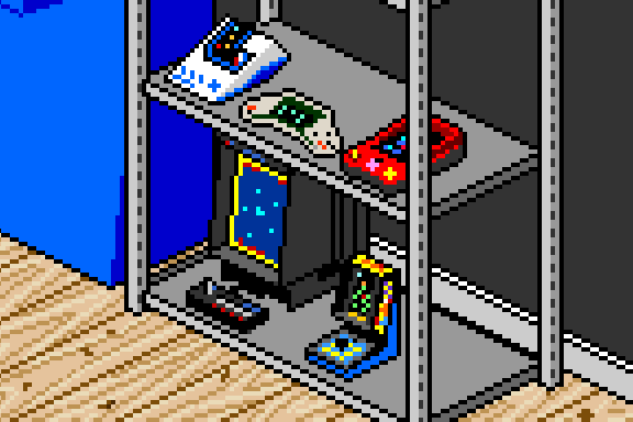
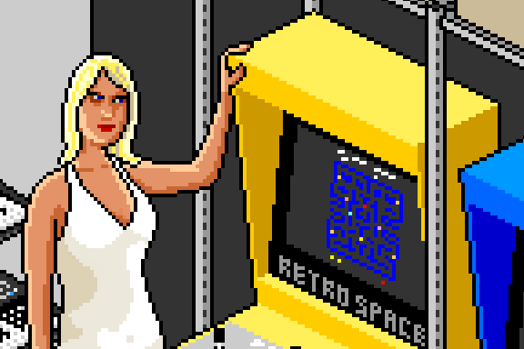
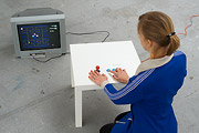
 ピクセルアート
Notice: Undefined variable: tekst in /home/w1512188/domains/martijnkoch.com/public_html/index.php on line 292

Notice: Undefined variable: tekst in /home/w1512188/domains/martijnkoch.com/public_html/index.php on line 281
 カタカナコンバータ
Notice: Undefined variable: tekst in /home/w1512188/domains/martijnkoch.com/public_html/index.php on line 292
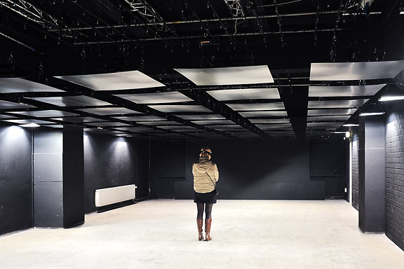
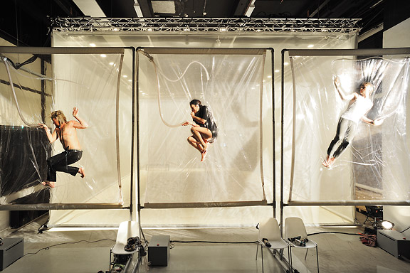
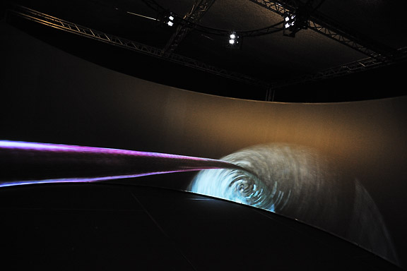
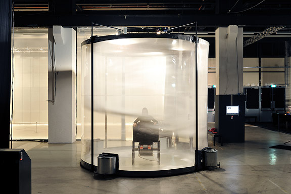
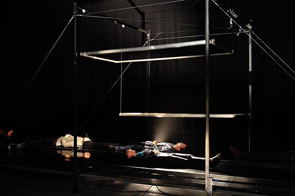
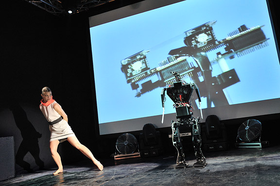
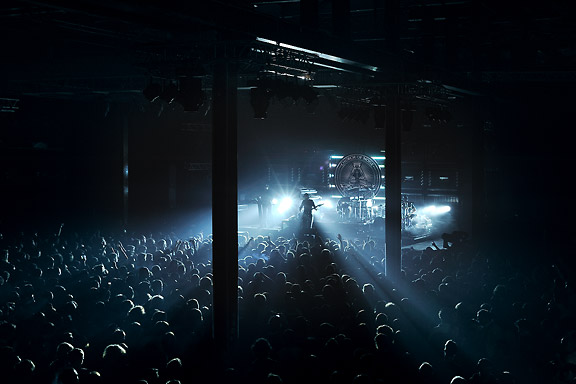
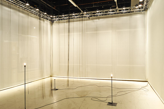
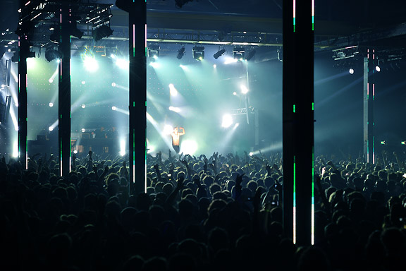
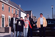
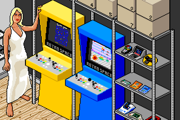
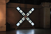
 STRPフェスティバル2010
ミック・ヴィッセルによる撮影マルタイン・コッホによる画像操作
左から右へ:
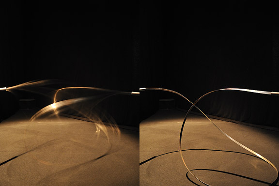
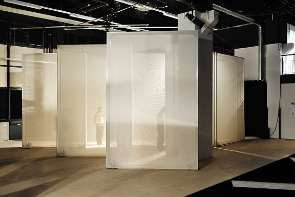
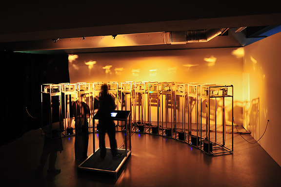
クリストフ・デ・ボエック、鋼の天井
ローレンス・マルスタフ、縮む
ジャン・ミッシェル・ブリュイエール、息子の分散
ローレンス・マルスタフ、ネモ天文台
ローレンス・マルスタフ、トランスポーター
ローズ・ファン・ベルケル&チューリップ、一種の2
ブラッディ·ビートルーツデスクルー77
ローレンス・マルスタフ、結び目
ローレンス・マルスタフ、ミスト
マルコム・マッキーバー&マルレーナ・ノバック&ジェイ・アラン・ジム、スケール
ローレンス・マルスタフ、領土
アンダーワールド


ナビゲーションに失われた
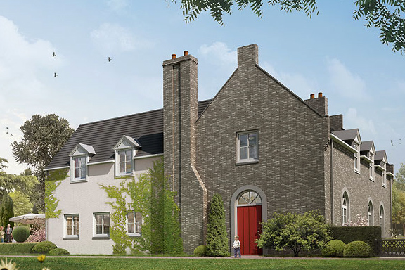
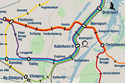
英語のみでの詳細Tokyo is a breathtaking city. Most metropolises have 1 urban railway network. Easy. Tokyo, the biggest metropolis on Earth, is a lot more complex.
The city has 2 official subway companies, the national railway operates several lines that can be considered metro lines as well, and there are tens of private operated railways that serve may areas just outside the central part of the city. Another problem is that many transfer stations use different station names on each line connected.
Creating a understandable subway map for this city is extremely complex. Should it be schematic, or geographic realistic? When is it easier to have a short walk than to switch lines?
This metro map for Tokyo only shows the most important lines for visitors of the city. That is already 25 lines! All distances are realistic, and the connections to Airports and Shinkansen trains are clearly visible. The parks that give a good orientation in the grey urban mass of Tokyo are visible. Icons show the most important landmarks. Matching the million neon lights the map is drawn in a night situation with the lines as glowing neon tubes.
The map is printed on 100x75 cm photo paper in a limited run, an can be ordered. Send an e-mail or call if you are interested to order.

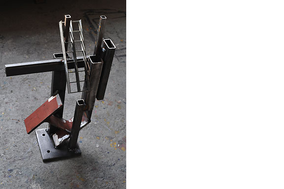
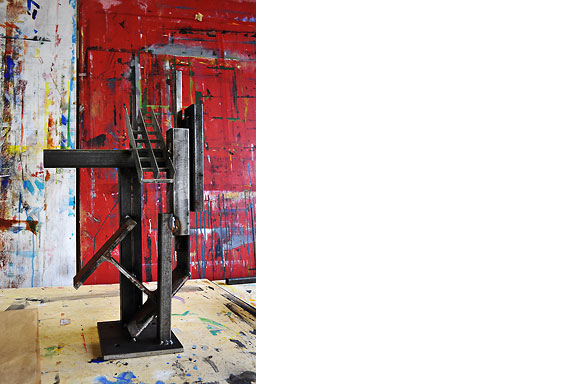
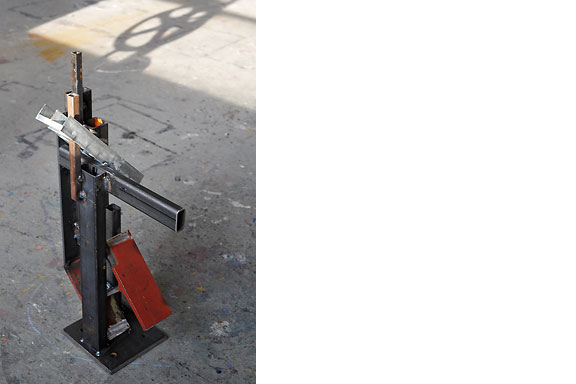
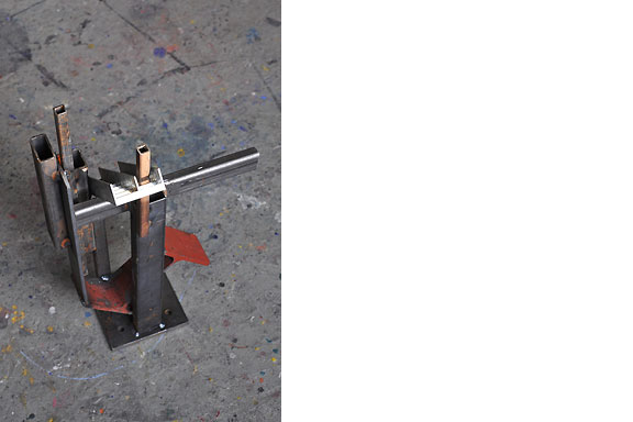
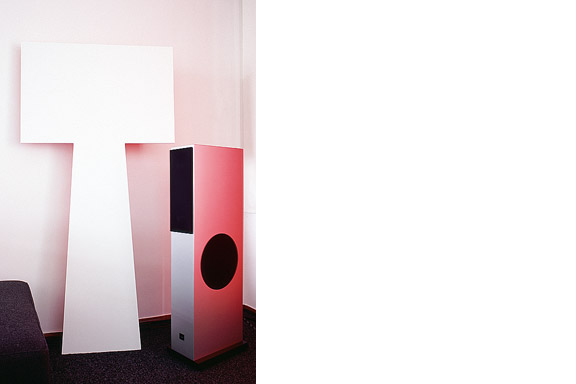
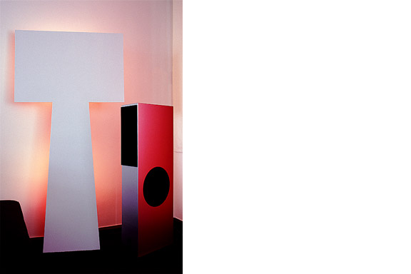
男のトロフィー
英語のみでの詳細Result from a weekend workshop at WiSPER in Leuven: A trophy for real men, made from construction beams. The trophy is welded using MIG and metal arc welding (MAW) techniques.
 僧接着
僧接着
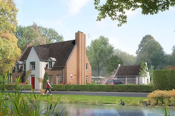
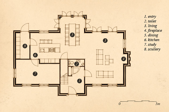
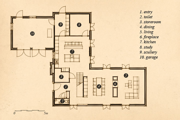
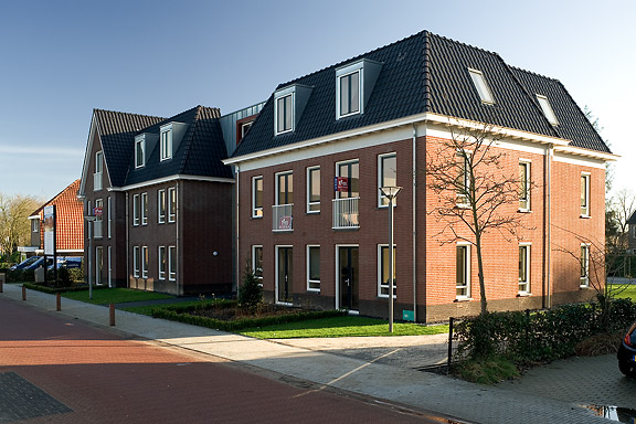
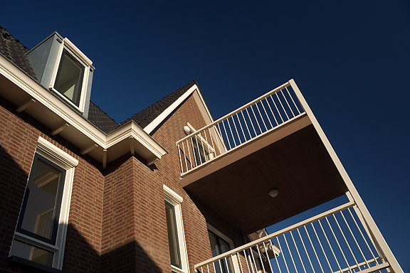
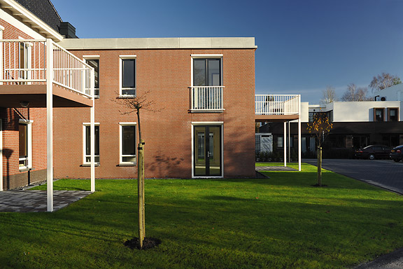
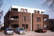
英語のみでの詳細When I started working at "bouwkundig ontwerp- en adviesburo Van Zeist" the preliminary design for these 8 apartments had been made already. I drew up the technical detailing.
One of the challenges was to draw the brickwork in monk bond, just like the classic houses in the same street.
To show the appartments are built in 2008, many details are modernized. The balconies for example look like old wooden porches, but in fact they are made of brown concrete and steel.
黒箱
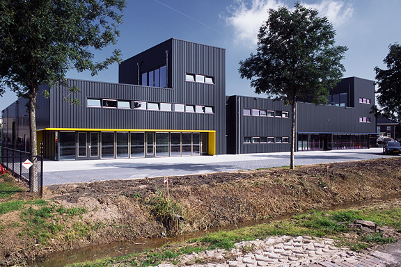
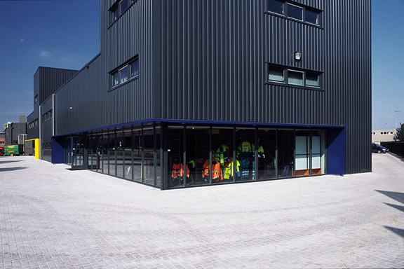
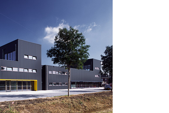
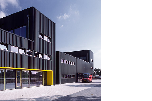
英語のみでの詳細Painter Bert de Haas and salesman in business outfits Chris Hendriks both wanted a new business building in Kesteren. Because of fire regulations it was best to combine the two buildings. Otherwise a big part of the plot was useless.
To preserve each ones identity and to answer the request for a good cantina, both parts of the building were accented by a small tower. These towers contain a special room looking out over the polders of the Betuwe.
The building is clad with anthracite profile sheets to ease the implementation of the detailing and to maximise the abstraction of the black boxes.
I made this design as employer of Bouwkundig ontwerp en adviesburo Van Zeist BV in Opheusden.

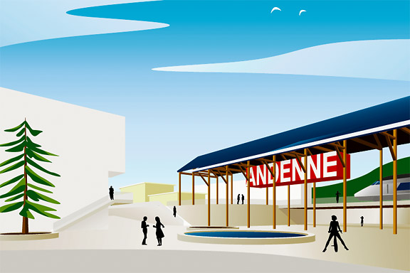
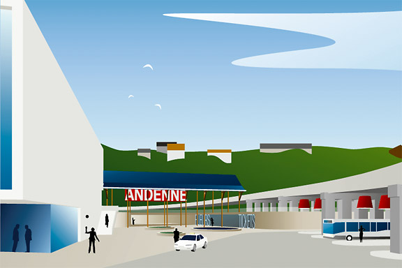
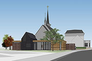
アンデンネでの歓迎します
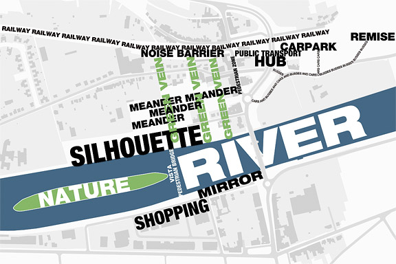
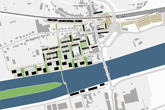
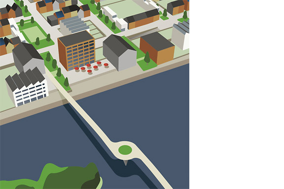
英語のみでの詳細Andenne is a small town on the bank of the Meuse between Namur and Liège. When entering Andenne the city does not impress. The abandoned factory area on the north bank of the Meuse makes a chaotic impression and the river is ignored. In collaboration with Wendy van Rosmalen I designed a new plan for this Europan 9 location.
With out plan we want to give Andenne a face. Between famous cities like Namur, Huy and Liège, Andenne is missing an inherent identity. We chose to multiply the nonchalant character of Belgian building and turn it into a specific typology. Our plan is a framework for development of the area in its own pace. A subtle guidance in building alignment and building heights delivers a varied public space that opens up towards the river Meuse.
A specific part of the assignment was the redesign of Andenne station. Bad attainableness of the platforms, a weird logistic and the uncomfortable public space underneath the viaduct are creating a moody atmosphere. The size of Andenne does not allow a large scale intervention. We choose a very modest solution. We created a square below the tracks to connect al transportation streams. The viaduct is decorated to resemble a living room and is transformed into a roof covering the bus platforms. New buildings surrounding the square size the public space.
Every Belgian wants its own house. Ignoring this feat makes a plan implausible. We go one step further through making the buying of a house resemble the buying of a car. By using a smart basic layout for the houses, every house can suit the needs of very different groups of people. Future change is very easy too. The architecture is a caricature of traditional Belgian building methods, its execution is contemporary and flexible.
ワンダ・ワンデレス
英語のみでの詳細The avatar Wanda Wanders was born in a chatconversation with Margot Scheltens. Wanda wanders around the World and shares her sharp opinion on various topics.
I created the website both technically and graphically. Many of the articles are written by me too.
Wanda Wanders is a registered Benelux trademark.
http://
偽ワンデレス
英語のみでの詳細The lamp is a joke. I had no space to place the Big Shadow Lamp by Marcel Wanders. I also liked the idea of the Fake Lamp by Sophie Krier, but not its shape. I mixed them and created the Fake Wanders. Definitely not for sale.
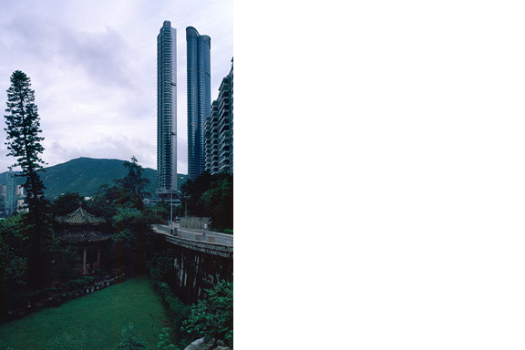
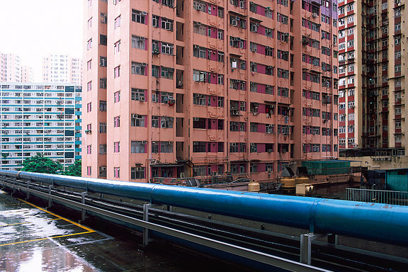
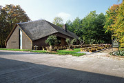
蟻の巣
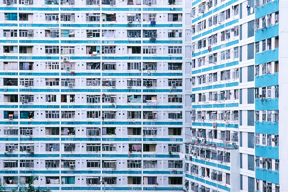
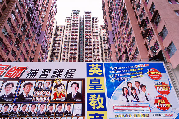
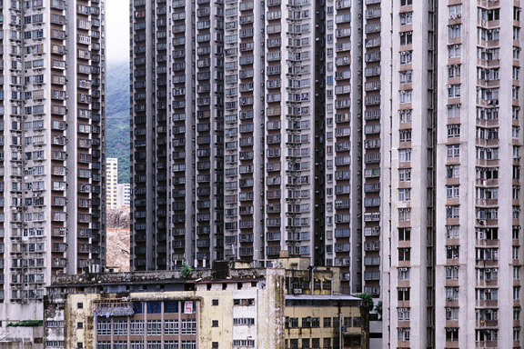
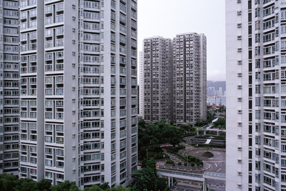
英語のみでの詳細Hong Kong has little room to built. There is a small piece of land to build on between the water and the mountains. The only option to house the millions of citizens is to use efficient towering blocks. Some area's have a FAR (floor to ground area aspect ratio) of 5 to 10.