 これは学校ではありません
英語のみでの詳細Learning is working best when kids are into subjects of study that match their interests. It also works well when projects are realistic.
Also there has to be place for the making. It should be possible to make prototypes, do experiments, program shows and produce goods to express yourself.
This Is No School is the world on a stamp. A meeting square, workshops, labs, a theater, a fram, sporting facilities, restaurants, shops and a hotel.
 STRPフェスティバル2011
ミック・ヴィッセルによる撮影マルタイン・コッホによる画像操作
左から右へ:
バート・シューター、風車Xモレン、1982
エドウィン・ファン・デル・ヘイデ、DSLE2、2011
テルコシステムズ、12シリーズ、2010
クートマ、2011年11月26日
エドウィン・ファン・デル・ヘイデ、スパークネットワークを進化、2010/2011
マクラル、位相=オーダー、2010
ブラム・スナイデレス、カロリーン・テウニッス、RE:、2010
マルニックス・デ・ナイス、エドウィン・ファン・デル・ヘイデ、空間的な音、2000/2001
ニッキー・アッスマン、ソレース、2011
ヘルト・ムル、転送ポイント、2002
エリック・ホバイン、自己いけにえの妄想、1990
Notice: Undefined variable: tekst in /home/w1512188/domains/martijnkoch.com/public_html/index.php on line 285
 カタカナコンバータ
Notice: Undefined variable: tekst in /home/w1512188/domains/martijnkoch.com/public_html/index.php on line 296
 ナビゲーションに失われた
英語のみでの詳細Tokyo is a breathtaking city. Most metropolises have 1 urban railway network. Easy. Tokyo, the biggest metropolis on Earth, is a lot more complex.
The city has 2 official subway companies, the national railway operates several lines that can be considered metro lines as well, and there are tens of private operated railways that serve may areas just outside the central part of the city. Another problem is that many transfer stations use different station names on each line connected.
Creating a understandable subway map for this city is extremely complex. Should it be schematic, or geographic realistic? When is it easier to have a short walk than to switch lines?
This metro map for Tokyo only shows the most important lines for visitors of the city. That is already 25 lines! All distances are realistic, and the connections to Airports and Shinkansen trains are clearly visible. The parks that give a good orientation in the grey urban mass of Tokyo are visible. Icons show the most important landmarks. Matching the million neon lights the map is drawn in a night situation with the lines as glowing neon tubes.
The map is printed on 100x75 cm photo paper in a limited run, an can be ordered. Send an e-mail or call if you are interested to order.
 XXL
XXL
英語のみでの詳細Kingspan Netherlands wanted to expand their factory for insulation panels in Kesteren, and to combine it with their distribution facility and offices in Dodewaard.
At the new industrial zone Medel near Tiel the needed 700.000m2 plot was available. The area also allowed high risk production plants.
At the moment phase 1 is completed. The plot has room for expansion with 2 more production lines and 3 times the amount of distribution storage that is part of phase 1.
Kinspan asked construction and design firm Van Zeist to draw the design. As architect I was responsible for the design up to approval of the design by the urban supervisor and the local "beauty commission".
Notice: Undefined variable: tekst in /home/w1512188/domains/martijnkoch.com/public_html/index.php on line 285
 ブルグステデ
Notice: Undefined variable: tekst in /home/w1512188/domains/martijnkoch.com/public_html/index.php on line 296
 僧接着
僧接着
英語のみでの詳細When I started working at "bouwkundig ontwerp- en adviesburo Van Zeist" the preliminary design for these 8 apartments had been made already. I drew up the technical detailing.
One of the challenges was to draw the brickwork in monk bond, just like the classic houses in the same street.
To show the appartments are built in 2008, many details are modernized. The balconies for example look like old wooden porches, but in fact they are made of brown concrete and steel.
 黒箱
黒箱
英語のみでの詳細Painter Bert de Haas and salesman in business outfits Chris Hendriks both wanted a new business building in Kesteren. Because of fire regulations it was best to combine the two buildings. Otherwise a big part of the plot was useless.
To preserve each ones identity and to answer the request for a good cantina, both parts of the building were accented by a small tower. These towers contain a special room looking out over the polders of the Betuwe.
The building is clad with anthracite profile sheets to ease the implementation of the detailing and to maximise the abstraction of the black boxes.
I made this design as employer of Bouwkundig ontwerp en adviesburo Van Zeist BV in Opheusden.
 低帯域幅
低帯域幅
英語のみでの詳細When the design of Retro Space was finished, we needed a matching website.
Because of the presumption that Retro Space could become a hit on the internet, we tried to make the website as small as possible. We did not want the website to crash on bandwidth problems.
Matching the style of the retro games, the website is designed in pixel art. All elements except some product shots are GIF images in 4 colours. It's just like the early years of internet when bandwidth was scarce.
 レトロスペース
英語のみでの詳細In 1971 the first coin-op video gaming system was built: Computer Space.
Soon the video arcade as hangout was born. Many famous games as Pac-Man, Space Invaders, Streetfighter and Donkey Kong were filled with our quarters. Today the last arcades are closing down. The Wii, the Playstation and owner "mr. Counchpotato" have won. As an homage to this era and to keep all the classics playable Retro Space was created.
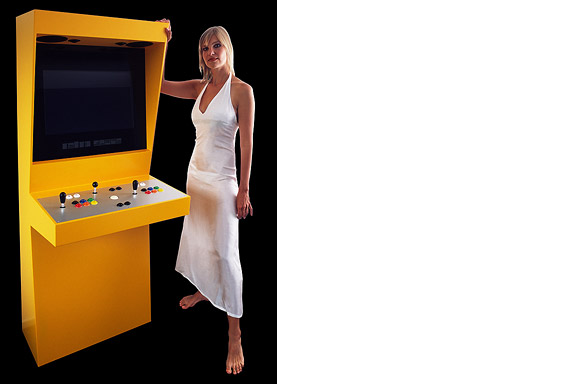
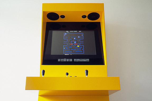
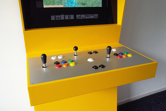
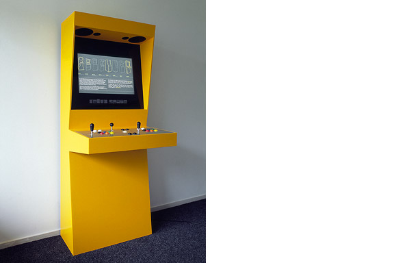
Retro Space is a modern arcade machine for at home or at work. It plays both all the arcade classics from Space Invaders up and all the console titles for your Nintendo, Sega or Atari. The system is made using modern technology and is flexible for future innovations. The system also is a perfect multimedia jukebox. Next to your favourite games, you can load Retro Space with your favourite music and movies. A full HD screen and a high quality speaker system ensure you to enjoy the best image and sound. And quarters are no longer needed.
Thanks to model Lara Verlaat for the imitation of the original Computer Space poster.
 アンデンネでの歓迎します
英語のみでの詳細Andenne is a small town on the bank of the Meuse between Namur and Liège. When entering Andenne the city does not impress. The abandoned factory area on the north bank of the Meuse makes a chaotic impression and the river is ignored. In collaboration with Wendy van Rosmalen I designed a new plan for this Europan 9 location.
With out plan we want to give Andenne a face. Between famous cities like Namur, Huy and Liège, Andenne is missing an inherent identity. We chose to multiply the nonchalant character of Belgian building and turn it into a specific typology. Our plan is a framework for development of the area in its own pace. A subtle guidance in building alignment and building heights delivers a varied public space that opens up towards the river Meuse.
A specific part of the assignment was the redesign of Andenne station. Bad attainableness of the platforms, a weird logistic and the uncomfortable public space underneath the viaduct are creating a moody atmosphere. The size of Andenne does not allow a large scale intervention. We choose a very modest solution. We created a square below the tracks to connect al transportation streams. The viaduct is decorated to resemble a living room and is transformed into a roof covering the bus platforms. New buildings surrounding the square size the public space.
Every Belgian wants its own house. Ignoring this feat makes a plan implausible. We go one step further through making the buying of a house resemble the buying of a car. By using a smart basic layout for the houses, every house can suit the needs of very different groups of people. Future change is very easy too. The architecture is a caricature of traditional Belgian building methods, its execution is contemporary and flexible.
 私はあなたにバラ園を約束したこと
英語のみでの詳細An abandoned commercial plot in the centre of Heteren had to be filled with 19 apartments. Contractor Kuijpers had moved to the city limits and the housing corporation "Woningstichting Heteren" had 4 outdated senior-citizen houses on the adjacent plot at the Rozenpad street. The combined plot connects a traditional village street with a seventies extension to Heteren. The housing coorporation asked me to design the modernist block fitting the seventies area.
I designed this appartment block as employer of Bouwkundig ontwerp- en adviesburo van Zeist BV
 人鱼姫
人鱼姫
英語のみでの詳細When we visited Copenhagen, I was surprised by the complex metro map for the very small network. It should be possible to draw a map easier to understand and graphically more appealing to visitors.
I designed a new metro map that shows the relation with the city. It combines all trains with different schedules on similar routes to bring back overview.
Autonomous work
 バーベキューXL
英語のみでの詳細Frank en Chantal van den Eijnden asked Johan van der Berkmortel and me to design an extension to their house in Beek en Donk. It was supposed to replace a decrepit shed and to add a new veranda with a fireplace. Two L-shaped entities frame the view into the deep garden. The brick element contains the chimney and acts as a bench. The wooden part contains the new shed, a log storage and a tool shed, and continues into the ceiling of the veranda.
This assignment is done in collaboration with Johan van den Berkmortel.
 偽ワンデレス
英語のみでの詳細The lamp is a joke. I had no space to place the Big Shadow Lamp by Marcel Wanders. I also liked the idea of the Fake Lamp by Sophie Krier, but not its shape. I mixed them and created the Fake Wanders. Definitely not for sale.
 蟻の巣
蟻の巣
英語のみでの詳細Hong Kong has little room to built. There is a small piece of land to build on between the water and the mountains. The only option to house the millions of citizens is to use efficient towering blocks. Some area's have a FAR (floor to ground area aspect ratio) of 5 to 10.


