 80's T's
英語のみでの詳細For my Youtube channel 2kB of Fun, I made several T-shirts based on logo graphics from 80's video games and electronic gadgets.
 アーケード キャビネットそれを自分で行う
英語のみでの詳細By the end of January 2013, Dutch Dame Garden asked me for a new series of arcade cabinets. They had to be finished within 1.5 month, to have it shipped to the Game Developer Conference in San Francisco from March 25th-29th. They wanted a new design with their beloved silhouette. The new version should be easier to carry, transportable as flat pack and when possible a lot cheaper.
The new cabinet can be assembled DIY with a standard 4mm hex wrench, just like IKEA furniture. De parts are made from white laminated poplar plywood for light weight and nice finish. At the top the cabinet holds 2 smoked plexi sheets to protect both screens at the front and the back. The Dutch Game Garden wants games to be visible on two sides for their Indigo shows. It allows a more passive group of visitors to just look at the games being played. The bottom part is filled with 2 matte white sheets of plexi. If you put multi-colour LED lights inside the bottom part, you can illuminate these sheets with any colour you like. The version that is showed here does not have any controls on the control panel. This is because companies that show games at Indigo bring their own controls. They make games for all platforms like Playstation, Xbox, iPad, PC etc, so there is no standard set of controls.
At the moment we are finding out the best way to sell this version to those who are interested in a DIY arcade cabinet.
 STRPフェスティバル2010
ミック・ヴィッセルによる撮影マルタイン・コッホによる画像操作
左から右へ:
クリストフ・デ・ボエック、鋼の天井
ローレンス・マルスタフ、縮む
ジャン・ミッシェル・ブリュイエール、息子の分散
ローレンス・マルスタフ、ネモ天文台
ローレンス・マルスタフ、トランスポーター
ローズ・ファン・ベルケル&チューリップ、一種の2
ブラッディ·ビートルーツデスクルー77
ローレンス・マルスタフ、結び目
ローレンス・マルスタフ、ミスト
マルコム・マッキーバー&マルレーナ・ノバック&ジェイ・アラン・ジム、スケール
ローレンス・マルスタフ、領土
アンダーワールド
 ナビゲーションに失われた
英語のみでの詳細Tokyo is a breathtaking city. Most metropolises have 1 urban railway network. Easy. Tokyo, the biggest metropolis on Earth, is a lot more complex.
The city has 2 official subway companies, the national railway operates several lines that can be considered metro lines as well, and there are tens of private operated railways that serve may areas just outside the central part of the city. Another problem is that many transfer stations use different station names on each line connected.
Creating a understandable subway map for this city is extremely complex. Should it be schematic, or geographic realistic? When is it easier to have a short walk than to switch lines?
This metro map for Tokyo only shows the most important lines for visitors of the city. That is already 25 lines! All distances are realistic, and the connections to Airports and Shinkansen trains are clearly visible. The parks that give a good orientation in the grey urban mass of Tokyo are visible. Icons show the most important landmarks. Matching the million neon lights the map is drawn in a night situation with the lines as glowing neon tubes.
The map is printed on 100x75 cm photo paper in a limited run, an can be ordered. Send an e-mail or call if you are interested to order.
 いくつかのビールをしたいです?
英語のみでの詳細ZZEF asked me to photograph 2 projects designed by Johan van den Berkmortel for the architecture portfolio of ZZEF.
One project is a beer cafe at the monk brewery Koningshoeve and the other is the Bavaria House in Helmond.
 僧接着
僧接着
英語のみでの詳細When I started working at "bouwkundig ontwerp- en adviesburo Van Zeist" the preliminary design for these 8 apartments had been made already. I drew up the technical detailing.
One of the challenges was to draw the brickwork in monk bond, just like the classic houses in the same street.
To show the appartments are built in 2008, many details are modernized. The balconies for example look like old wooden porches, but in fact they are made of brown concrete and steel.
 黒箱
黒箱
英語のみでの詳細Painter Bert de Haas and salesman in business outfits Chris Hendriks both wanted a new business building in Kesteren. Because of fire regulations it was best to combine the two buildings. Otherwise a big part of the plot was useless.
To preserve each ones identity and to answer the request for a good cantina, both parts of the building were accented by a small tower. These towers contain a special room looking out over the polders of the Betuwe.
The building is clad with anthracite profile sheets to ease the implementation of the detailing and to maximise the abstraction of the black boxes.
I made this design as employer of Bouwkundig ontwerp en adviesburo Van Zeist BV in Opheusden.
 低帯域幅
低帯域幅
英語のみでの詳細When the design of Retro Space was finished, we needed a matching website.
Because of the presumption that Retro Space could become a hit on the internet, we tried to make the website as small as possible. We did not want the website to crash on bandwidth problems.
Matching the style of the retro games, the website is designed in pixel art. All elements except some product shots are GIF images in 4 colours. It's just like the early years of internet when bandwidth was scarce.
 レトロスペース
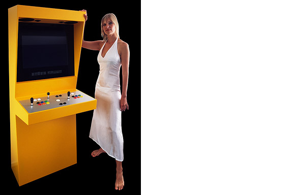
英語のみでの詳細In 1971 the first coin-op video gaming system was built: Computer Space.
Soon the video arcade as hangout was born. Many famous games as Pac-Man, Space Invaders, Streetfighter and Donkey Kong were filled with our quarters. Today the last arcades are closing down. The Wii, the Playstation and owner "mr. Counchpotato" have won. As an homage to this era and to keep all the classics playable Retro Space was created.
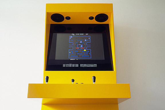
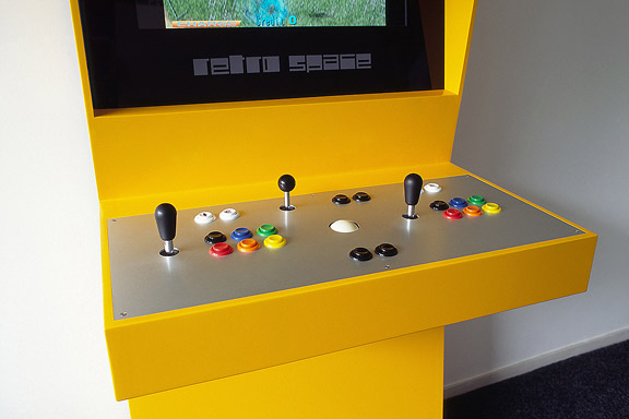
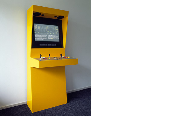
Retro Space is a modern arcade machine for at home or at work. It plays both all the arcade classics from Space Invaders up and all the console titles for your Nintendo, Sega or Atari. The system is made using modern technology and is flexible for future innovations. The system also is a perfect multimedia jukebox. Next to your favourite games, you can load Retro Space with your favourite music and movies. A full HD screen and a high quality speaker system ensure you to enjoy the best image and sound. And quarters are no longer needed.
Thanks to model Lara Verlaat for the imitation of the original Computer Space poster.
 人鱼姫
人鱼姫
英語のみでの詳細When we visited Copenhagen, I was surprised by the complex metro map for the very small network. It should be possible to draw a map easier to understand and graphically more appealing to visitors.
I designed a new metro map that shows the relation with the city. It combines all trains with different schedules on similar routes to bring back overview.
Autonomous work
 バーベキューXL
英語のみでの詳細Frank en Chantal van den Eijnden asked Johan van der Berkmortel and me to design an extension to their house in Beek en Donk. It was supposed to replace a decrepit shed and to add a new veranda with a fireplace. Two L-shaped entities frame the view into the deep garden. The brick element contains the chimney and acts as a bench. The wooden part contains the new shed, a log storage and a tool shed, and continues into the ceiling of the veranda.
This assignment is done in collaboration with Johan van den Berkmortel.


