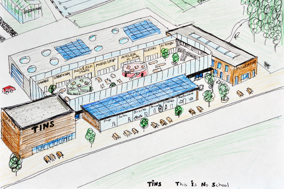
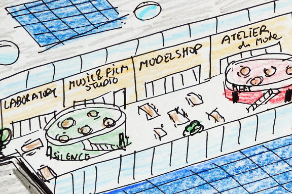
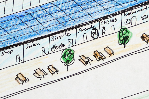
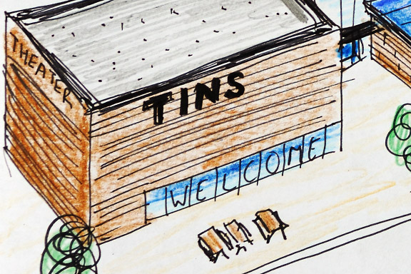
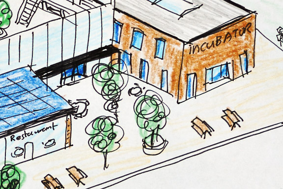
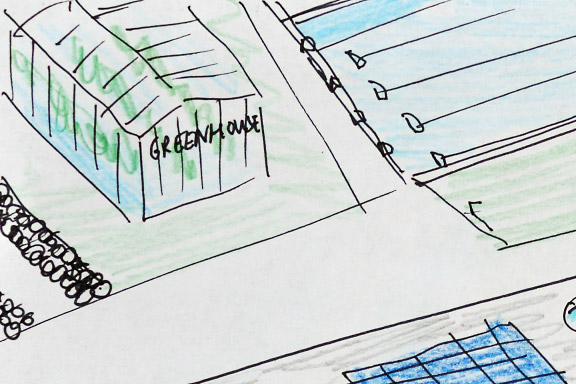
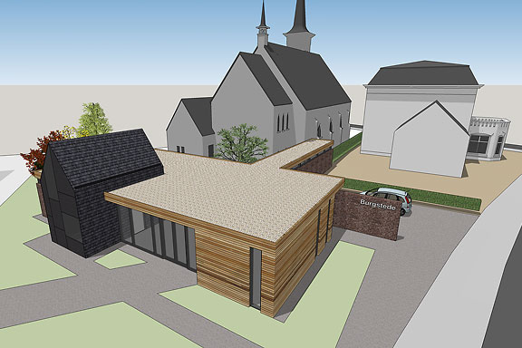
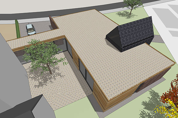
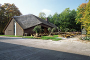
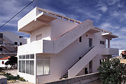
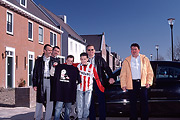
 This Is No School
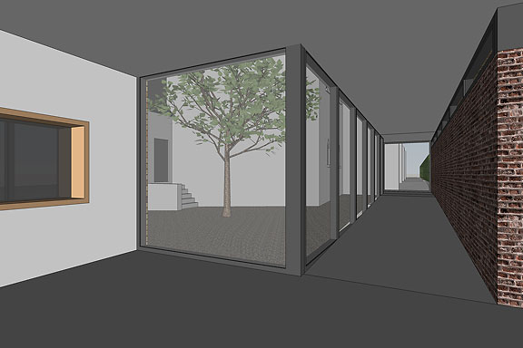
Learning is working best when kids are into subjects of study that match their interests. It also works well when projects are realistic.Also there has to be place for the making. It should be possible to make prototypes, do experiments, program shows and produce goods to express yourself.
This Is No School is the world on a stamp. A meeting square, workshops, labs, a theater, a fram, sporting facilities, restaurants, shops and a hotel.

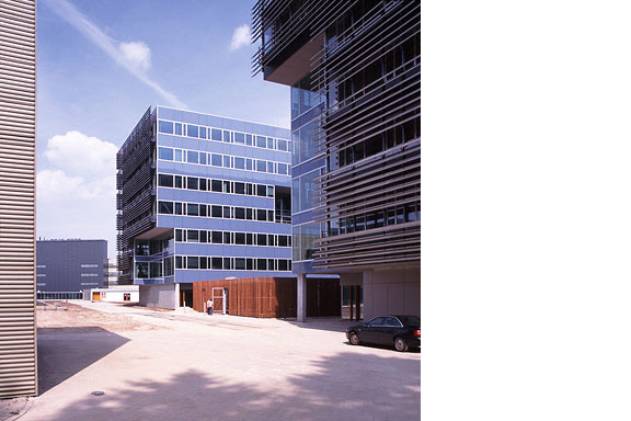
 Creative Factory
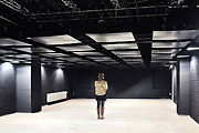
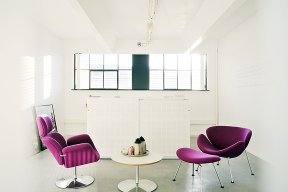
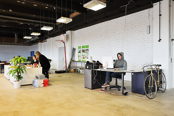
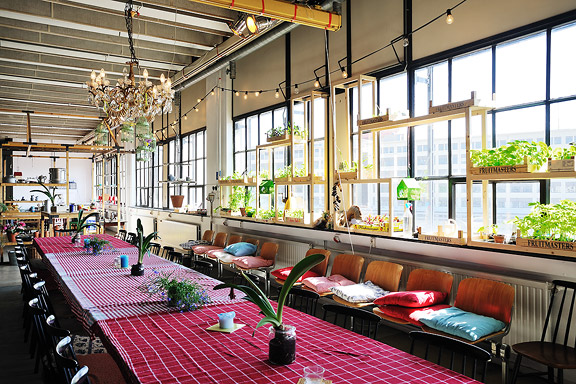
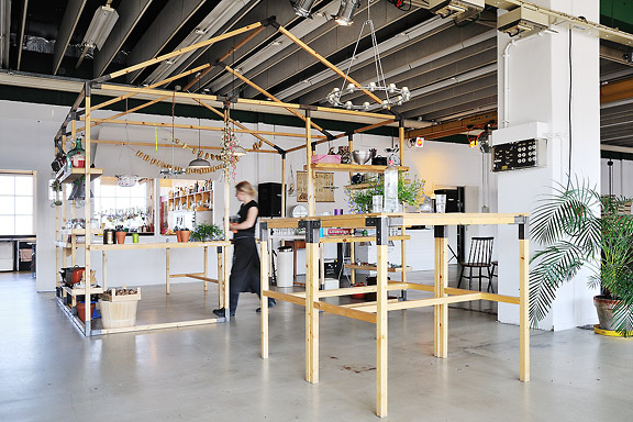
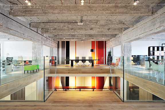
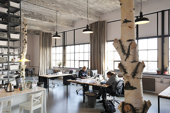
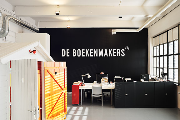
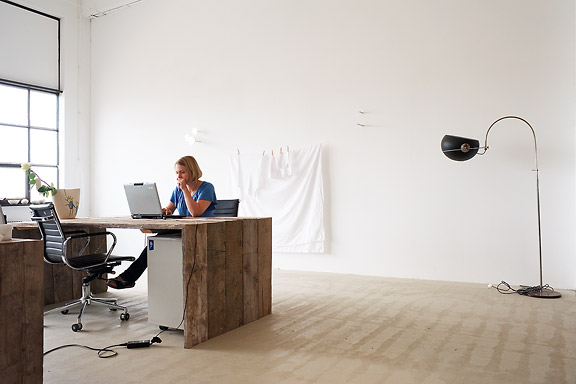
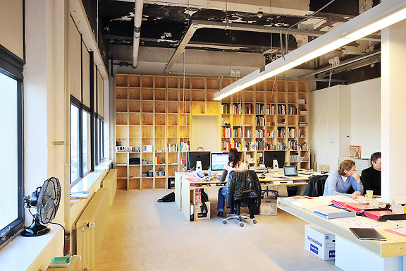
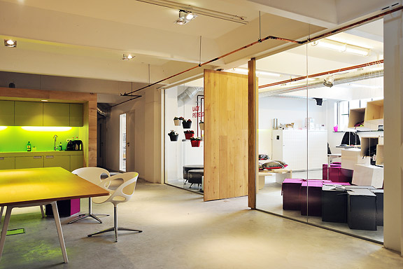
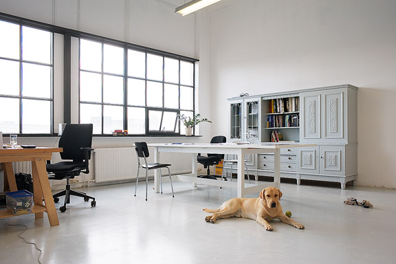
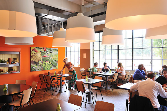
The Clock Building is a magnificent icon for Eindhoven. It is built as factory by Philips Electronics in 1928/1929. After having been used for years as office space by Philips, the building now transforms back to its original function: a factory.This time no series production. Trudo turned the building into a creative factory. Architects, designers, musicians, photographers, creative consultants: a colourful aggregation of creative talent took over this icon of the city Eindhoven.
The building has been split into units of various proportions. They all share one common feature though. Huge window openings with delicate metal frames. The light that enters the building gives unity to the diversity of interiors.
I photographed numerous interiors of the Clock Building to give insight in the new use of the building. The transformation of the Clock Building is a starting point in the transformation of the city district Strijp-S, a new centre for the city of Eindhoven.
The pictured companies are from left to right: Architectuurcentrum Eindhoven, Little Mountain, Keukenconfessies (2x), Desque, FuturOn.net, De Boekenmakers, studio-OOK, Scherpontwerp, Lady Penelope, Dikgedrukt en PopEI


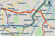
Lost in Navigation
Tokyo is a breathtaking city. Most metropolises have 1 urban railway network. Easy. Tokyo, the biggest metropolis on Earth, is a lot more complex.The city has 2 official subway companies, the national railway operates several lines that can be considered metro lines as well, and there are tens of private operated railways that serve may areas just outside the central part of the city. Another problem is that many transfer stations use different station names on each line connected.
Creating a understandable subway map for this city is extremely complex. Should it be schematic, or geographic realistic? When is it easier to have a short walk than to switch lines?
This metro map for Tokyo only shows the most important lines for visitors of the city. That is already 25 lines! All distances are realistic, and the connections to Airports and Shinkansen trains are clearly visible. The parks that give a good orientation in the grey urban mass of Tokyo are visible. Icons show the most important landmarks. Matching the million neon lights the map is drawn in a night situation with the lines as glowing neon tubes.
The map is printed on 100x75 cm photo paper in a limited run, an can be ordered. Send an e-mail or call if you are interested to order.

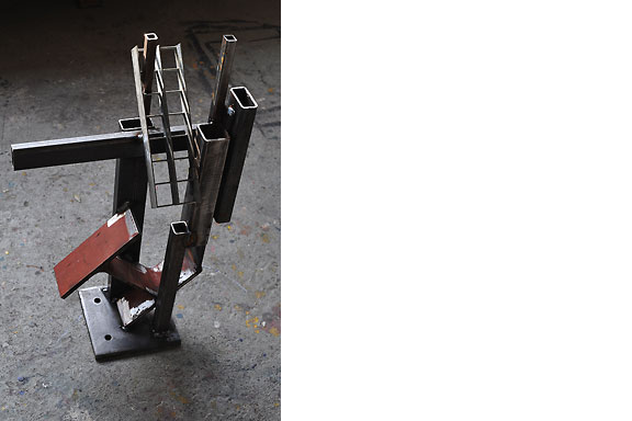
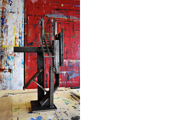
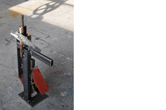
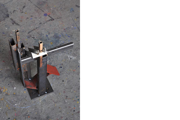
Trophy for Men
Result from a weekend workshop at WiSPER in Leuven: A trophy for real men, made from construction beams. The trophy is welded using MIG and metal arc welding (MAW) techniques.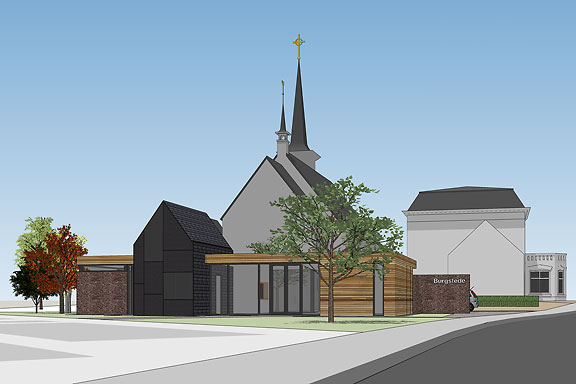
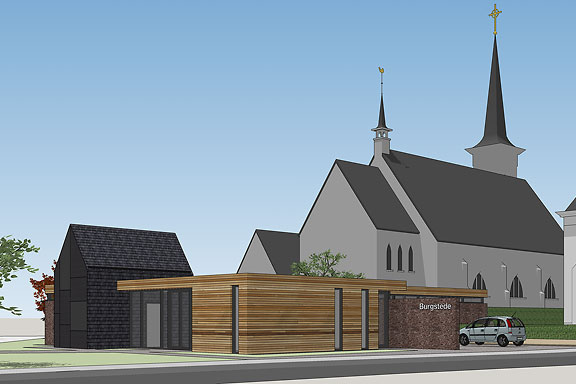
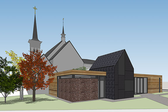
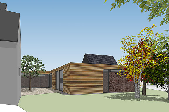
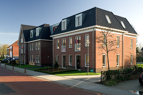
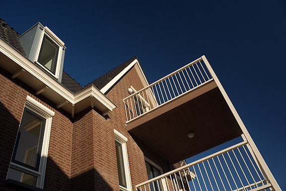
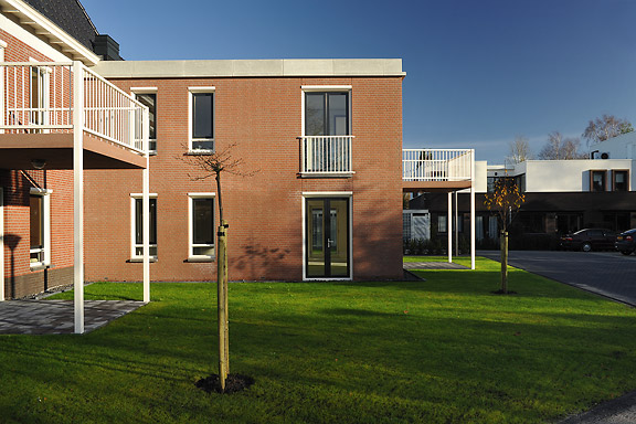
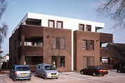
 Monk Bond
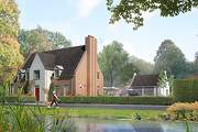
When I started working at "bouwkundig ontwerp- en adviesburo Van Zeist" the preliminary design for these 8 apartments had been made already. I drew up the technical detailing.One of the challenges was to draw the brickwork in monk bond, just like the classic houses in the same street.
To show the appartments are built in 2008, many details are modernized. The balconies for example look like old wooden porches, but in fact they are made of brown concrete and steel.
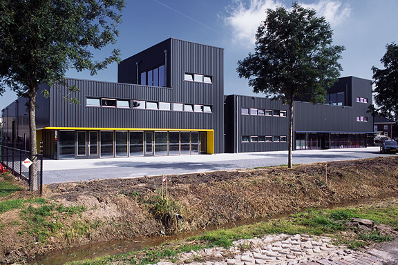
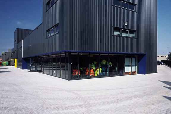
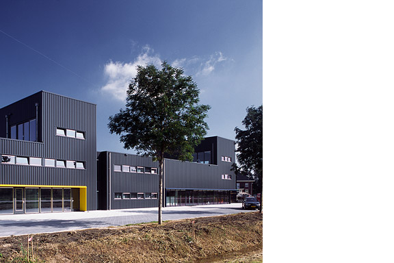
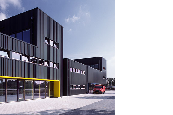
Black Box
Painter Bert de Haas and salesman in business outfits Chris Hendriks both wanted a new business building in Kesteren. Because of fire regulations it was best to combine the two buildings. Otherwise a big part of the plot was useless.To preserve each ones identity and to answer the request for a good cantina, both parts of the building were accented by a small tower. These towers contain a special room looking out over the polders of the Betuwe.
The building is clad with anthracite profile sheets to ease the implementation of the detailing and to maximise the abstraction of the black boxes.
I made this design as employer of Bouwkundig ontwerp en adviesburo Van Zeist BV in Opheusden.
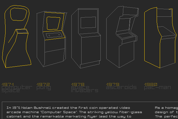
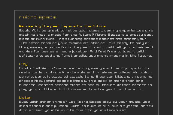
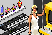
Low Bandwith
When the design of Retro Space was finished, we needed a matching website.Because of the presumption that Retro Space could become a hit on the internet, we tried to make the website as small as possible. We did not want the website to crash on bandwidth problems.
Matching the style of the retro games, the website is designed in pixel art. All elements except some product shots are GIF images in 4 colours. It's just like the early years of internet when bandwidth was scarce.

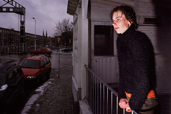
Cinderella
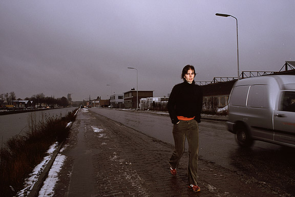
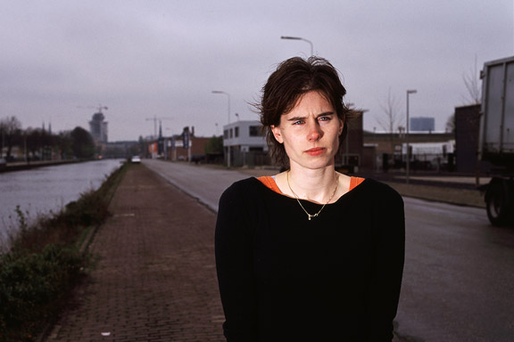
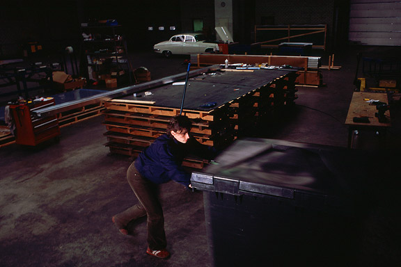
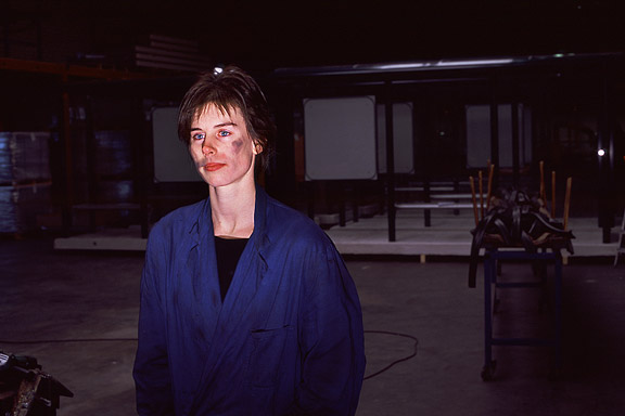
While doing a creative portfolio course at the CKE in Eindhoven I worked on a new interpretation of the story of Cinderella.Thanks to model Christine Nabuurs, to Jeroen Roxs for the workshop location, and to John Körmeling for using his veranda.

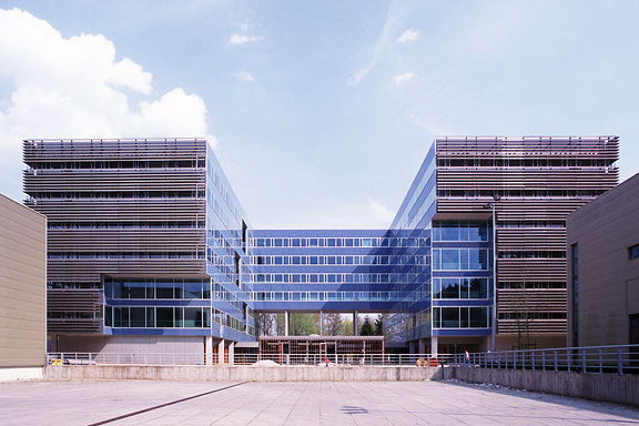
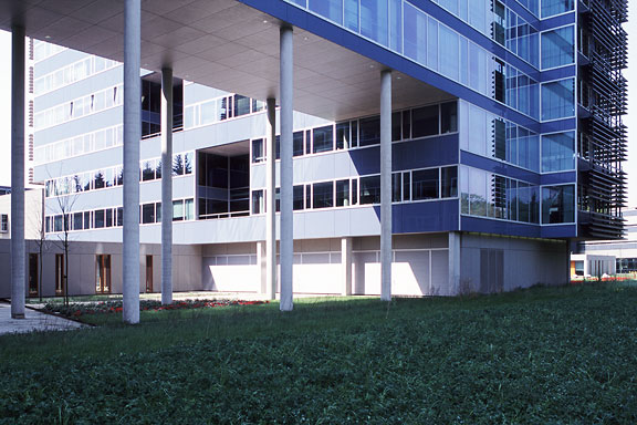
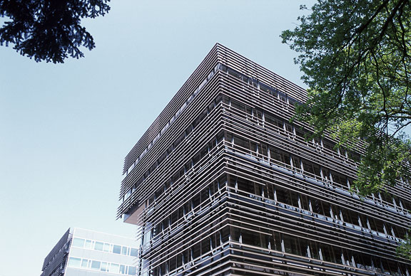
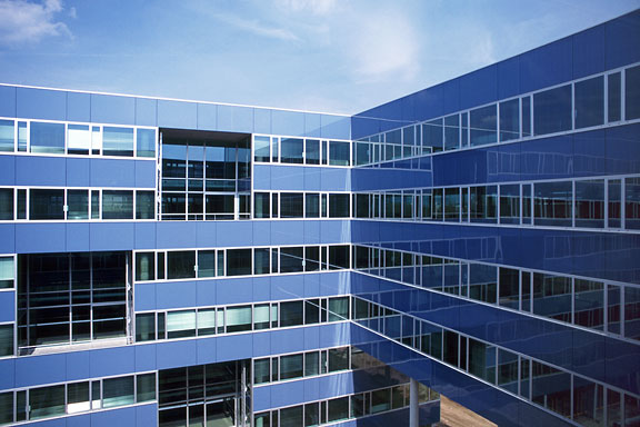
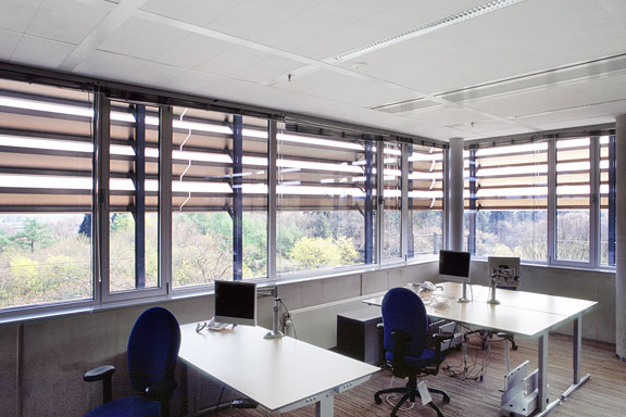
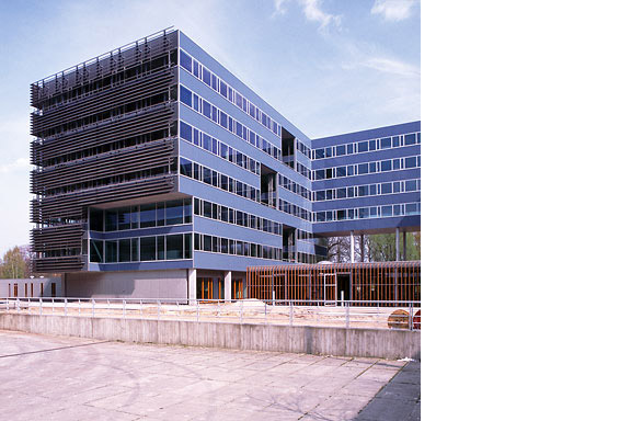
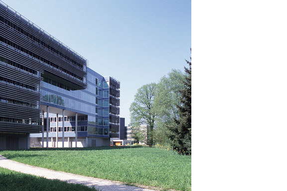
Blue Envelope
The Dutch Tax Administration feels like a family business. The atmosphere is open and relaxed. The organization is responsible for the total financial administration of The Netherlands Ltd. Dutch citizens expect professional civil servants. The office at the Quintax location in Apeldoorn expresses the two faces of the Dutch Tax Administration. The building looks severe and mimics the impregnability of Fort Knox. But internal, the building is totally transparent. Walls are exceptions, and voids open the floors to improve contact between employees.At JHK Architects, I was responsible for the concept of the building. I also worked out most of the technical details.