 This Is No School
Learning is working best when kids are into subjects of study that match their interests. It also works well when projects are realistic.Also there has to be place for the making. It should be possible to make prototypes, do experiments, program shows and produce goods to express yourself.
This Is No School is the world on a stamp. A meeting square, workshops, labs, a theater, a fram, sporting facilities, restaurants, shops and a hotel.
 2kB of Fun
Never has a consumer electronic product seen such an extravagant variety in case design as early handheld games from 1976-1985. Never have computer games been so beautifully reduced to their essence as these handhelds offered. Never did 2Kb of memory offer so much fun.1983 was the best year with top titles like Amidar, Astro Thunder 7, Burger Time, Dig Dug, Ms. Pac-Man, Q*bert, Super-Cobra and Zaxxon.
Martijn Koch, architect from the Netherlands bought 180 of the best handheld games, photographed them, took them apart, analysed their tech, and put all the material together in this stunning book, a catalog like you never saw before.
 STRP Festival 2011
Mick Visser made a photo report of the STRP Festival 2011 in Eindhoven. I participate in the photography process as image editor. Our colaboration results in the best posible quality for the images.From left to right:
Bert Schutter - Mill X Molen - 1982
Edwin van der Heide - DSLE2 - 2011
Telcosystems - 12_series - 2010
Kutmah - 26 November 2011
Edwin van der Heide - Evolving Spark Network - 2010/2011
Macular - Phase=Order - 2010
Bram Snijders, Carolien Teunisse - RE: - 2010
Marnix de Nijs, Edwin van der Heide - Spatial Sounds - 2000/2001
Nicky Assmann - Solace - 2011
Geert Mul - Transfer Points - 2002
Erik Hobijn - The Delusion of Self Immolation - 1990
 M+ M- ???
Redesignme.com is a website where designers are challenged to create new designs for certain products.Garton Jones used redesignme.com to search for a redesign of the Ativa 10 Digit Desk Calculator.
I'm always puzzled by the fact most calculators still function like the early 1970 designs. A time when chip logic was very expensive, and the amount of components was kept to a minimum. Today's standard micro controller is way more powerful. So my primary goal was to create a new set of basic functionality.
Which means I had to redesign the layout of the buttons first. The design itself continues proved ingredients like injection mould plastic, the perfect shape of PTT's Zurich telephone and modern white OLED matrix displays.
My own challenge was to make the design in one hour on a Friday afternoon.
The result: a top 3 note among 109 redesigns. "Your redesign was part of my top 3. Very well done! Yours sincerely, Charlie Garton-Jones"
 Lost in Navigation
Tokyo is a breathtaking city. Most metropolises have 1 urban railway network. Easy. Tokyo, the biggest metropolis on Earth, is a lot more complex.The city has 2 official subway companies, the national railway operates several lines that can be considered metro lines as well, and there are tens of private operated railways that serve may areas just outside the central part of the city. Another problem is that many transfer stations use different station names on each line connected.
Creating a understandable subway map for this city is extremely complex. Should it be schematic, or geographic realistic? When is it easier to have a short walk than to switch lines?
This metro map for Tokyo only shows the most important lines for visitors of the city. That is already 25 lines! All distances are realistic, and the connections to Airports and Shinkansen trains are clearly visible. The parks that give a good orientation in the grey urban mass of Tokyo are visible. Icons show the most important landmarks. Matching the million neon lights the map is drawn in a night situation with the lines as glowing neon tubes.
The map is printed on 100x75 cm photo paper in a limited run, an can be ordered. Send an e-mail or call if you are interested to order.
 XXL
XXL
Kingspan Netherlands wanted to expand their factory for insulation panels in Kesteren, and to combine it with their distribution facility and offices in Dodewaard.At the new industrial zone Medel near Tiel the needed 700.000m2 plot was available. The area also allowed high risk production plants.
At the moment phase 1 is completed. The plot has room for expansion with 2 more production lines and 3 times the amount of distribution storage that is part of phase 1.
Kinspan asked construction and design firm Van Zeist to draw the design. As architect I was responsible for the design up to approval of the design by the urban supervisor and the local "beauty commission".
 Low Bandwith
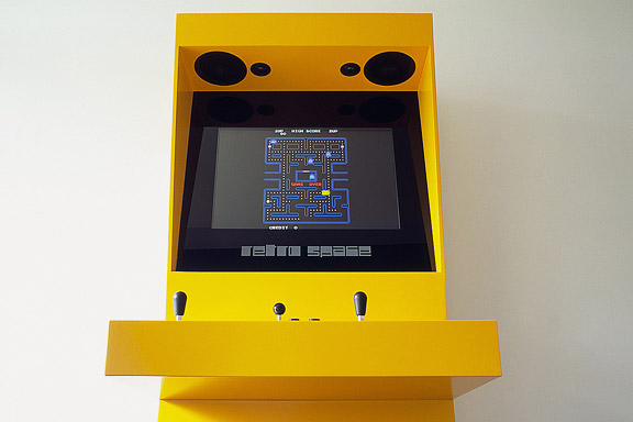
When the design of Retro Space was finished, we needed a matching website.Because of the presumption that Retro Space could become a hit on the internet, we tried to make the website as small as possible. We did not want the website to crash on bandwidth problems.
Matching the style of the retro games, the website is designed in pixel art. All elements except some product shots are GIF images in 4 colours. It's just like the early years of internet when bandwidth was scarce.
 Retro Space
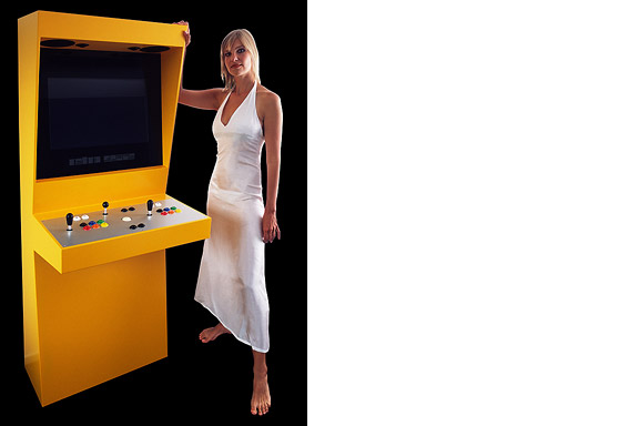
In 1971 the first coin-op video gaming system was built: Computer Space.Soon the video arcade as hangout was born. Many famous games as Pac-Man, Space Invaders, Streetfighter and Donkey Kong were filled with our quarters. Today the last arcades are closing down. The Wii, the Playstation and owner "mr. Counchpotato" have won. As an homage to this era and to keep all the classics playable Retro Space was created.
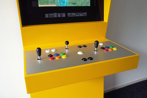
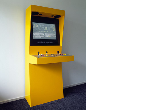
Retro Space is a modern arcade machine for at home or at work. It plays both all the arcade classics from Space Invaders up and all the console titles for your Nintendo, Sega or Atari. The system is made using modern technology and is flexible for future innovations. The system also is a perfect multimedia jukebox. Next to your favourite games, you can load Retro Space with your favourite music and movies. A full HD screen and a high quality speaker system ensure you to enjoy the best image and sound. And quarters are no longer needed.
Thanks to model Lara Verlaat for the imitation of the original Computer Space poster.
 Welcome to Andenne
Andenne is a small town on the bank of the Meuse between Namur and Liège. When entering Andenne the city does not impress. The abandoned factory area on the north bank of the Meuse makes a chaotic impression and the river is ignored. In collaboration with Wendy van Rosmalen I designed a new plan for this Europan 9 location.With out plan we want to give Andenne a face. Between famous cities like Namur, Huy and Liège, Andenne is missing an inherent identity. We chose to multiply the nonchalant character of Belgian building and turn it into a specific typology. Our plan is a framework for development of the area in its own pace. A subtle guidance in building alignment and building heights delivers a varied public space that opens up towards the river Meuse.
A specific part of the assignment was the redesign of Andenne station. Bad attainableness of the platforms, a weird logistic and the uncomfortable public space underneath the viaduct are creating a moody atmosphere. The size of Andenne does not allow a large scale intervention. We choose a very modest solution. We created a square below the tracks to connect al transportation streams. The viaduct is decorated to resemble a living room and is transformed into a roof covering the bus platforms. New buildings surrounding the square size the public space.
Every Belgian wants its own house. Ignoring this feat makes a plan implausible. We go one step further through making the buying of a house resemble the buying of a car. By using a smart basic layout for the houses, every house can suit the needs of very different groups of people. Future change is very easy too. The architecture is a caricature of traditional Belgian building methods, its execution is contemporary and flexible.
 Little Mermaid
When we visited Copenhagen, I was surprised by the complex metro map for the very small network. It should be possible to draw a map easier to understand and graphically more appealing to visitors.I designed a new metro map that shows the relation with the city. It combines all trains with different schedules on similar routes to bring back overview.
Autonomous work
 Unknown Modernism
For most tourists the city of Faro in southern Portugal is nothing more than an entrance by plane to the Algarve. Which is a pity. The biggest city of southern Portugal is probably the only one giving room to creativity. You will not see kitsch appartment blocks for Dutch and Germans, but subtile shaped private houses for the Portugese themselves. You will see images that remind of modernists like Gerrit Rietveld, Adolf Loos and Le Corbusier. You will wonder wheter MVRDV got inspiration here, or if Portugese architects checked out work of the Durch architecture firm. Ghost World
Detroit is a weird city. The city disappears slowly and turns back to nature. Not caused by war or disaster, it vanishes because of economic irrelevance. De automotive industry moved towards the Mexican border. Jobs are gone. The city renders useless. The General Motors headquarters still shine as a major highlight downtown. Perhaps as an icon for the glorious past.These photographs are taken during a trip of the USA and Canada in the autumn of 2005.
 Miniature City
Brandevoort is one of the big suburban extensions according to the governmental document Vinex. Under supervision of Rob Krier, the city of Helmond tried to mimic the classic Dutch canal city for its big extension. Modern legislation on parking and the fact that a family in a suburban plan like this needs 2 cars to reach all daily facilities, resulted in weird interiors for the urban blocks. The gardens are petite, and most space is used for the cars. Blue Envelope
The Dutch Tax Administration feels like a family business. The atmosphere is open and relaxed. The organization is responsible for the total financial administration of The Netherlands Ltd. Dutch citizens expect professional civil servants. The office at the Quintax location in Apeldoorn expresses the two faces of the Dutch Tax Administration. The building looks severe and mimics the impregnability of Fort Knox. But internal, the building is totally transparent. Walls are exceptions, and voids open the floors to improve contact between employees.At JHK Architects, I was responsible for the concept of the building. I also worked out most of the technical details.


