 80's T's
英語のみでの詳細For my Youtube channel 2kB of Fun, I made several T-shirts based on logo graphics from 80's video games and electronic gadgets.
 2kB of Fun
1976年から1985年の初期の携帯ゲーム機で、これほど贅沢な種類のケースデザインを誰もみたことがありませんでした。これらの携帯ゲーム機がもつ本質をこれまで美しくシンプルに出したコンピューターゲームはありませんでした。2KBメモリーでこれほどまでの楽しみを提供できた例はなかったのです。1983年はアミダー、アストロサンダー7、バーガータイム、ディグダグ、ミズパックマン、キューバート、スーパーコブラ、ザクソンのようなゲームにとって最高の年でした。
オランダの建築家、マルタィン・コッホは200に及ぶ優れた携帯ゲームを購入し、撮影、解体したのちに技術分析をし、研究後、今まで誰もみたことがない、素晴らしいカタログのような本にしました。
 アーケード キャビネットそれを自分で行う
英語のみでの詳細By the end of January 2013, Dutch Dame Garden asked me for a new series of arcade cabinets. They had to be finished within 1.5 month, to have it shipped to the Game Developer Conference in San Francisco from March 25th-29th. They wanted a new design with their beloved silhouette. The new version should be easier to carry, transportable as flat pack and when possible a lot cheaper.
The new cabinet can be assembled DIY with a standard 4mm hex wrench, just like IKEA furniture. De parts are made from white laminated poplar plywood for light weight and nice finish. At the top the cabinet holds 2 smoked plexi sheets to protect both screens at the front and the back. The Dutch Game Garden wants games to be visible on two sides for their Indigo shows. It allows a more passive group of visitors to just look at the games being played. The bottom part is filled with 2 matte white sheets of plexi. If you put multi-colour LED lights inside the bottom part, you can illuminate these sheets with any colour you like. The version that is showed here does not have any controls on the control panel. This is because companies that show games at Indigo bring their own controls. They make games for all platforms like Playstation, Xbox, iPad, PC etc, so there is no standard set of controls.
At the moment we are finding out the best way to sell this version to those who are interested in a DIY arcade cabinet.
Notice: Undefined variable: tekst in /home/w1512188/domains/martijnkoch.com/public_html/index.php on line 281
 DAF46スーパー ・ デラックス
Notice: Undefined variable: tekst in /home/w1512188/domains/martijnkoch.com/public_html/index.php on line 292
Notice: Undefined variable: tekst in /home/w1512188/domains/martijnkoch.com/public_html/index.php on line 281
 カタカナコンバータ
Notice: Undefined variable: tekst in /home/w1512188/domains/martijnkoch.com/public_html/index.php on line 292
 STRPフェスティバル2010
ミック・ヴィッセルによる撮影マルタイン・コッホによる画像操作
左から右へ:
クリストフ・デ・ボエック、鋼の天井
ローレンス・マルスタフ、縮む
ジャン・ミッシェル・ブリュイエール、息子の分散
ローレンス・マルスタフ、ネモ天文台
ローレンス・マルスタフ、トランスポーター
ローズ・ファン・ベルケル&チューリップ、一種の2
ブラッディ·ビートルーツデスクルー77
ローレンス・マルスタフ、結び目
ローレンス・マルスタフ、ミスト
マルコム・マッキーバー&マルレーナ・ノバック&ジェイ・アラン・ジム、スケール
ローレンス・マルスタフ、領土
アンダーワールド
 創造的工場
創造的工場
英語のみでの詳細The Clock Building is a magnificent icon for Eindhoven. It is built as factory by Philips Electronics in 1928/1929. After having been used for years as office space by Philips, the building now transforms back to its original function: a factory.
This time no series production. Trudo turned the building into a creative factory. Architects, designers, musicians, photographers, creative consultants: a colourful aggregation of creative talent took over this icon of the city Eindhoven.
The building has been split into units of various proportions. They all share one common feature though. Huge window openings with delicate metal frames. The light that enters the building gives unity to the diversity of interiors.
I photographed numerous interiors of the Clock Building to give insight in the new use of the building. The transformation of the Clock Building is a starting point in the transformation of the city district Strijp-S, a new centre for the city of Eindhoven.
The pictured companies are from left to right: Architectuurcentrum Eindhoven, Little Mountain, Keukenconfessies (2x), Desque, FuturOn.net, De Boekenmakers, studio-OOK, Scherpontwerp, Lady Penelope, Dikgedrukt en PopEI
 XXL
XXL
英語のみでの詳細Kingspan Netherlands wanted to expand their factory for insulation panels in Kesteren, and to combine it with their distribution facility and offices in Dodewaard.
At the new industrial zone Medel near Tiel the needed 700.000m2 plot was available. The area also allowed high risk production plants.
At the moment phase 1 is completed. The plot has room for expansion with 2 more production lines and 3 times the amount of distribution storage that is part of phase 1.
Kinspan asked construction and design firm Van Zeist to draw the design. As architect I was responsible for the design up to approval of the design by the urban supervisor and the local "beauty commission".
 男のトロフィー
英語のみでの詳細Result from a weekend workshop at WiSPER in Leuven: A trophy for real men, made from construction beams. The trophy is welded using MIG and metal arc welding (MAW) techniques.
 パックマン・ラック・ハック
英語のみでの詳細One of the most popular IKEA products is the LACK coffee table. It is so cheap, it must be hollow.
I opened the tables, I built in a retro TV computer game by Jakks and added real arcade controls to this game. This way the TV game has a longer life and the Ikea LACK is no longer the boring classic every household owns.
Thanks to Lara Verlaat for Playin Pac-Man.
 いくつかのビールをしたいです?
英語のみでの詳細ZZEF asked me to photograph 2 projects designed by Johan van den Berkmortel for the architecture portfolio of ZZEF.
One project is a beer cafe at the monk brewery Koningshoeve and the other is the Bavaria House in Helmond.
 僧接着
僧接着
英語のみでの詳細When I started working at "bouwkundig ontwerp- en adviesburo Van Zeist" the preliminary design for these 8 apartments had been made already. I drew up the technical detailing.
One of the challenges was to draw the brickwork in monk bond, just like the classic houses in the same street.
To show the appartments are built in 2008, many details are modernized. The balconies for example look like old wooden porches, but in fact they are made of brown concrete and steel.
 黒箱
黒箱
英語のみでの詳細Painter Bert de Haas and salesman in business outfits Chris Hendriks both wanted a new business building in Kesteren. Because of fire regulations it was best to combine the two buildings. Otherwise a big part of the plot was useless.
To preserve each ones identity and to answer the request for a good cantina, both parts of the building were accented by a small tower. These towers contain a special room looking out over the polders of the Betuwe.
The building is clad with anthracite profile sheets to ease the implementation of the detailing and to maximise the abstraction of the black boxes.
I made this design as employer of Bouwkundig ontwerp en adviesburo Van Zeist BV in Opheusden.
 低帯域幅
低帯域幅
英語のみでの詳細When the design of Retro Space was finished, we needed a matching website.
Because of the presumption that Retro Space could become a hit on the internet, we tried to make the website as small as possible. We did not want the website to crash on bandwidth problems.
Matching the style of the retro games, the website is designed in pixel art. All elements except some product shots are GIF images in 4 colours. It's just like the early years of internet when bandwidth was scarce.
 レトロスペース
英語のみでの詳細In 1971 the first coin-op video gaming system was built: Computer Space.
Soon the video arcade as hangout was born. Many famous games as Pac-Man, Space Invaders, Streetfighter and Donkey Kong were filled with our quarters. Today the last arcades are closing down. The Wii, the Playstation and owner "mr. Counchpotato" have won. As an homage to this era and to keep all the classics playable Retro Space was created.
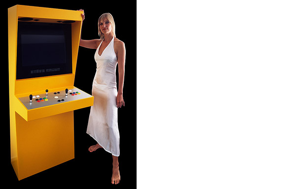
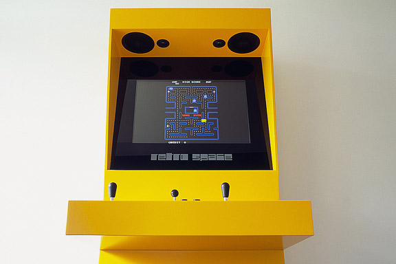
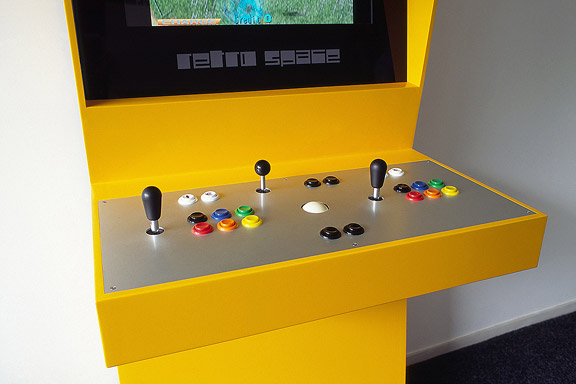
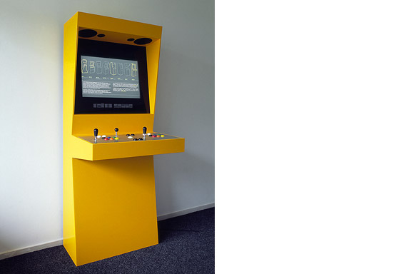
Retro Space is a modern arcade machine for at home or at work. It plays both all the arcade classics from Space Invaders up and all the console titles for your Nintendo, Sega or Atari. The system is made using modern technology and is flexible for future innovations. The system also is a perfect multimedia jukebox. Next to your favourite games, you can load Retro Space with your favourite music and movies. A full HD screen and a high quality speaker system ensure you to enjoy the best image and sound. And quarters are no longer needed.
Thanks to model Lara Verlaat for the imitation of the original Computer Space poster.
 アンデンネでの歓迎します
英語のみでの詳細Andenne is a small town on the bank of the Meuse between Namur and Liège. When entering Andenne the city does not impress. The abandoned factory area on the north bank of the Meuse makes a chaotic impression and the river is ignored. In collaboration with Wendy van Rosmalen I designed a new plan for this Europan 9 location.
With out plan we want to give Andenne a face. Between famous cities like Namur, Huy and Liège, Andenne is missing an inherent identity. We chose to multiply the nonchalant character of Belgian building and turn it into a specific typology. Our plan is a framework for development of the area in its own pace. A subtle guidance in building alignment and building heights delivers a varied public space that opens up towards the river Meuse.
A specific part of the assignment was the redesign of Andenne station. Bad attainableness of the platforms, a weird logistic and the uncomfortable public space underneath the viaduct are creating a moody atmosphere. The size of Andenne does not allow a large scale intervention. We choose a very modest solution. We created a square below the tracks to connect al transportation streams. The viaduct is decorated to resemble a living room and is transformed into a roof covering the bus platforms. New buildings surrounding the square size the public space.
Every Belgian wants its own house. Ignoring this feat makes a plan implausible. We go one step further through making the buying of a house resemble the buying of a car. By using a smart basic layout for the houses, every house can suit the needs of very different groups of people. Future change is very easy too. The architecture is a caricature of traditional Belgian building methods, its execution is contemporary and flexible.
 人鱼姫
人鱼姫
英語のみでの詳細When we visited Copenhagen, I was surprised by the complex metro map for the very small network. It should be possible to draw a map easier to understand and graphically more appealing to visitors.
I designed a new metro map that shows the relation with the city. It combines all trains with different schedules on similar routes to bring back overview.
Autonomous work
 バーベキューXL
英語のみでの詳細Frank en Chantal van den Eijnden asked Johan van der Berkmortel and me to design an extension to their house in Beek en Donk. It was supposed to replace a decrepit shed and to add a new veranda with a fireplace. Two L-shaped entities frame the view into the deep garden. The brick element contains the chimney and acts as a bench. The wooden part contains the new shed, a log storage and a tool shed, and continues into the ceiling of the veranda.
This assignment is done in collaboration with Johan van den Berkmortel.
 シンデレラ
シンデレラ
英語のみでの詳細While doing a creative portfolio course at the CKE in Eindhoven I worked on a new interpretation of the story of Cinderella.
Thanks to model Christine Nabuurs, to Jeroen Roxs for the workshop location, and to John Körmeling for using his veranda.
 ワンダ・ワンデレス
英語のみでの詳細The avatar Wanda Wanders was born in a chatconversation with Margot Scheltens. Wanda wanders around the World and shares her sharp opinion on various topics.
I created the website both technically and graphically. Many of the articles are written by me too.
Wanda Wanders is a registered Benelux trademark.
http://
 不明なモダニズム
英語のみでの詳細For most tourists the city of Faro in southern Portugal is nothing more than an entrance by plane to the Algarve. Which is a pity. The biggest city of southern Portugal is probably the only one giving room to creativity. You will not see kitsch appartment blocks for Dutch and Germans, but subtile shaped private houses for the Portugese themselves. You will see images that remind of modernists like Gerrit Rietveld, Adolf Loos and Le Corbusier. You will wonder wheter MVRDV got inspiration here, or if Portugese architects checked out work of the Durch architecture firm.
 偽ワンデレス
英語のみでの詳細The lamp is a joke. I had no space to place the Big Shadow Lamp by Marcel Wanders. I also liked the idea of the Fake Lamp by Sophie Krier, but not its shape. I mixed them and created the Fake Wanders. Definitely not for sale.
 青い封筒
青い封筒
英語のみでの詳細The Dutch Tax Administration feels like a family business. The atmosphere is open and relaxed. The organization is responsible for the total financial administration of The Netherlands Ltd. Dutch citizens expect professional civil servants. The office at the Quintax location in Apeldoorn expresses the two faces of the Dutch Tax Administration. The building looks severe and mimics the impregnability of Fort Knox. But internal, the building is totally transparent. Walls are exceptions, and voids open the floors to improve contact between employees.
At JHK Architects, I was responsible for the concept of the building. I also worked out most of the technical details.


