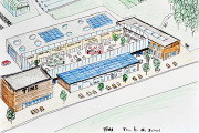
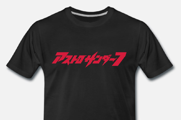
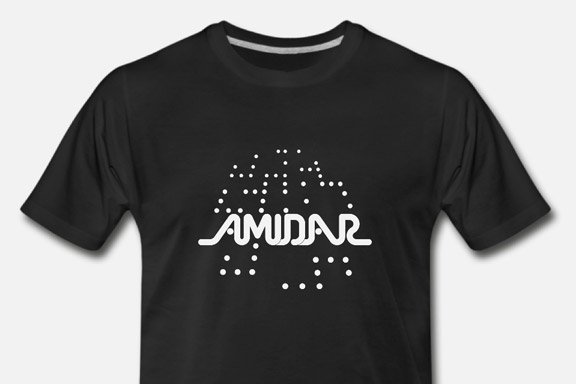
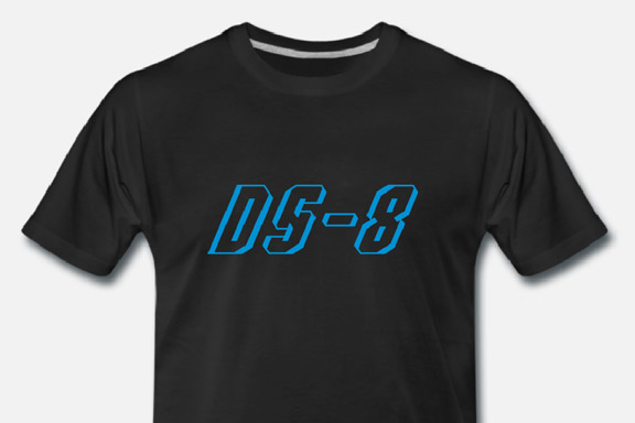
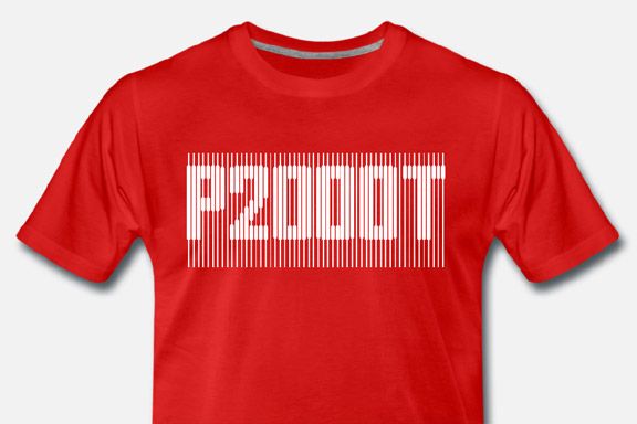
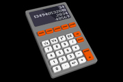
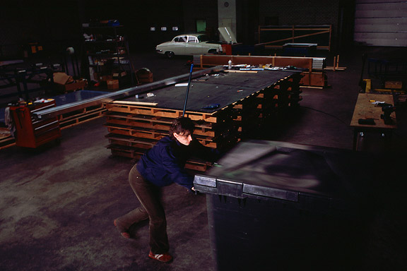
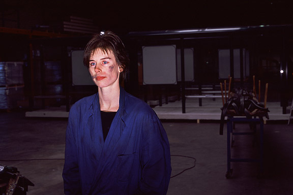
 80's T's
Denna text är inte översatt till svenska och endast tillgänglig på engelska.For my Youtube channel 2kB of Fun, I made several T-shirts based on logo graphics from 80's video games and electronic gadgets.


Notice: Undefined variable: tekst in /home/w1512188/domains/martijnkoch.com/public_html/index.php on line 281
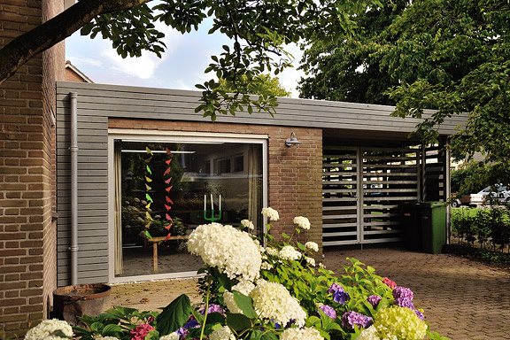
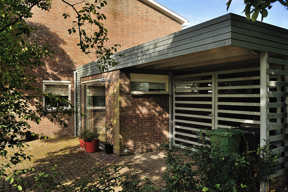
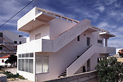
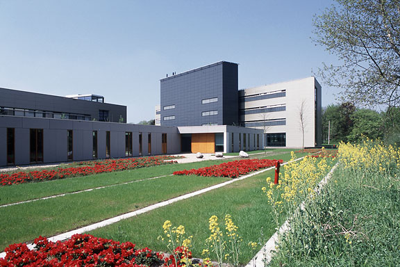
 DAF 46 Super Luxe
Notice: Undefined variable: tekst in /home/w1512188/domains/martijnkoch.com/public_html/index.php on line 292
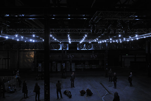
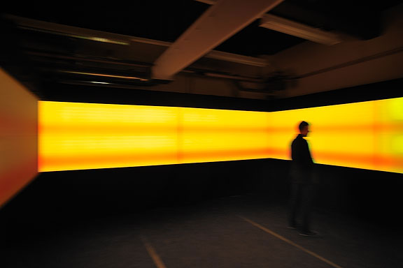
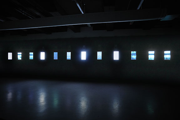
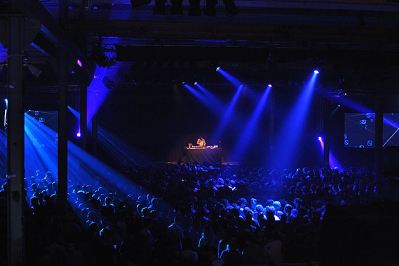
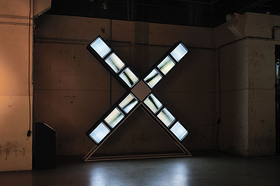
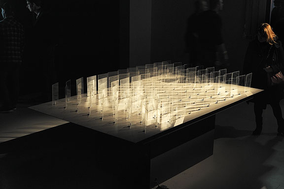
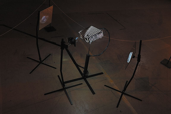
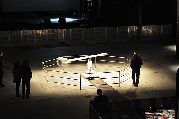
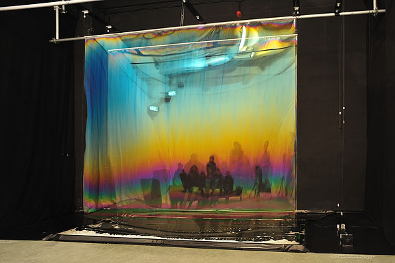
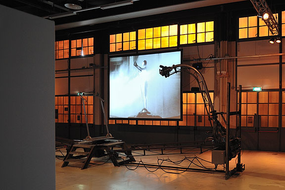
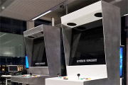
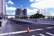
 STRP Festival 2011
Denna text är inte översatt till svenska och endast tillgänglig på engelska.Mick Visser made a photo report of the STRP Festival 2011 in Eindhoven. I participate in the photography process as image editor. Our colaboration results in the best posible quality for the images.
From left to right:
Bert Schutter - Mill X Molen - 1982
Edwin van der Heide - DSLE2 - 2011
Telcosystems - 12_series - 2010
Kutmah - 26 November 2011
Edwin van der Heide - Evolving Spark Network - 2010/2011
Macular - Phase=Order - 2010
Bram Snijders, Carolien Teunisse - RE: - 2010
Marnix de Nijs, Edwin van der Heide - Spatial Sounds - 2000/2001
Nicky Assmann - Solace - 2011
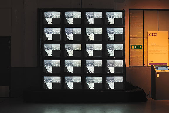
Geert Mul - Transfer Points - 2002
Erik Hobijn - The Delusion of Self Immolation - 1990


 Lost in Navigation
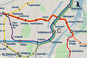
Denna text är inte översatt till svenska och endast tillgänglig på engelska.Tokyo is a breathtaking city. Most metropolises have 1 urban railway network. Easy. Tokyo, the biggest metropolis on Earth, is a lot more complex.
The city has 2 official subway companies, the national railway operates several lines that can be considered metro lines as well, and there are tens of private operated railways that serve may areas just outside the central part of the city. Another problem is that many transfer stations use different station names on each line connected.
Creating a understandable subway map for this city is extremely complex. Should it be schematic, or geographic realistic? When is it easier to have a short walk than to switch lines?
This metro map for Tokyo only shows the most important lines for visitors of the city. That is already 25 lines! All distances are realistic, and the connections to Airports and Shinkansen trains are clearly visible. The parks that give a good orientation in the grey urban mass of Tokyo are visible. Icons show the most important landmarks. Matching the million neon lights the map is drawn in a night situation with the lines as glowing neon tubes.
The map is printed on 100x75 cm photo paper in a limited run, an can be ordered. Send an e-mail or call if you are interested to order.

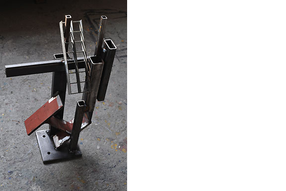
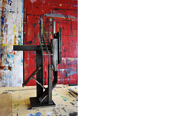
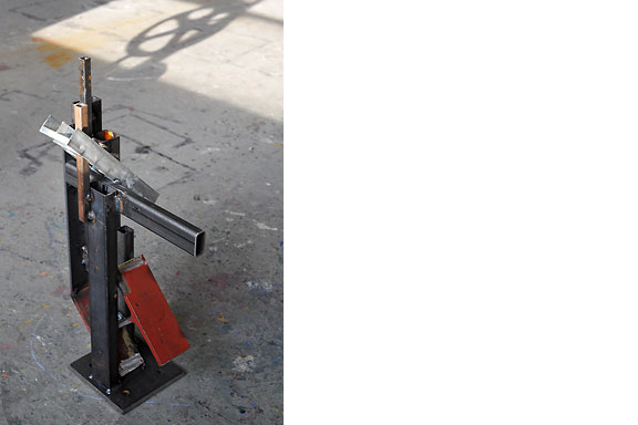
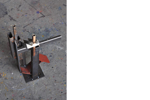
Pokal för Män
Denna text är inte översatt till svenska och endast tillgänglig på engelska.Result from a weekend workshop at WiSPER in Leuven: A trophy for real men, made from construction beams. The trophy is welded using MIG and metal arc welding (MAW) techniques.
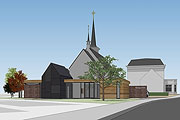

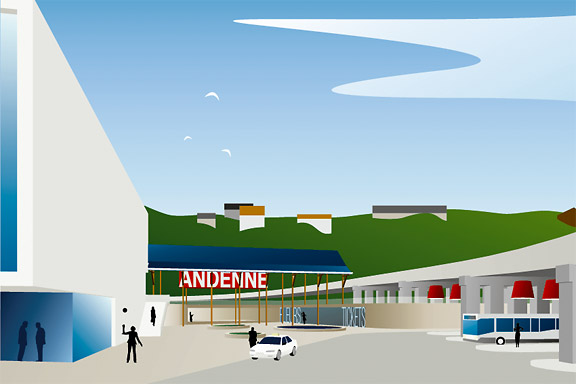
Välkommen till Andenne
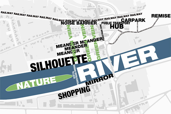
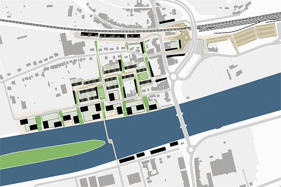
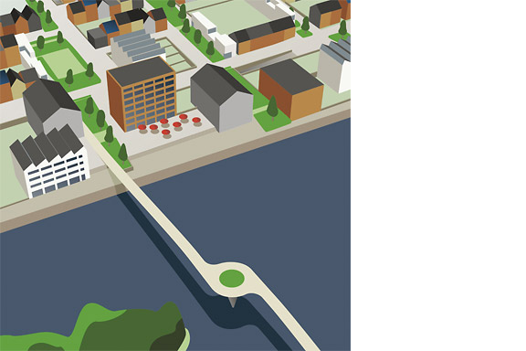
Denna text är inte översatt till svenska och endast tillgänglig på engelska.Andenne is a small town on the bank of the Meuse between Namur and Liège. When entering Andenne the city does not impress. The abandoned factory area on the north bank of the Meuse makes a chaotic impression and the river is ignored. In collaboration with Wendy van Rosmalen I designed a new plan for this Europan 9 location.
With out plan we want to give Andenne a face. Between famous cities like Namur, Huy and Liège, Andenne is missing an inherent identity. We chose to multiply the nonchalant character of Belgian building and turn it into a specific typology. Our plan is a framework for development of the area in its own pace. A subtle guidance in building alignment and building heights delivers a varied public space that opens up towards the river Meuse.
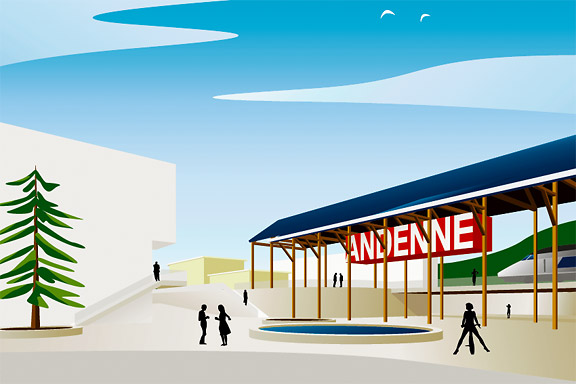
A specific part of the assignment was the redesign of Andenne station. Bad attainableness of the platforms, a weird logistic and the uncomfortable public space underneath the viaduct are creating a moody atmosphere. The size of Andenne does not allow a large scale intervention. We choose a very modest solution. We created a square below the tracks to connect al transportation streams. The viaduct is decorated to resemble a living room and is transformed into a roof covering the bus platforms. New buildings surrounding the square size the public space.
Every Belgian wants its own house. Ignoring this feat makes a plan implausible. We go one step further through making the buying of a house resemble the buying of a car. By using a smart basic layout for the houses, every house can suit the needs of very different groups of people. Future change is very easy too. The architecture is a caricature of traditional Belgian building methods, its execution is contemporary and flexible.
I never promised you a rosegarden
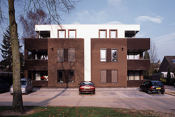
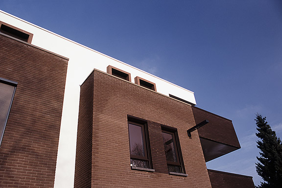
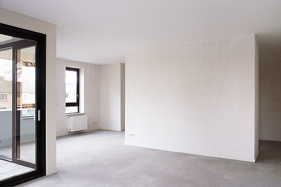
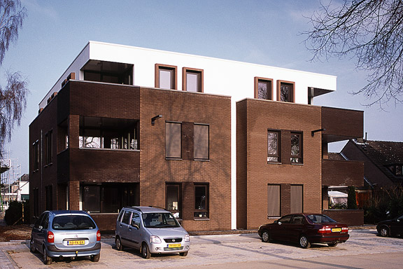
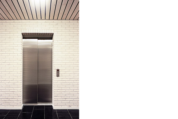
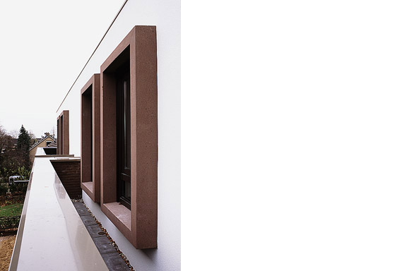
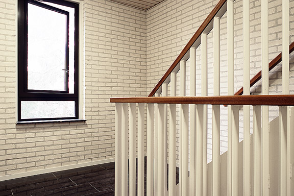
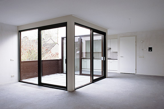
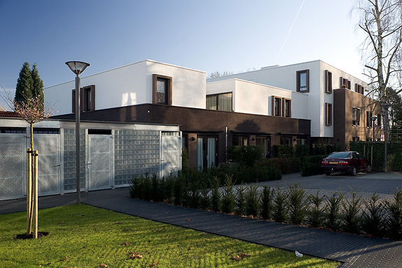
Denna text är inte översatt till svenska och endast tillgänglig på engelska.An abandoned commercial plot in the centre of Heteren had to be filled with 19 apartments. Contractor Kuijpers had moved to the city limits and the housing corporation "Woningstichting Heteren" had 4 outdated senior-citizen houses on the adjacent plot at the Rozenpad street. The combined plot connects a traditional village street with a seventies extension to Heteren. The housing coorporation asked me to design the modernist block fitting the seventies area.
I designed this appartment block as employer of Bouwkundig ontwerp- en adviesburo van Zeist BV
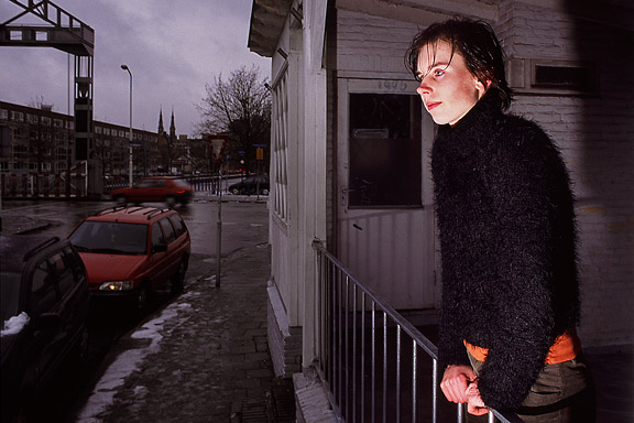
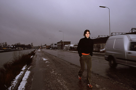
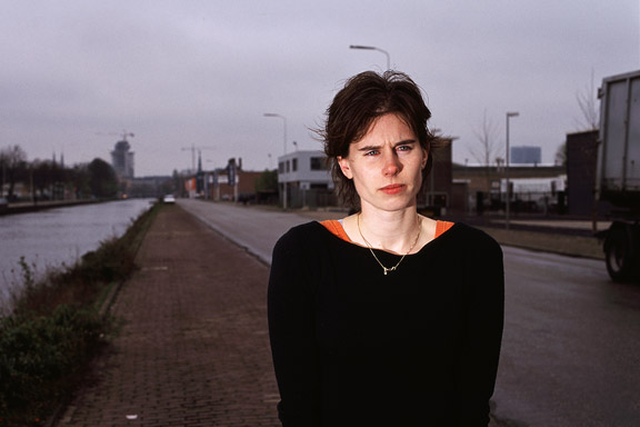
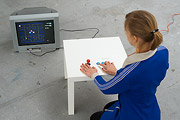
Askungen
Denna text är inte översatt till svenska och endast tillgänglig på engelska.While doing a creative portfolio course at the CKE in Eindhoven I worked on a new interpretation of the story of Cinderella.
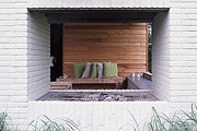
Thanks to model Christine Nabuurs, to Jeroen Roxs for the workshop location, and to John Körmeling for using his veranda.

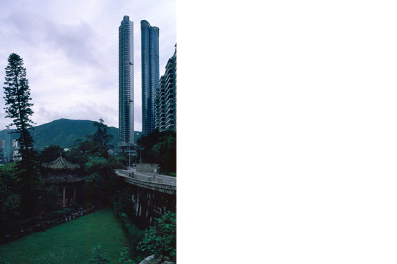
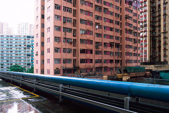
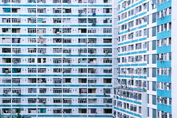
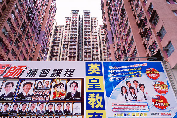
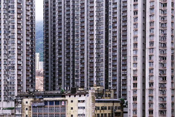
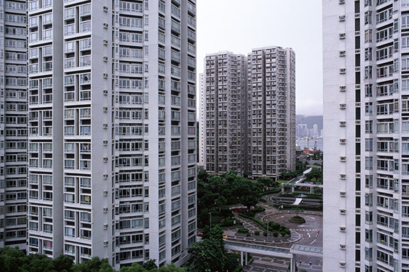
Myrstack
Denna text är inte översatt till svenska och endast tillgänglig på engelska.Hong Kong has little room to built. There is a small piece of land to build on between the water and the mountains. The only option to house the millions of citizens is to use efficient towering blocks. Some area's have a FAR (floor to ground area aspect ratio) of 5 to 10.
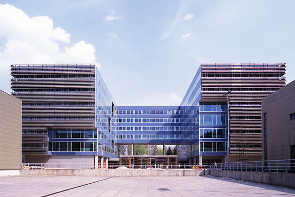
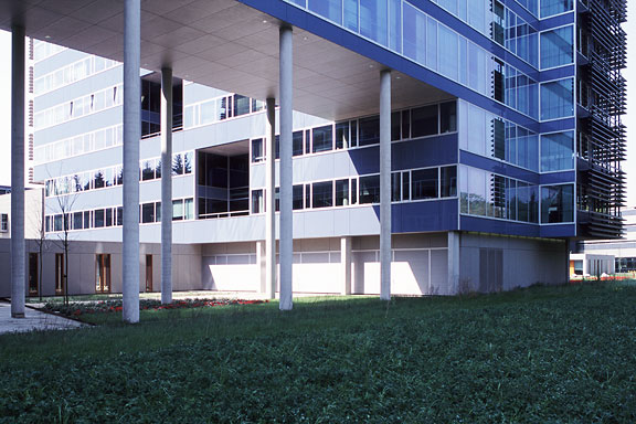
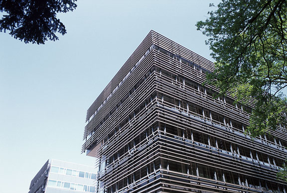
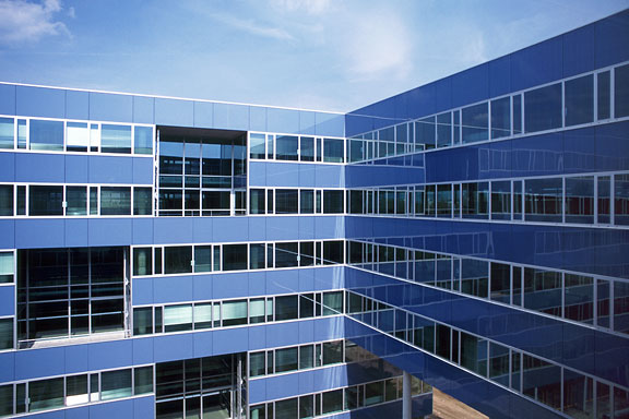
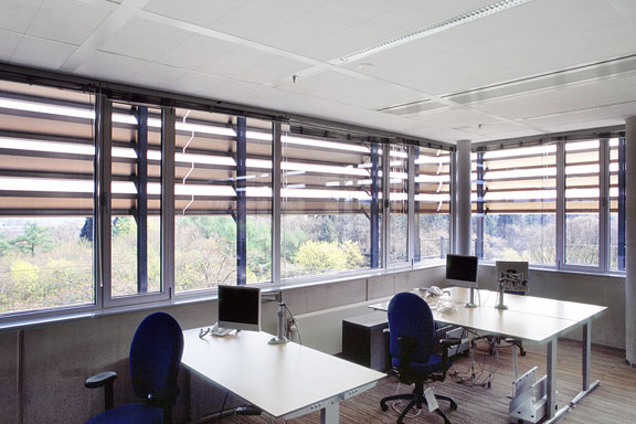
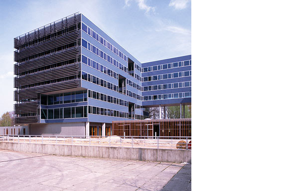
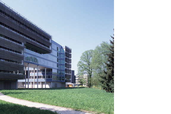
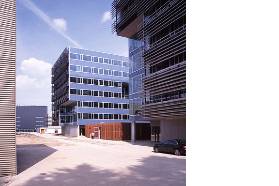
Blå kuvert
Denna text är inte översatt till svenska och endast tillgänglig på engelska.The Dutch Tax Administration feels like a family business. The atmosphere is open and relaxed. The organization is responsible for the total financial administration of The Netherlands Ltd. Dutch citizens expect professional civil servants. The office at the Quintax location in Apeldoorn expresses the two faces of the Dutch Tax Administration. The building looks severe and mimics the impregnability of Fort Knox. But internal, the building is totally transparent. Walls are exceptions, and voids open the floors to improve contact between employees.
At JHK Architects, I was responsible for the concept of the building. I also worked out most of the technical details.