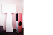
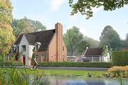
 Retro Space 4.0
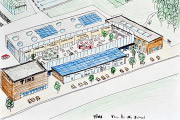
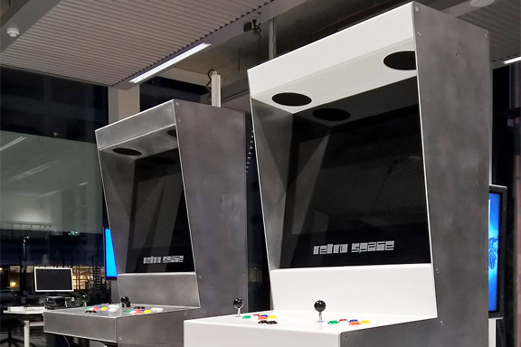
Denna text är inte översatt till svenska och endast tillgänglig på engelska.Sound and Vision in Hilverum was interested in buying Retro Space arcade cabinets for their museum.
This request demanded an extra durable version of the Retro Space cabinets.
The new cabinet is fully re-engineered in folded aluminium sheets. The cab is fully modular, perfectly recyclable and gets prettier from a little use.

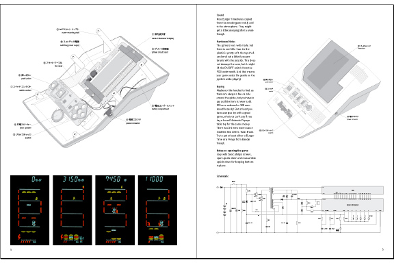
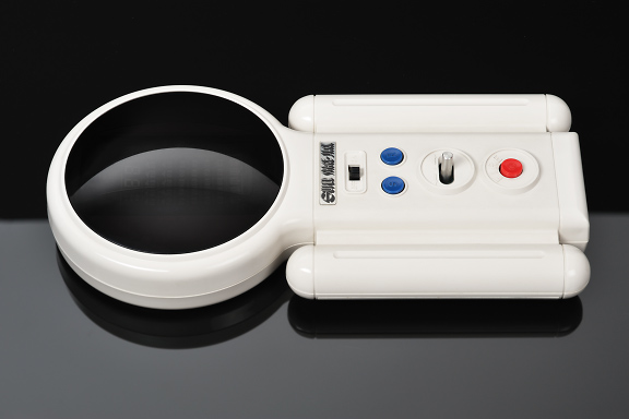
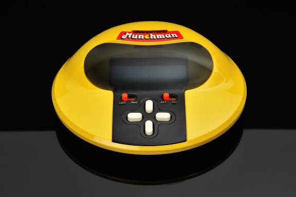
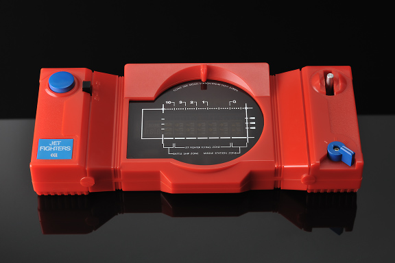
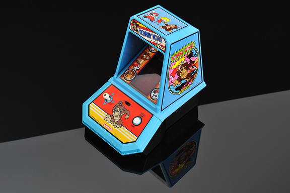
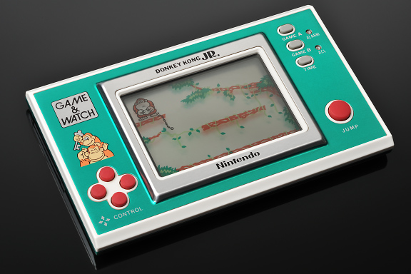
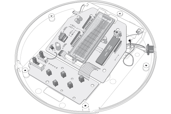
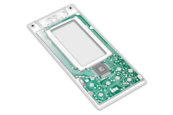
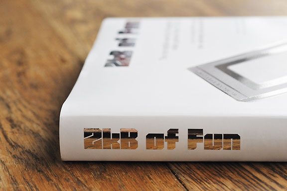
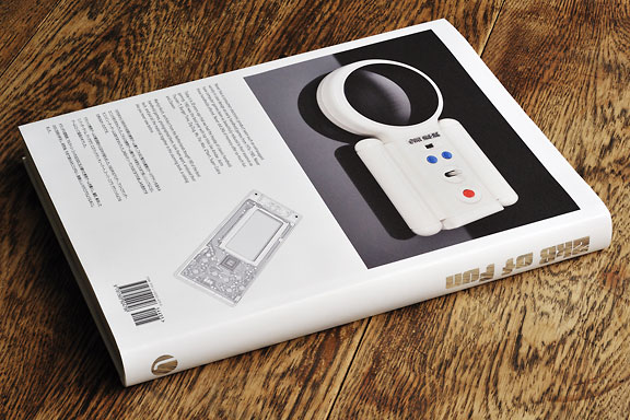
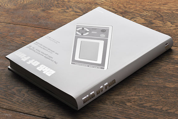
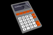
 2kB of Fun
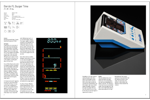
Denna text är inte översatt till svenska och endast tillgänglig på engelska.Never has a consumer electronic product seen such an extravagant variety in case design as early handheld games from 1976-1985. Never have computer games been so beautifully reduced to their essence as these handhelds offered. Never did 2Kb of memory offer so much fun.
1983 was the best year with top titles like Amidar, Astro Thunder 7, Burger Time, Dig Dug, Ms. Pac-Man, Q*bert, Super-Cobra and Zaxxon.
Martijn Koch, architect from the Netherlands bought 180 of the best handheld games, photographed them, took them apart, analysed their tech, and put all the material together in this stunning book, a catalog like you never saw before.

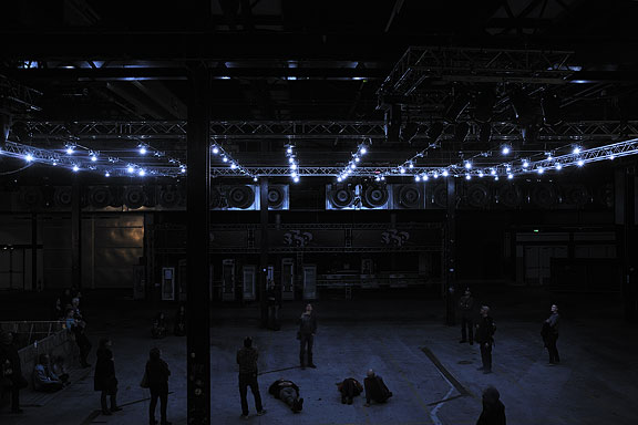
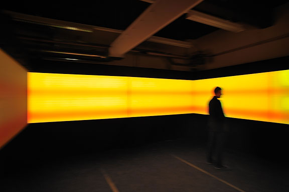
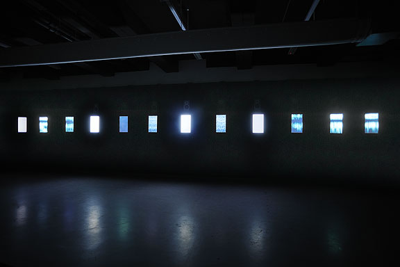
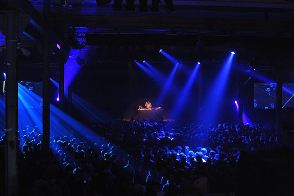
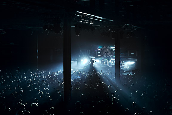
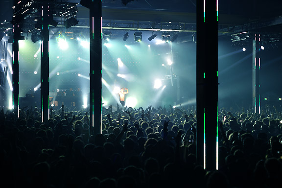
 STRP Festival 2011
Denna text är inte översatt till svenska och endast tillgänglig på engelska.Mick Visser made a photo report of the STRP Festival 2011 in Eindhoven. I participate in the photography process as image editor. Our colaboration results in the best posible quality for the images.
From left to right:
Bert Schutter - Mill X Molen - 1982
Edwin van der Heide - DSLE2 - 2011
Telcosystems - 12_series - 2010
Kutmah - 26 November 2011
Edwin van der Heide - Evolving Spark Network - 2010/2011
Macular - Phase=Order - 2010
Bram Snijders, Carolien Teunisse - RE: - 2010
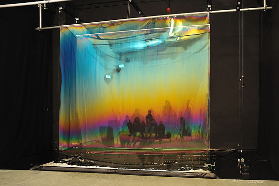
Marnix de Nijs, Edwin van der Heide - Spatial Sounds - 2000/2001
Nicky Assmann - Solace - 2011
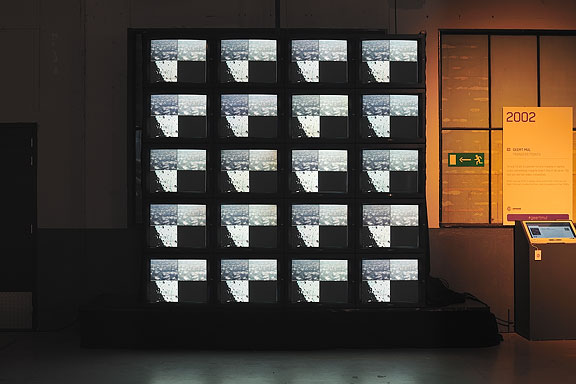
Geert Mul - Transfer Points - 2002
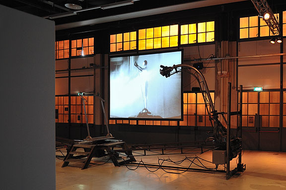
Erik Hobijn - The Delusion of Self Immolation - 1990
STRP Festival 2010
Denna text är inte översatt till svenska och endast tillgänglig på engelska.Mick Visser made a photo report of the STRP Festival 2010 in Eindhoven. I participate in the photography process as image editor. Our colaboration results in the best posible quality for the images.
From left to right:
Christoph De Boeck - Staalhemel
Lawrence Malstaf - Shrink
Jean Michel Bruyère - La Dispersion du Fils
Lawrence Malstaf - Nemo Observatorium
Lawrence Malstaf - Transporter
Roos van Berkel & TUlip - 2 of a kind
The Bloody Beetroots Death Crew 77
Lawrence Malstaf - Knot
Lawrence Malstaf - Nevel
Malcolm MacIver, Marlena Novak & Jay Alan Yim - Scale
Lawrence Malstaf - Territorium
Underworld


Lost in Navigation
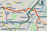
Denna text är inte översatt till svenska och endast tillgänglig på engelska.Tokyo is a breathtaking city. Most metropolises have 1 urban railway network. Easy. Tokyo, the biggest metropolis on Earth, is a lot more complex.
The city has 2 official subway companies, the national railway operates several lines that can be considered metro lines as well, and there are tens of private operated railways that serve may areas just outside the central part of the city. Another problem is that many transfer stations use different station names on each line connected.
Creating a understandable subway map for this city is extremely complex. Should it be schematic, or geographic realistic? When is it easier to have a short walk than to switch lines?
This metro map for Tokyo only shows the most important lines for visitors of the city. That is already 25 lines! All distances are realistic, and the connections to Airports and Shinkansen trains are clearly visible. The parks that give a good orientation in the grey urban mass of Tokyo are visible. Icons show the most important landmarks. Matching the million neon lights the map is drawn in a night situation with the lines as glowing neon tubes.
The map is printed on 100x75 cm photo paper in a limited run, an can be ordered. Send an e-mail or call if you are interested to order.

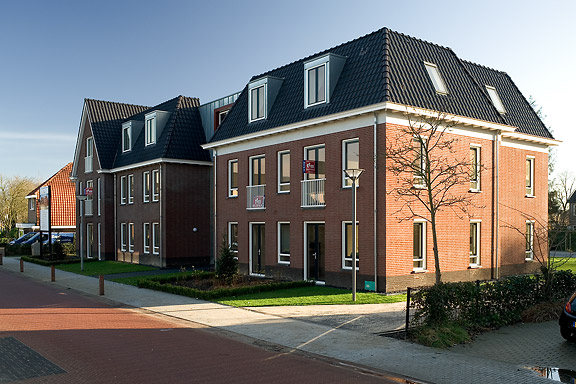
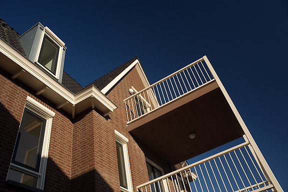
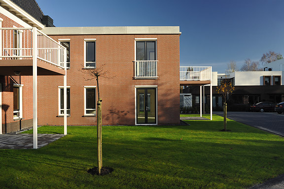
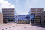
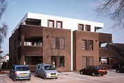
 Munkförband
Denna text är inte översatt till svenska och endast tillgänglig på engelska.When I started working at "bouwkundig ontwerp- en adviesburo Van Zeist" the preliminary design for these 8 apartments had been made already. I drew up the technical detailing.
One of the challenges was to draw the brickwork in monk bond, just like the classic houses in the same street.
To show the appartments are built in 2008, many details are modernized. The balconies for example look like old wooden porches, but in fact they are made of brown concrete and steel.
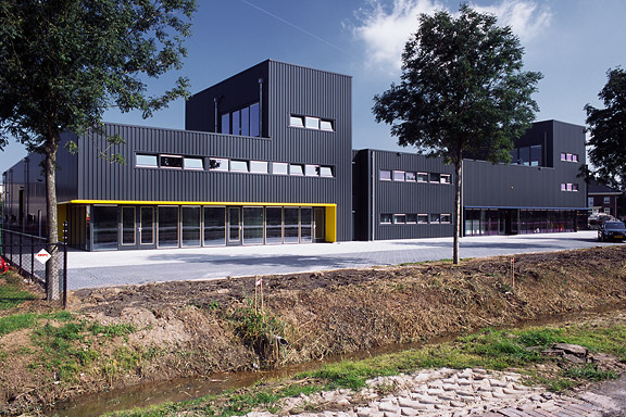
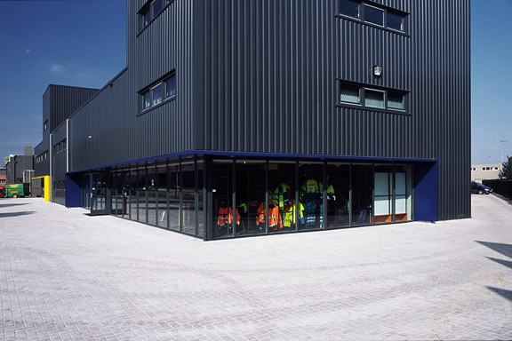
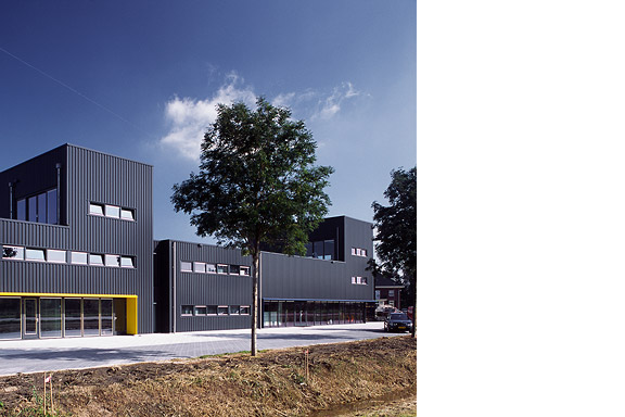
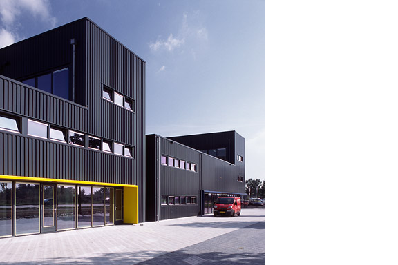
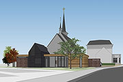
Svart låda
Denna text är inte översatt till svenska och endast tillgänglig på engelska.Painter Bert de Haas and salesman in business outfits Chris Hendriks both wanted a new business building in Kesteren. Because of fire regulations it was best to combine the two buildings. Otherwise a big part of the plot was useless.
To preserve each ones identity and to answer the request for a good cantina, both parts of the building were accented by a small tower. These towers contain a special room looking out over the polders of the Betuwe.
The building is clad with anthracite profile sheets to ease the implementation of the detailing and to maximise the abstraction of the black boxes.
I made this design as employer of Bouwkundig ontwerp en adviesburo Van Zeist BV in Opheusden.


Spökevärld
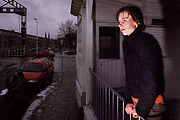
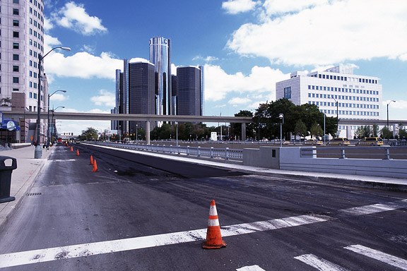
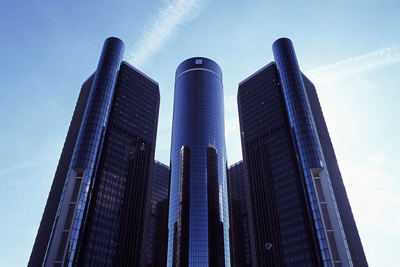
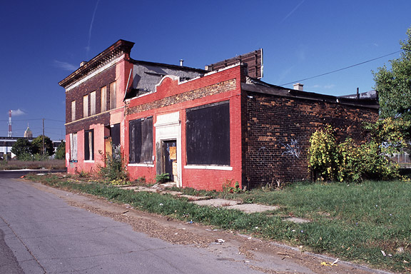
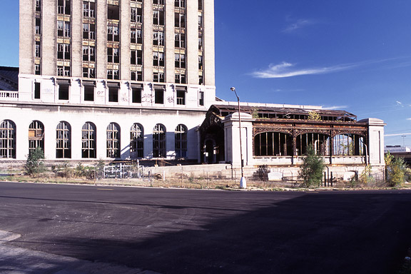
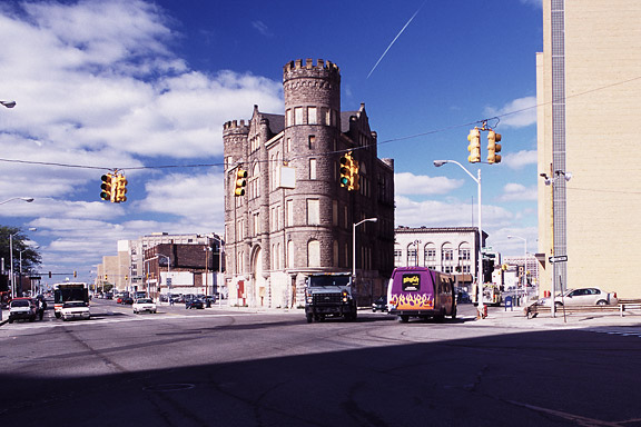
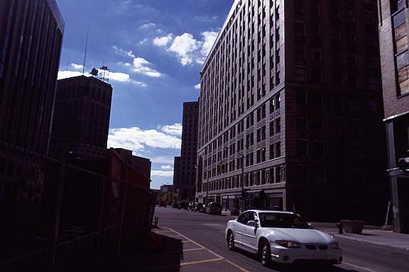
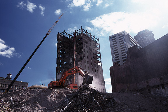
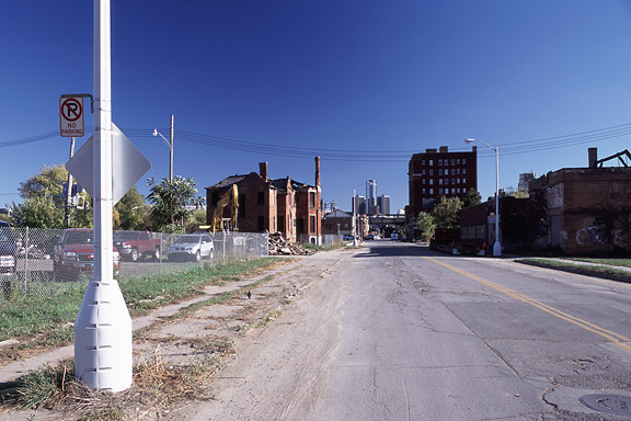
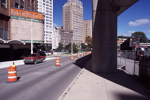
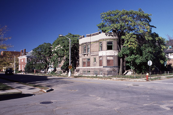
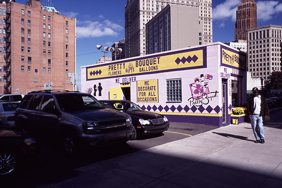
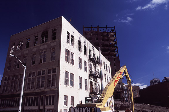
Denna text är inte översatt till svenska och endast tillgänglig på engelska.Detroit is a weird city. The city disappears slowly and turns back to nature. Not caused by war or disaster, it vanishes because of economic irrelevance. De automotive industry moved towards the Mexican border. Jobs are gone. The city renders useless. The General Motors headquarters still shine as a major highlight downtown. Perhaps as an icon for the glorious past.
These photographs are taken during a trip of the USA and Canada in the autumn of 2005.