 80's T's
For my Youtube channel 2kB of Fun, I made several T-shirts based on logo graphics from 80's video games and electronic gadgets. STRP Festival 2010
Mick Visser made a photo report of the STRP Festival 2010 in Eindhoven. I participate in the photography process as image editor. Our colaboration results in the best posible quality for the images.From left to right:
Christoph De Boeck - Staalhemel
Lawrence Malstaf - Shrink
Jean Michel Bruyère - La Dispersion du Fils
Lawrence Malstaf - Nemo Observatorium
Lawrence Malstaf - Transporter
Roos van Berkel & TUlip - 2 of a kind
The Bloody Beetroots Death Crew 77
Lawrence Malstaf - Knot
Lawrence Malstaf - Nevel
Malcolm MacIver, Marlena Novak & Jay Alan Yim - Scale
Lawrence Malstaf - Territorium
Underworld
 Lost in Navigation
Tokyo is a breathtaking city. Most metropolises have 1 urban railway network. Easy. Tokyo, the biggest metropolis on Earth, is a lot more complex.The city has 2 official subway companies, the national railway operates several lines that can be considered metro lines as well, and there are tens of private operated railways that serve may areas just outside the central part of the city. Another problem is that many transfer stations use different station names on each line connected.
Creating a understandable subway map for this city is extremely complex. Should it be schematic, or geographic realistic? When is it easier to have a short walk than to switch lines?
This metro map for Tokyo only shows the most important lines for visitors of the city. That is already 25 lines! All distances are realistic, and the connections to Airports and Shinkansen trains are clearly visible. The parks that give a good orientation in the grey urban mass of Tokyo are visible. Icons show the most important landmarks. Matching the million neon lights the map is drawn in a night situation with the lines as glowing neon tubes.
The map is printed on 100x75 cm photo paper in a limited run, an can be ordered. Send an e-mail or call if you are interested to order.
 Low Bandwith
When the design of Retro Space was finished, we needed a matching website.Because of the presumption that Retro Space could become a hit on the internet, we tried to make the website as small as possible. We did not want the website to crash on bandwidth problems.
Matching the style of the retro games, the website is designed in pixel art. All elements except some product shots are GIF images in 4 colours. It's just like the early years of internet when bandwidth was scarce.
 Retro Space
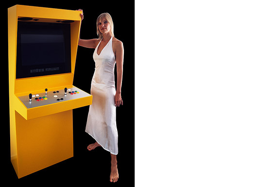
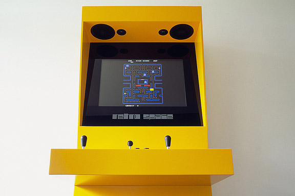
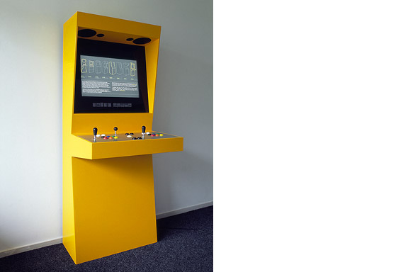
In 1971 the first coin-op video gaming system was built: Computer Space.Soon the video arcade as hangout was born. Many famous games as Pac-Man, Space Invaders, Streetfighter and Donkey Kong were filled with our quarters. Today the last arcades are closing down. The Wii, the Playstation and owner "mr. Counchpotato" have won. As an homage to this era and to keep all the classics playable Retro Space was created.
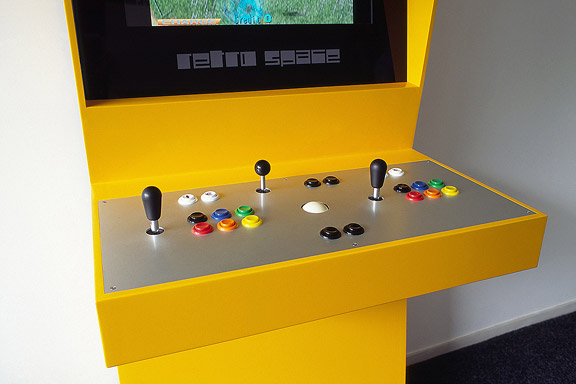
Retro Space is a modern arcade machine for at home or at work. It plays both all the arcade classics from Space Invaders up and all the console titles for your Nintendo, Sega or Atari. The system is made using modern technology and is flexible for future innovations. The system also is a perfect multimedia jukebox. Next to your favourite games, you can load Retro Space with your favourite music and movies. A full HD screen and a high quality speaker system ensure you to enjoy the best image and sound. And quarters are no longer needed.
Thanks to model Lara Verlaat for the imitation of the original Computer Space poster.
 Fake Wanders
The lamp is a joke. I had no space to place the Big Shadow Lamp by Marcel Wanders. I also liked the idea of the Fake Lamp by Sophie Krier, but not its shape. I mixed them and created the Fake Wanders. Definitely not for sale. Miniature City
Brandevoort is one of the big suburban extensions according to the governmental document Vinex. Under supervision of Rob Krier, the city of Helmond tried to mimic the classic Dutch canal city for its big extension. Modern legislation on parking and the fact that a family in a suburban plan like this needs 2 cars to reach all daily facilities, resulted in weird interiors for the urban blocks. The gardens are petite, and most space is used for the cars. Blue Envelope
The Dutch Tax Administration feels like a family business. The atmosphere is open and relaxed. The organization is responsible for the total financial administration of The Netherlands Ltd. Dutch citizens expect professional civil servants. The office at the Quintax location in Apeldoorn expresses the two faces of the Dutch Tax Administration. The building looks severe and mimics the impregnability of Fort Knox. But internal, the building is totally transparent. Walls are exceptions, and voids open the floors to improve contact between employees.At JHK Architects, I was responsible for the concept of the building. I also worked out most of the technical details.


