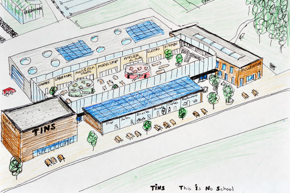
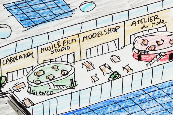
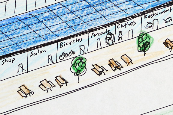
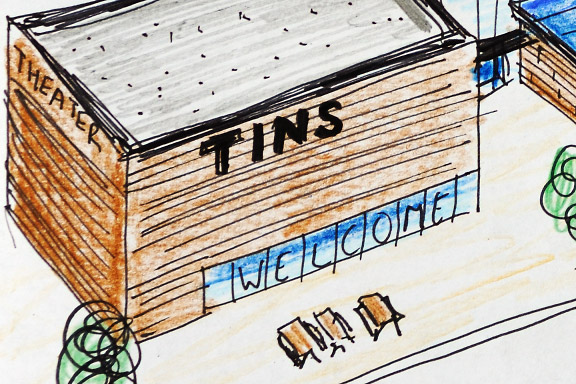
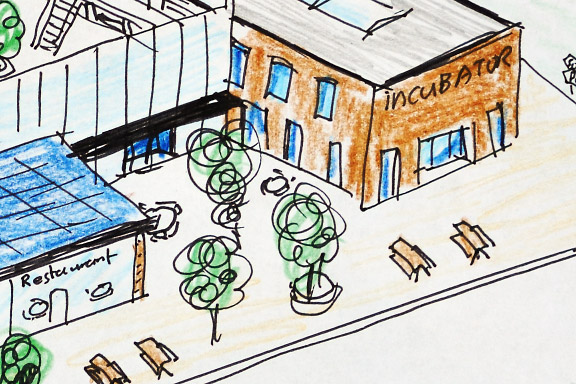
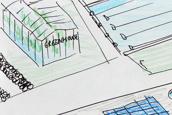
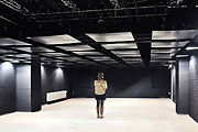
 これは学校ではありません
英語のみでの詳細Learning is working best when kids are into subjects of study that match their interests. It also works well when projects are realistic.
Also there has to be place for the making. It should be possible to make prototypes, do experiments, program shows and produce goods to express yourself.
This Is No School is the world on a stamp. A meeting square, workshops, labs, a theater, a fram, sporting facilities, restaurants, shops and a hotel.
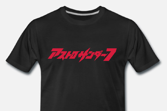
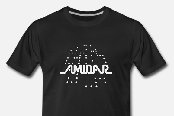
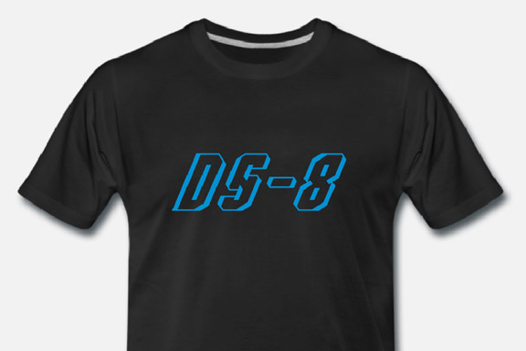
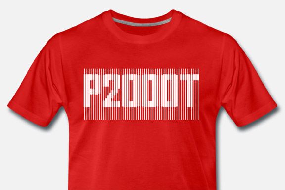
 80's T's
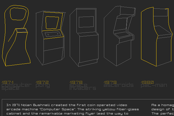
英語のみでの詳細For my Youtube channel 2kB of Fun, I made several T-shirts based on logo graphics from 80's video games and electronic gadgets.


ナビゲーションに失われた
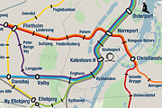
英語のみでの詳細Tokyo is a breathtaking city. Most metropolises have 1 urban railway network. Easy. Tokyo, the biggest metropolis on Earth, is a lot more complex.
The city has 2 official subway companies, the national railway operates several lines that can be considered metro lines as well, and there are tens of private operated railways that serve may areas just outside the central part of the city. Another problem is that many transfer stations use different station names on each line connected.
Creating a understandable subway map for this city is extremely complex. Should it be schematic, or geographic realistic? When is it easier to have a short walk than to switch lines?
This metro map for Tokyo only shows the most important lines for visitors of the city. That is already 25 lines! All distances are realistic, and the connections to Airports and Shinkansen trains are clearly visible. The parks that give a good orientation in the grey urban mass of Tokyo are visible. Icons show the most important landmarks. Matching the million neon lights the map is drawn in a night situation with the lines as glowing neon tubes.
The map is printed on 100x75 cm photo paper in a limited run, an can be ordered. Send an e-mail or call if you are interested to order.

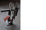
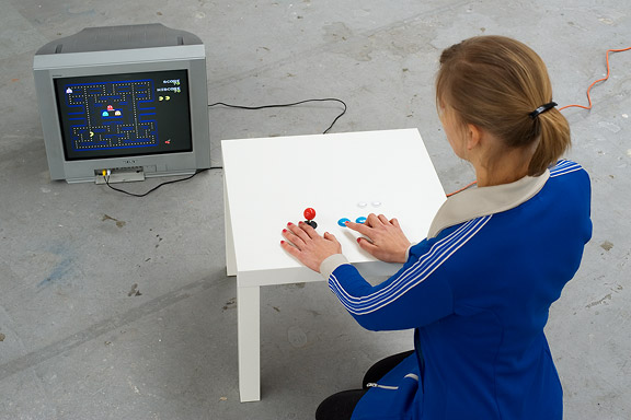
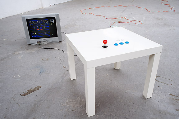
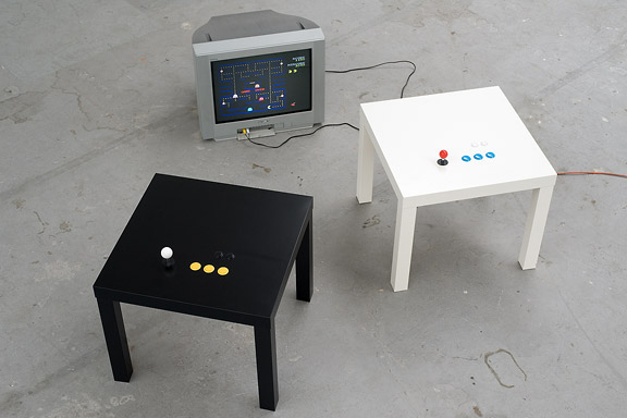
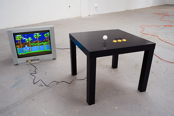
パックマン・ラック・ハック
英語のみでの詳細One of the most popular IKEA products is the LACK coffee table. It is so cheap, it must be hollow.
I opened the tables, I built in a retro TV computer game by Jakks and added real arcade controls to this game. This way the TV game has a longer life and the Ikea LACK is no longer the boring classic every household owns.
Thanks to Lara Verlaat for Playin Pac-Man.
低帯域幅
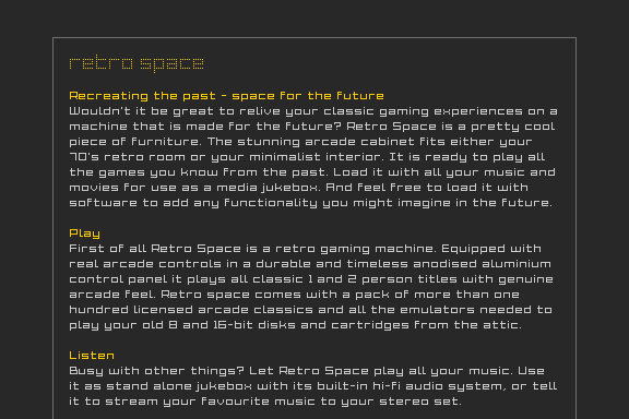
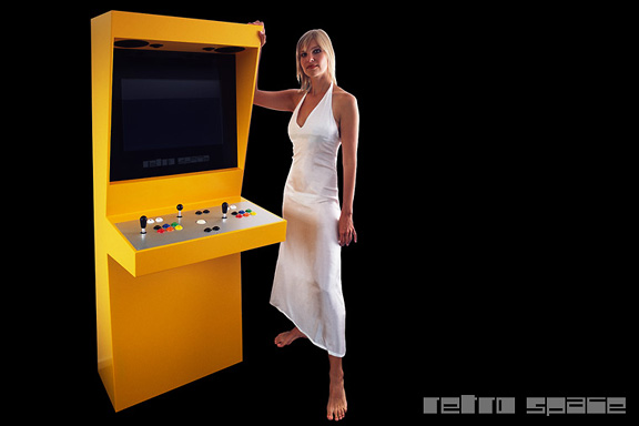
英語のみでの詳細When the design of Retro Space was finished, we needed a matching website.
Because of the presumption that Retro Space could become a hit on the internet, we tried to make the website as small as possible. We did not want the website to crash on bandwidth problems.
Matching the style of the retro games, the website is designed in pixel art. All elements except some product shots are GIF images in 4 colours. It's just like the early years of internet when bandwidth was scarce.

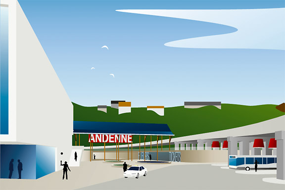
 アンデンネでの歓迎します
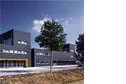
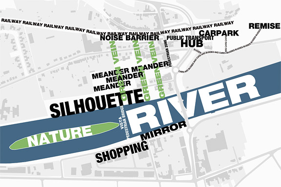
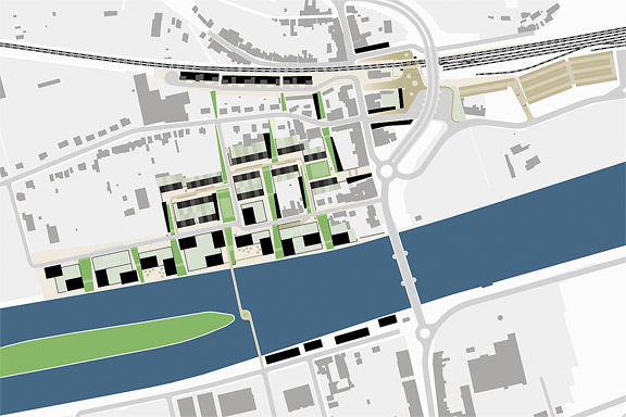
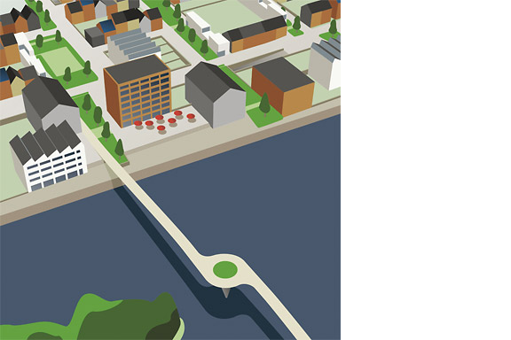
英語のみでの詳細Andenne is a small town on the bank of the Meuse between Namur and Liège. When entering Andenne the city does not impress. The abandoned factory area on the north bank of the Meuse makes a chaotic impression and the river is ignored. In collaboration with Wendy van Rosmalen I designed a new plan for this Europan 9 location.
With out plan we want to give Andenne a face. Between famous cities like Namur, Huy and Liège, Andenne is missing an inherent identity. We chose to multiply the nonchalant character of Belgian building and turn it into a specific typology. Our plan is a framework for development of the area in its own pace. A subtle guidance in building alignment and building heights delivers a varied public space that opens up towards the river Meuse.
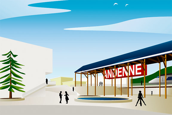
A specific part of the assignment was the redesign of Andenne station. Bad attainableness of the platforms, a weird logistic and the uncomfortable public space underneath the viaduct are creating a moody atmosphere. The size of Andenne does not allow a large scale intervention. We choose a very modest solution. We created a square below the tracks to connect al transportation streams. The viaduct is decorated to resemble a living room and is transformed into a roof covering the bus platforms. New buildings surrounding the square size the public space.
Every Belgian wants its own house. Ignoring this feat makes a plan implausible. We go one step further through making the buying of a house resemble the buying of a car. By using a smart basic layout for the houses, every house can suit the needs of very different groups of people. Future change is very easy too. The architecture is a caricature of traditional Belgian building methods, its execution is contemporary and flexible.
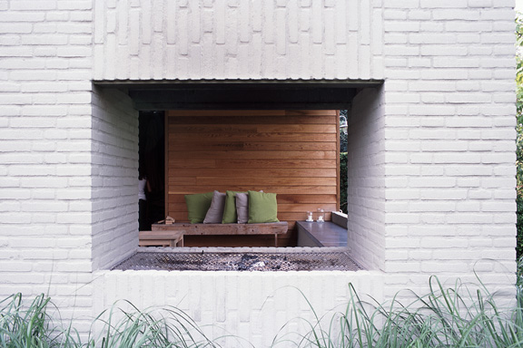
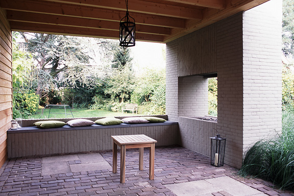
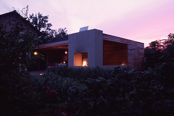
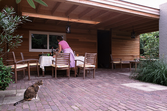
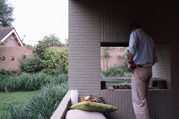
バーベキューXL
英語のみでの詳細Frank en Chantal van den Eijnden asked Johan van der Berkmortel and me to design an extension to their house in Beek en Donk. It was supposed to replace a decrepit shed and to add a new veranda with a fireplace. Two L-shaped entities frame the view into the deep garden. The brick element contains the chimney and acts as a bench. The wooden part contains the new shed, a log storage and a tool shed, and continues into the ceiling of the veranda.
This assignment is done in collaboration with Johan van den Berkmortel.
ワンダ・ワンデレス
英語のみでの詳細The avatar Wanda Wanders was born in a chatconversation with Margot Scheltens. Wanda wanders around the World and shares her sharp opinion on various topics.
I created the website both technically and graphically. Many of the articles are written by me too.
Wanda Wanders is a registered Benelux trademark.
http://
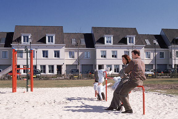
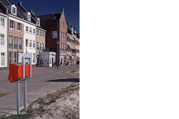
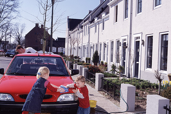
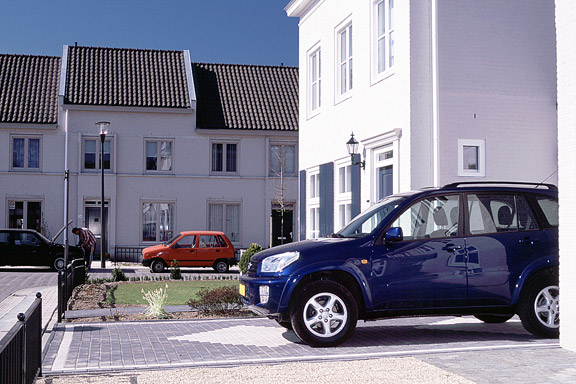
 ミニチュア都市
英語のみでの詳細Brandevoort is one of the big suburban extensions according to the governmental document Vinex. Under supervision of Rob Krier, the city of Helmond tried to mimic the classic Dutch canal city for its big extension. Modern legislation on parking and the fact that a family in a suburban plan like this needs 2 cars to reach all daily facilities, resulted in weird interiors for the urban blocks. The gardens are petite, and most space is used for the cars.