 80's T's
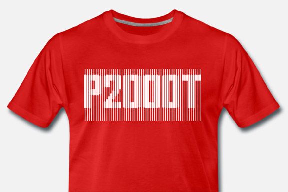
英語のみでの詳細For my Youtube channel 2kB of Fun, I made several T-shirts based on logo graphics from 80's video games and electronic gadgets.

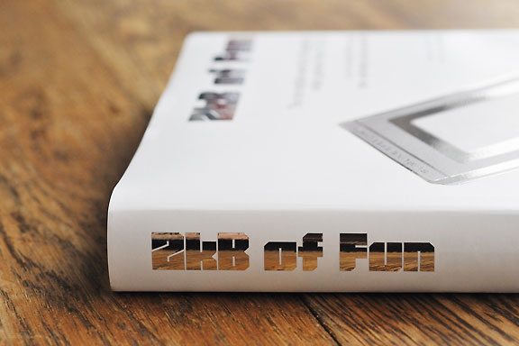
 2kB of Fun
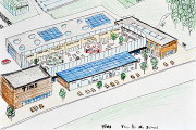
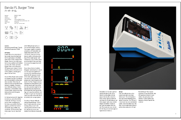
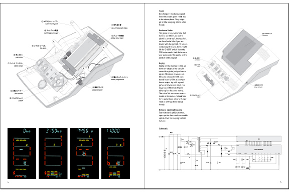
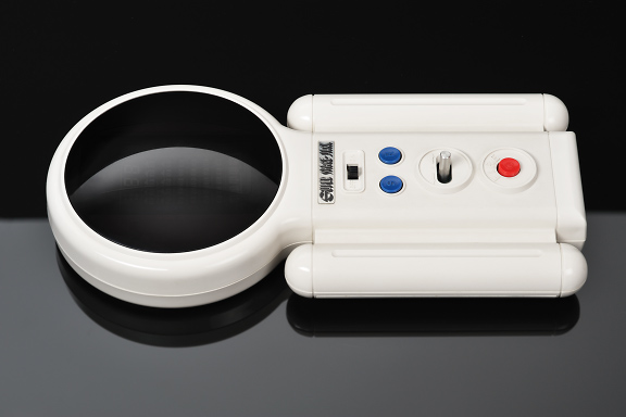
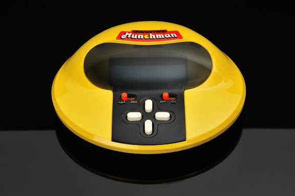
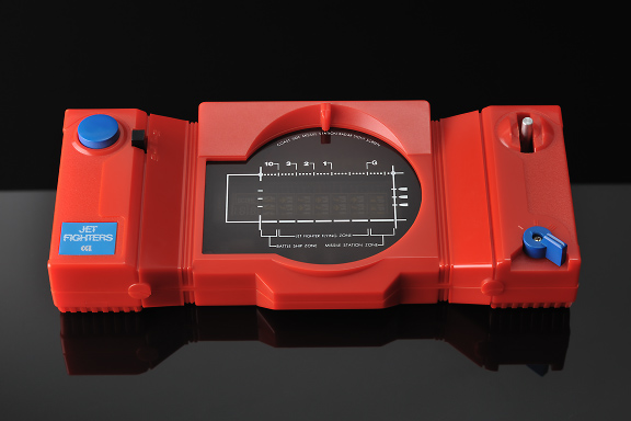
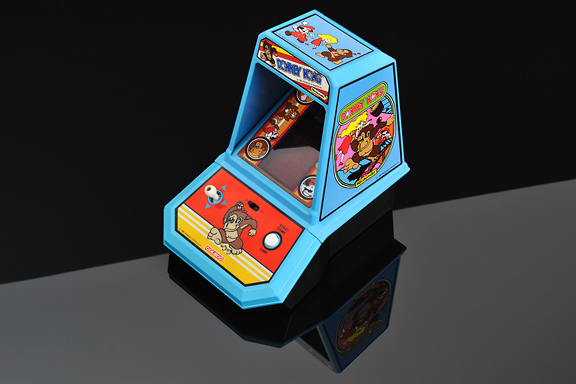
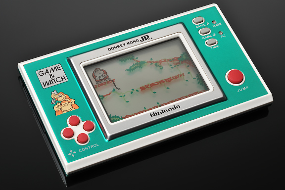
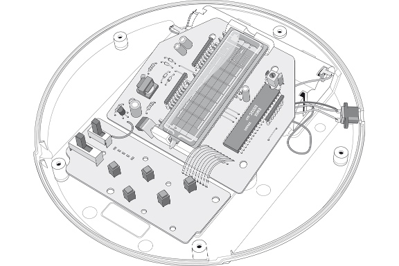
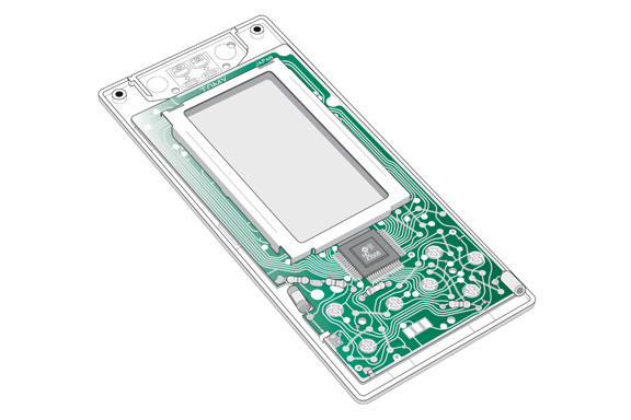
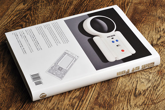
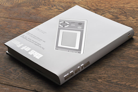
1976年から1985年の初期の携帯ゲーム機で、これほど贅沢な種類のケースデザインを誰もみたことがありませんでした。これらの携帯ゲーム機がもつ本質をこれまで美しくシンプルに出したコンピューターゲームはありませんでした。2KBメモリーでこれほどまでの楽しみを提供できた例はなかったのです。1983年はアミダー、アストロサンダー7、バーガータイム、ディグダグ、ミズパックマン、キューバート、スーパーコブラ、ザクソンのようなゲームにとって最高の年でした。
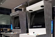
オランダの建築家、マルタィン・コッホは200に及ぶ優れた携帯ゲームを購入し、撮影、解体したのちに技術分析をし、研究後、今まで誰もみたことがない、素晴らしいカタログのような本にしました。

Notice: Undefined variable: tekst in /home/w1512188/domains/martijnkoch.com/public_html/index.php on line 281
 DAF46スーパー ・ デラックス
Notice: Undefined variable: tekst in /home/w1512188/domains/martijnkoch.com/public_html/index.php on line 292
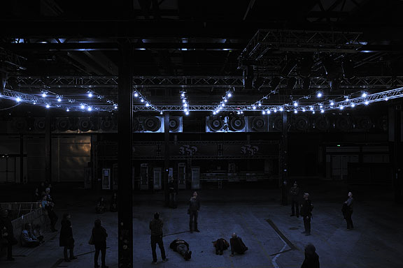
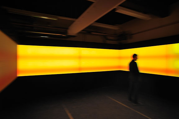
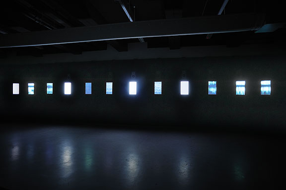
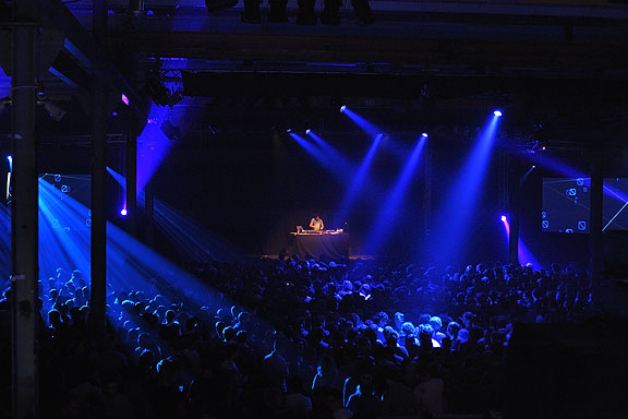
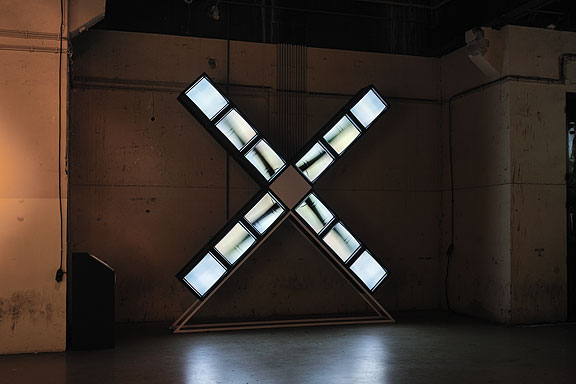
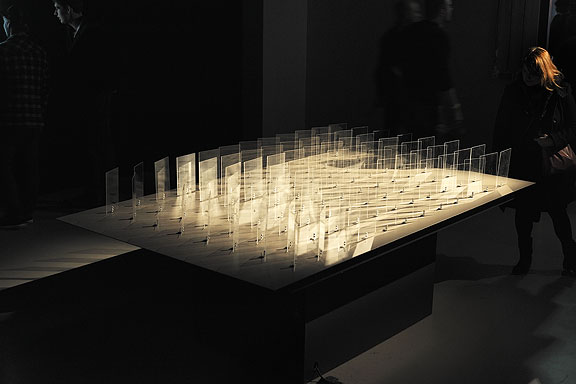
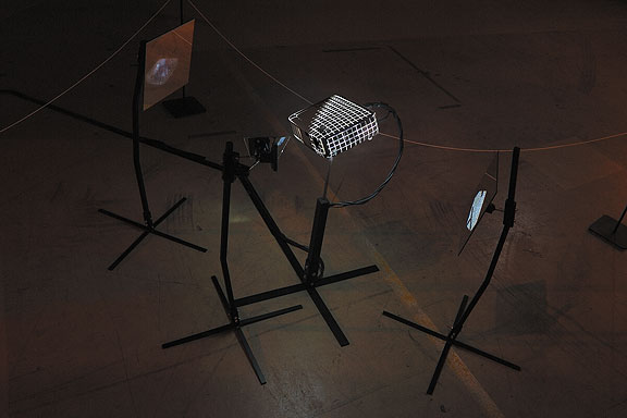
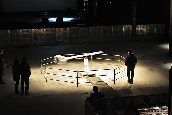
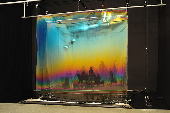
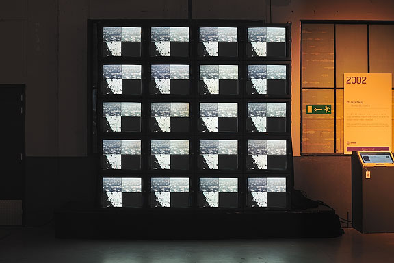
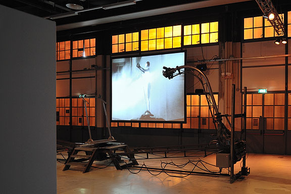
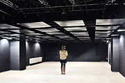
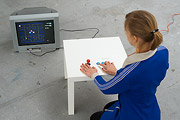
 STRPフェスティバル2011
ミック・ヴィッセルによる撮影マルタイン・コッホによる画像操作
左から右へ:
バート・シューター、風車Xモレン、1982
エドウィン・ファン・デル・ヘイデ、DSLE2、2011
テルコシステムズ、12シリーズ、2010
クートマ、2011年11月26日
エドウィン・ファン・デル・ヘイデ、スパークネットワークを進化、2010/2011
マクラル、位相=オーダー、2010
ブラム・スナイデレス、カロリーン・テウニッス、RE:、2010
マルニックス・デ・ナイス、エドウィン・ファン・デル・ヘイデ、空間的な音、2000/2001
ニッキー・アッスマン、ソレース、2011
ヘルト・ムル、転送ポイント、2002
エリック・ホバイン、自己いけにえの妄想、1990
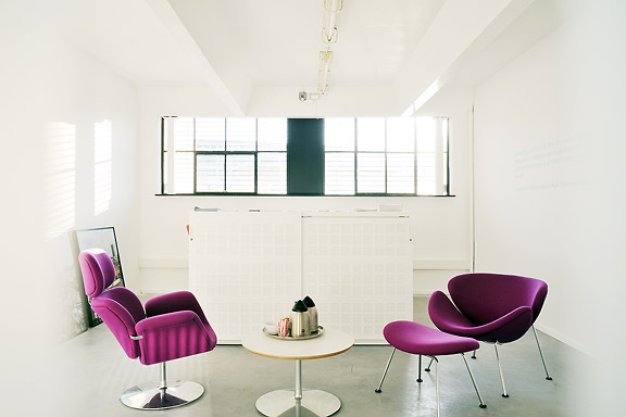
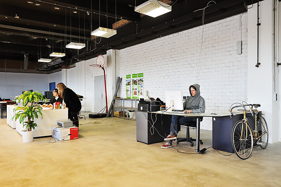
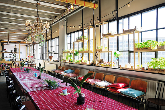
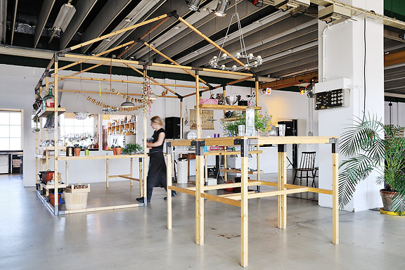
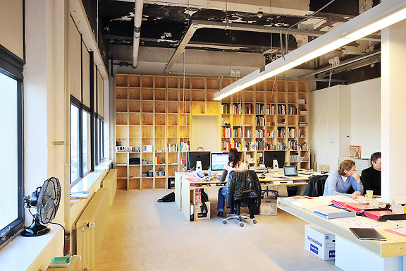
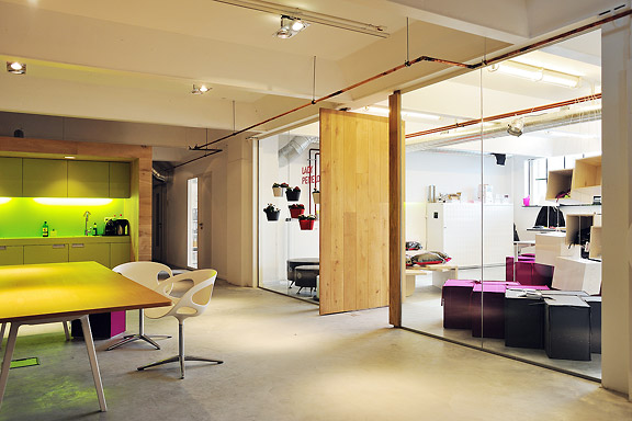
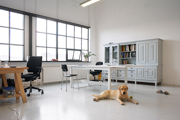
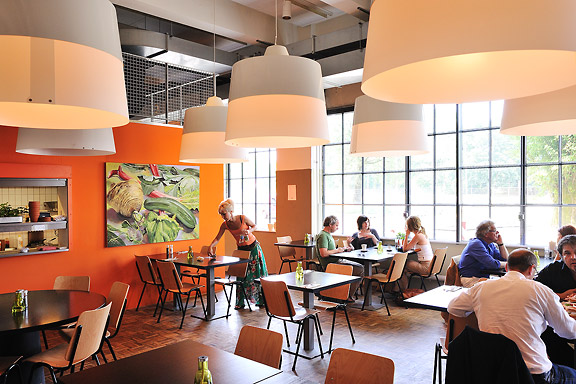
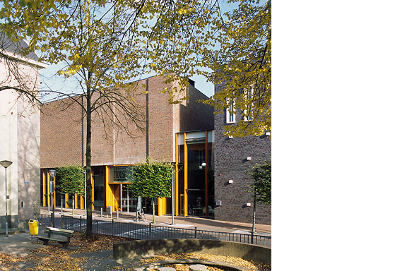
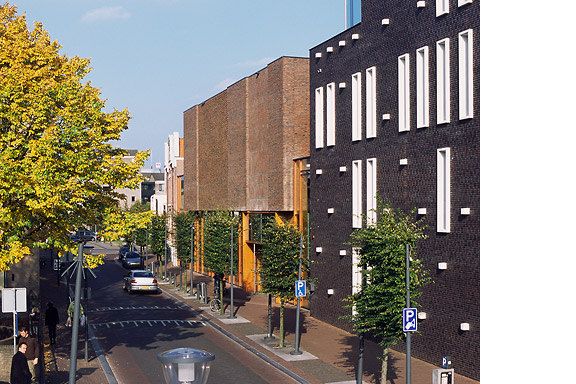
創造的工場
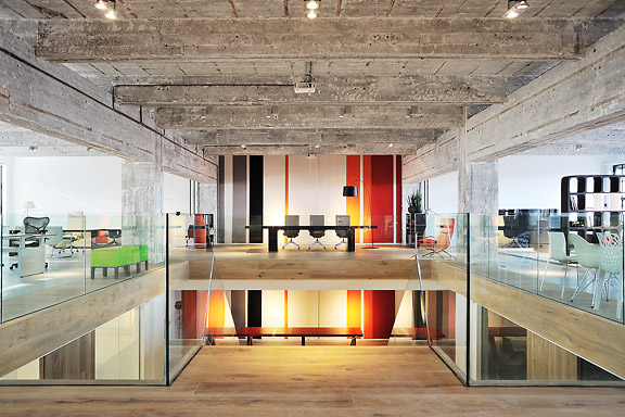
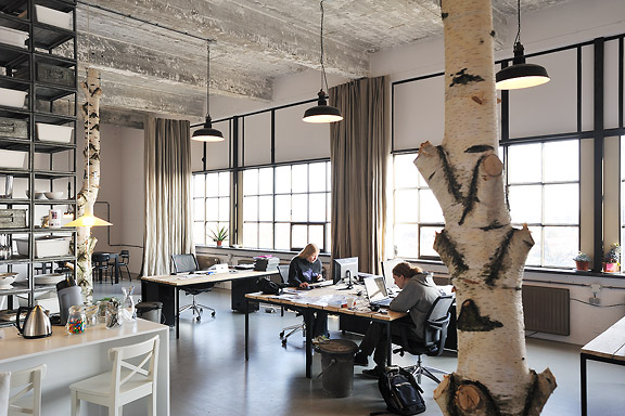
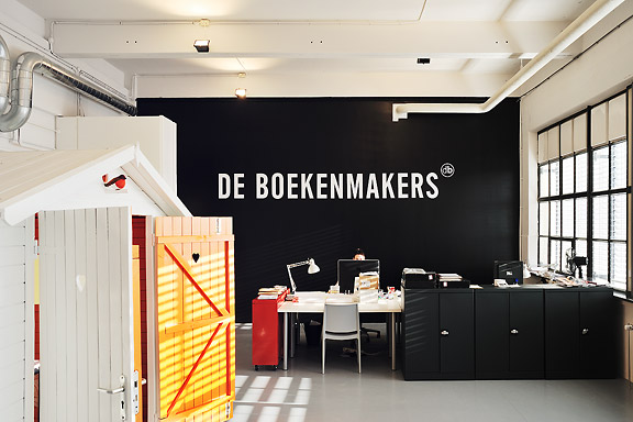
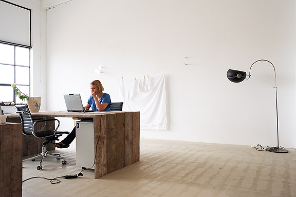
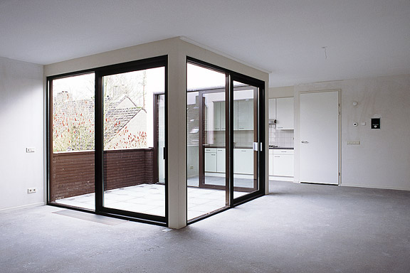
英語のみでの詳細The Clock Building is a magnificent icon for Eindhoven. It is built as factory by Philips Electronics in 1928/1929. After having been used for years as office space by Philips, the building now transforms back to its original function: a factory.
This time no series production. Trudo turned the building into a creative factory. Architects, designers, musicians, photographers, creative consultants: a colourful aggregation of creative talent took over this icon of the city Eindhoven.
The building has been split into units of various proportions. They all share one common feature though. Huge window openings with delicate metal frames. The light that enters the building gives unity to the diversity of interiors.
I photographed numerous interiors of the Clock Building to give insight in the new use of the building. The transformation of the Clock Building is a starting point in the transformation of the city district Strijp-S, a new centre for the city of Eindhoven.
The pictured companies are from left to right: Architectuurcentrum Eindhoven, Little Mountain, Keukenconfessies (2x), Desque, FuturOn.net, De Boekenmakers, studio-OOK, Scherpontwerp, Lady Penelope, Dikgedrukt en PopEI


ナビゲーションに失われた
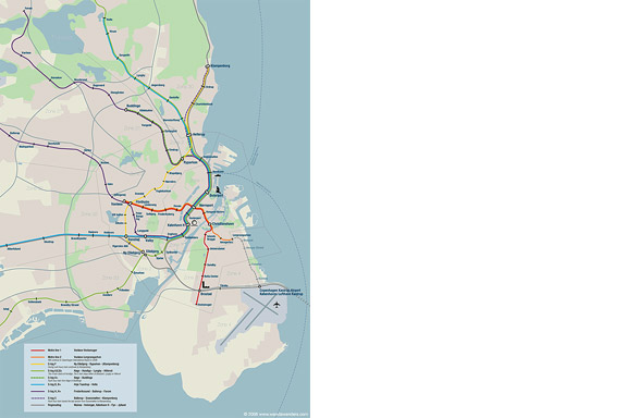
英語のみでの詳細Tokyo is a breathtaking city. Most metropolises have 1 urban railway network. Easy. Tokyo, the biggest metropolis on Earth, is a lot more complex.
The city has 2 official subway companies, the national railway operates several lines that can be considered metro lines as well, and there are tens of private operated railways that serve may areas just outside the central part of the city. Another problem is that many transfer stations use different station names on each line connected.
Creating a understandable subway map for this city is extremely complex. Should it be schematic, or geographic realistic? When is it easier to have a short walk than to switch lines?
This metro map for Tokyo only shows the most important lines for visitors of the city. That is already 25 lines! All distances are realistic, and the connections to Airports and Shinkansen trains are clearly visible. The parks that give a good orientation in the grey urban mass of Tokyo are visible. Icons show the most important landmarks. Matching the million neon lights the map is drawn in a night situation with the lines as glowing neon tubes.
The map is printed on 100x75 cm photo paper in a limited run, an can be ordered. Send an e-mail or call if you are interested to order.

いくつかのビールをしたいです?
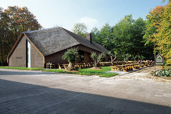
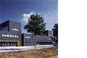
英語のみでの詳細ZZEF asked me to photograph 2 projects designed by Johan van den Berkmortel for the architecture portfolio of ZZEF.
One project is a beer cafe at the monk brewery Koningshoeve and the other is the Bavaria House in Helmond.


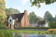
私はあなたにバラ園を約束したこと
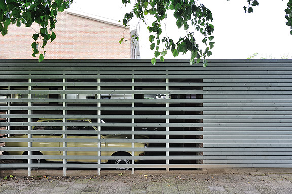
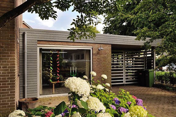
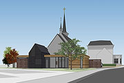
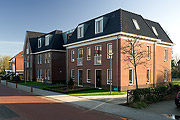
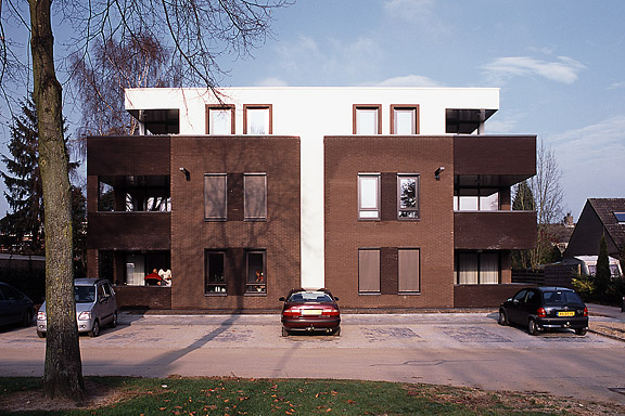
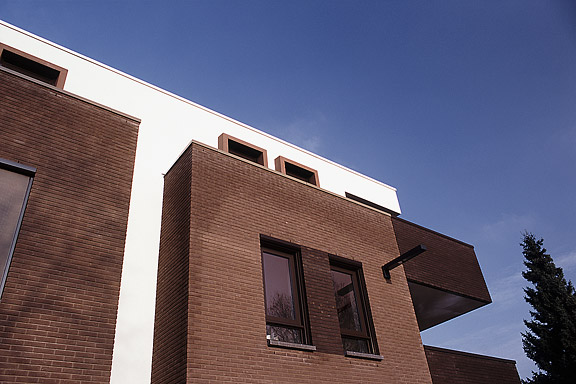
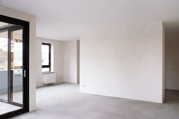
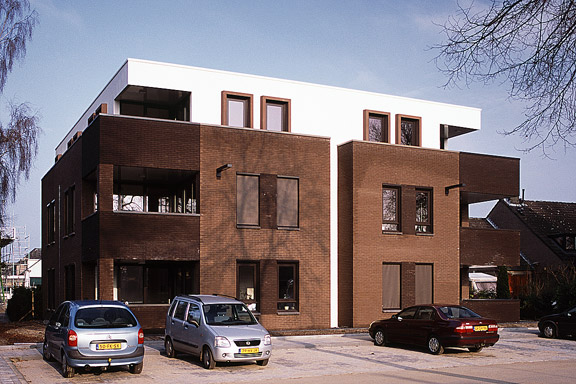
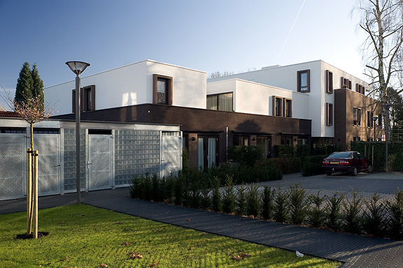
英語のみでの詳細An abandoned commercial plot in the centre of Heteren had to be filled with 19 apartments. Contractor Kuijpers had moved to the city limits and the housing corporation "Woningstichting Heteren" had 4 outdated senior-citizen houses on the adjacent plot at the Rozenpad street. The combined plot connects a traditional village street with a seventies extension to Heteren. The housing coorporation asked me to design the modernist block fitting the seventies area.
I designed this appartment block as employer of Bouwkundig ontwerp- en adviesburo van Zeist BV
人鱼姫
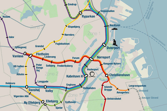
英語のみでの詳細When we visited Copenhagen, I was surprised by the complex metro map for the very small network. It should be possible to draw a map easier to understand and graphically more appealing to visitors.
I designed a new metro map that shows the relation with the city. It combines all trains with different schedules on similar routes to bring back overview.
Autonomous work
ワンダ・ワンデレス
英語のみでの詳細The avatar Wanda Wanders was born in a chatconversation with Margot Scheltens. Wanda wanders around the World and shares her sharp opinion on various topics.
I created the website both technically and graphically. Many of the articles are written by me too.
Wanda Wanders is a registered Benelux trademark.
http://
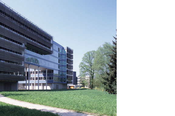
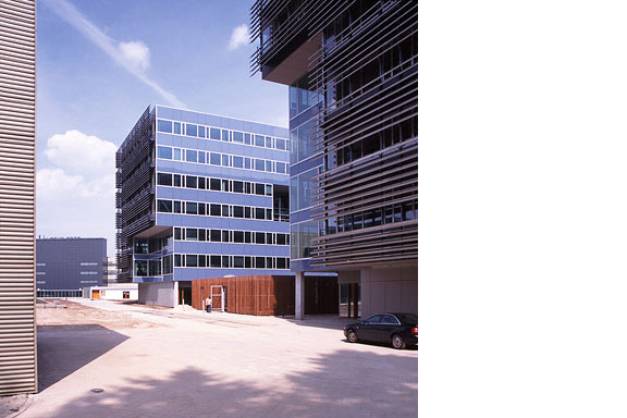
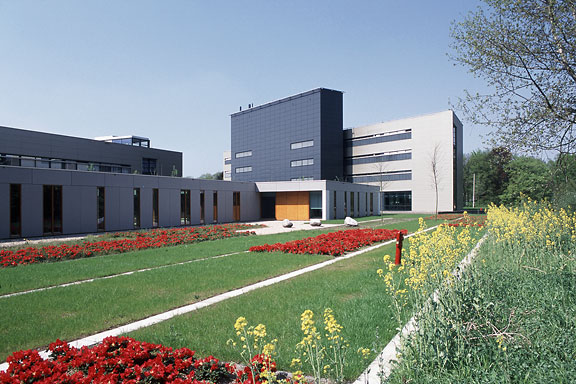
青い封筒
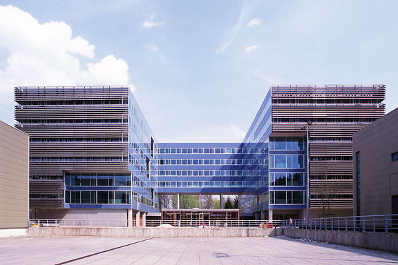
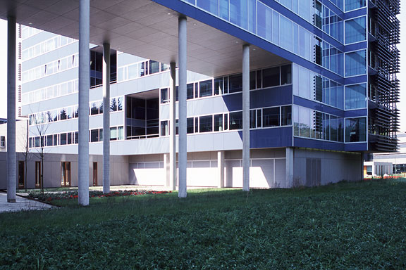
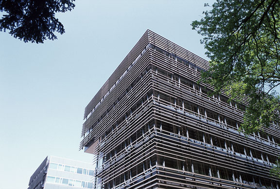
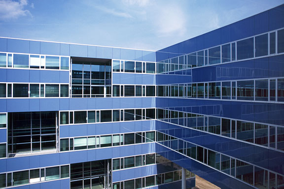
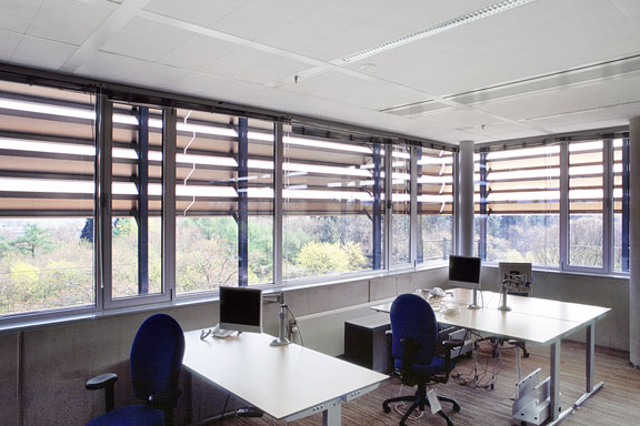
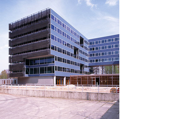
英語のみでの詳細The Dutch Tax Administration feels like a family business. The atmosphere is open and relaxed. The organization is responsible for the total financial administration of The Netherlands Ltd. Dutch citizens expect professional civil servants. The office at the Quintax location in Apeldoorn expresses the two faces of the Dutch Tax Administration. The building looks severe and mimics the impregnability of Fort Knox. But internal, the building is totally transparent. Walls are exceptions, and voids open the floors to improve contact between employees.
At JHK Architects, I was responsible for the concept of the building. I also worked out most of the technical details.