 80's T's
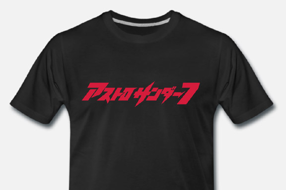
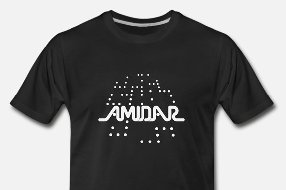
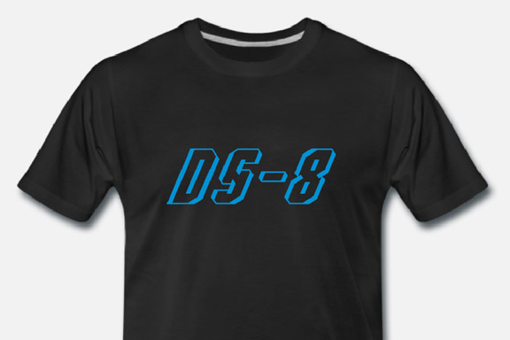
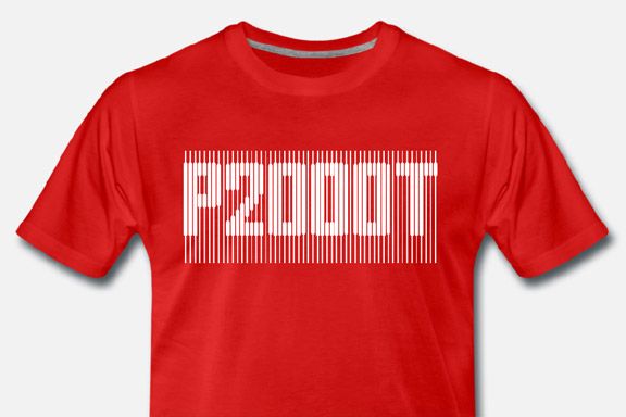
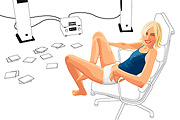
For my Youtube channel 2kB of Fun, I made several T-shirts based on logo graphics from 80's video games and electronic gadgets. STRP Festival 2011
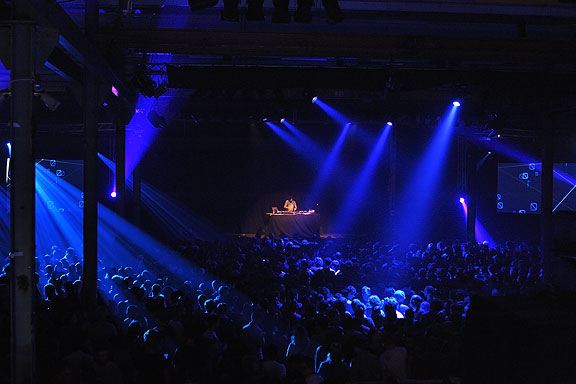
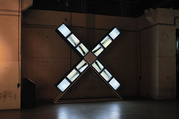
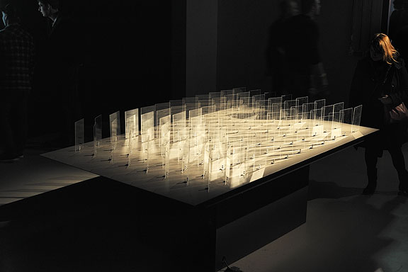
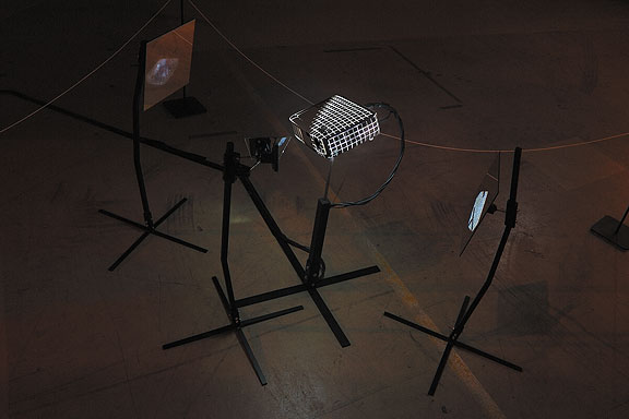
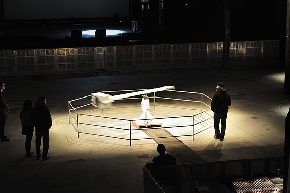
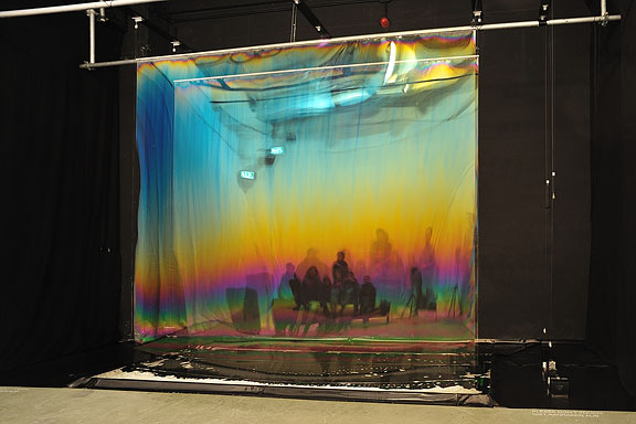
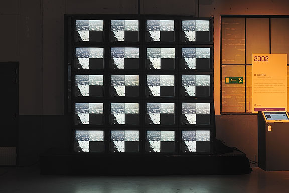
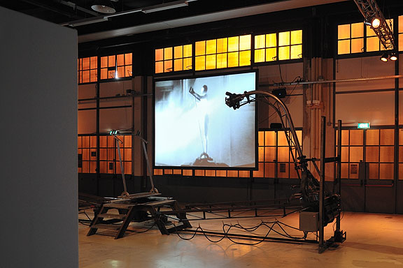
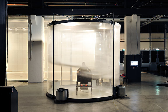
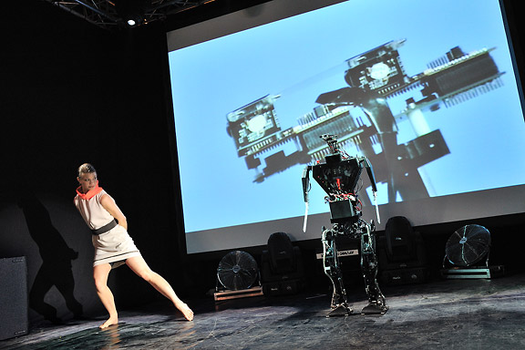
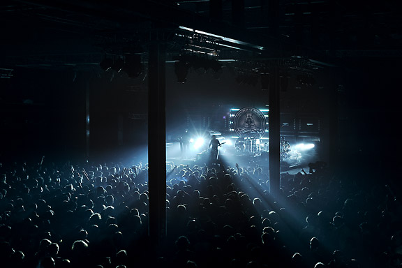
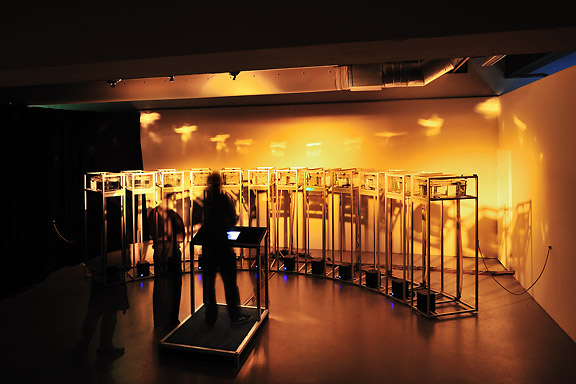
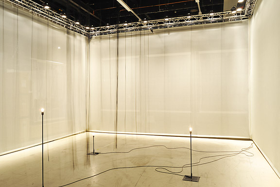
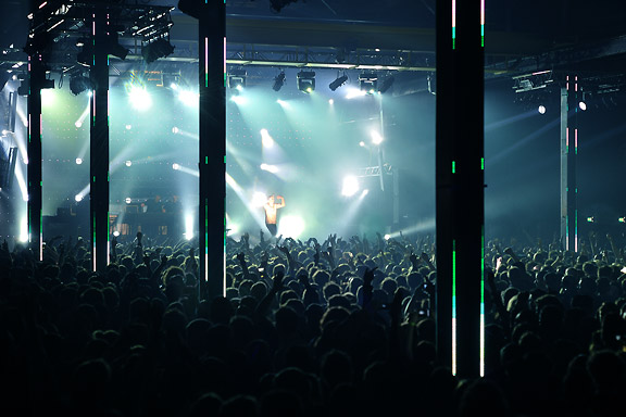
Mick Visser made a photo report of the STRP Festival 2011 in Eindhoven. I participate in the photography process as image editor. Our colaboration results in the best posible quality for the images.From left to right:
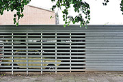
Bert Schutter - Mill X Molen - 1982
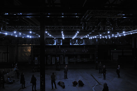
Edwin van der Heide - DSLE2 - 2011
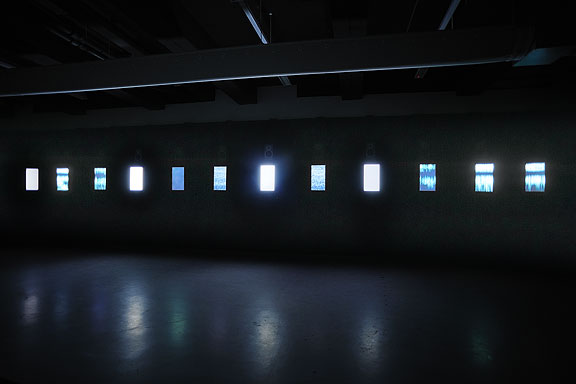
Telcosystems - 12_series - 2010
Kutmah - 26 November 2011
Edwin van der Heide - Evolving Spark Network - 2010/2011
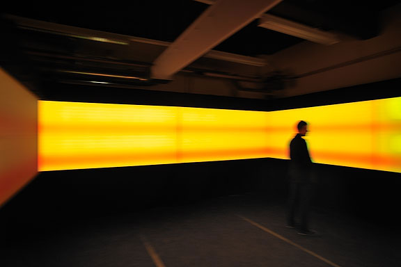
Macular - Phase=Order - 2010
Bram Snijders, Carolien Teunisse - RE: - 2010
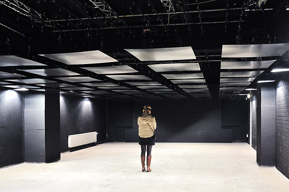
Marnix de Nijs, Edwin van der Heide - Spatial Sounds - 2000/2001
Nicky Assmann - Solace - 2011
Geert Mul - Transfer Points - 2002
Erik Hobijn - The Delusion of Self Immolation - 1990
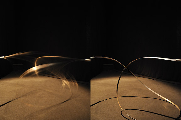
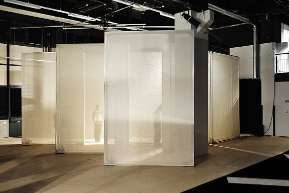
 STRP Festival 2010
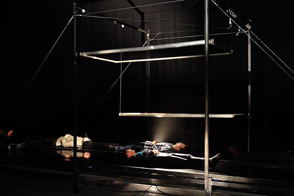
Mick Visser made a photo report of the STRP Festival 2010 in Eindhoven. I participate in the photography process as image editor. Our colaboration results in the best posible quality for the images.From left to right:
Christoph De Boeck - Staalhemel
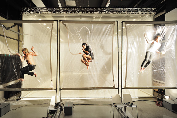
Lawrence Malstaf - Shrink
Jean Michel Bruyère - La Dispersion du Fils
Lawrence Malstaf - Nemo Observatorium
Lawrence Malstaf - Transporter
Roos van Berkel & TUlip - 2 of a kind
The Bloody Beetroots Death Crew 77
Lawrence Malstaf - Knot
Lawrence Malstaf - Nevel
Malcolm MacIver, Marlena Novak & Jay Alan Yim - Scale
Lawrence Malstaf - Territorium
Underworld
 M+ M- ???
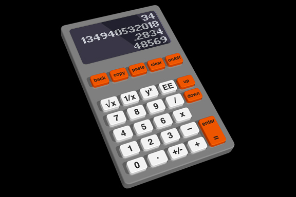
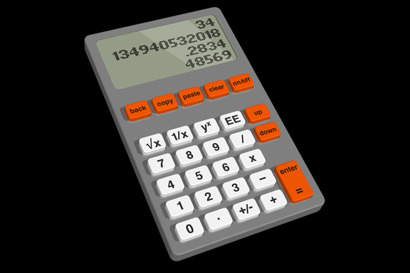
Redesignme.com is a website where designers are challenged to create new designs for certain products.Garton Jones used redesignme.com to search for a redesign of the Ativa 10 Digit Desk Calculator.
I'm always puzzled by the fact most calculators still function like the early 1970 designs. A time when chip logic was very expensive, and the amount of components was kept to a minimum. Today's standard micro controller is way more powerful. So my primary goal was to create a new set of basic functionality.
Which means I had to redesign the layout of the buttons first. The design itself continues proved ingredients like injection mould plastic, the perfect shape of PTT's Zurich telephone and modern white OLED matrix displays.
My own challenge was to make the design in one hour on a Friday afternoon.
The result: a top 3 note among 109 redesigns. "Your redesign was part of my top 3. Very well done! Yours sincerely, Charlie Garton-Jones"
 Creative Factory
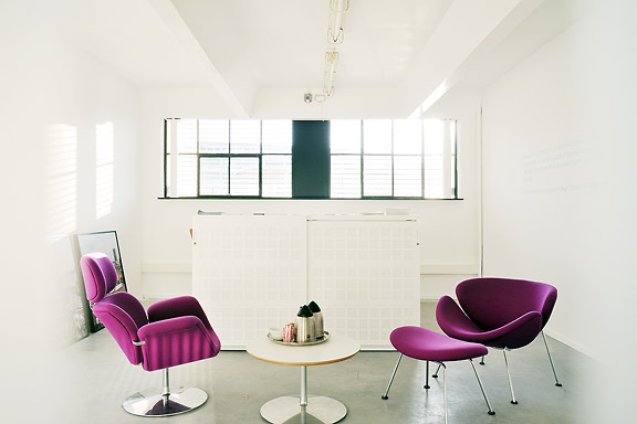
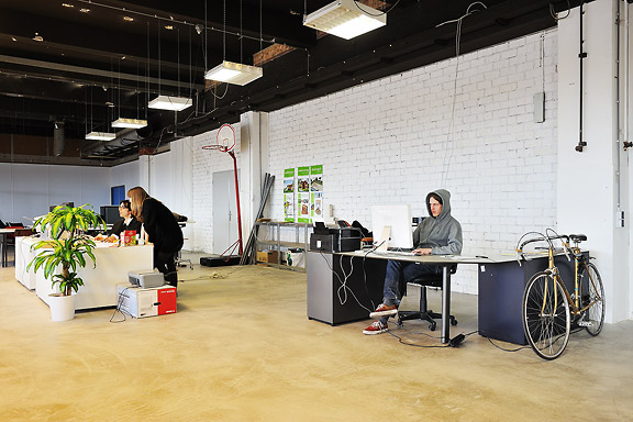
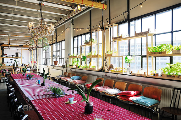
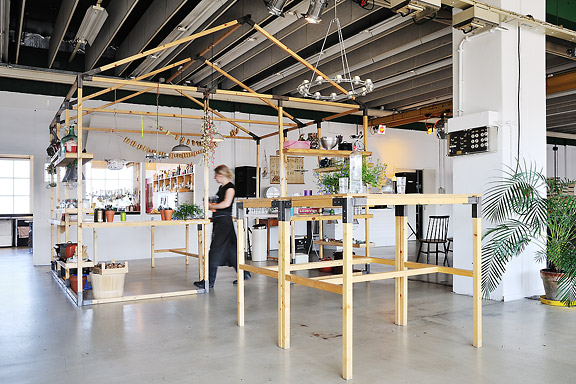
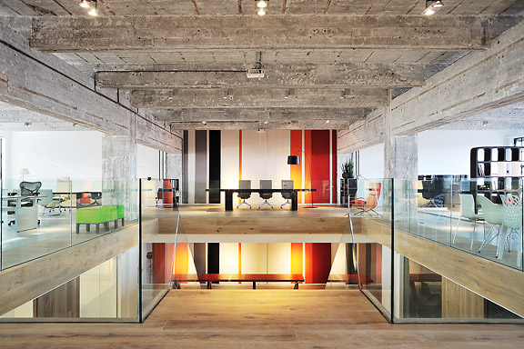
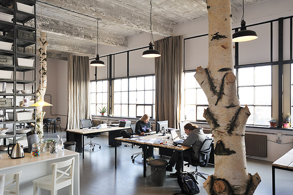
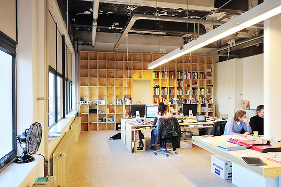
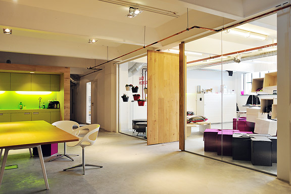
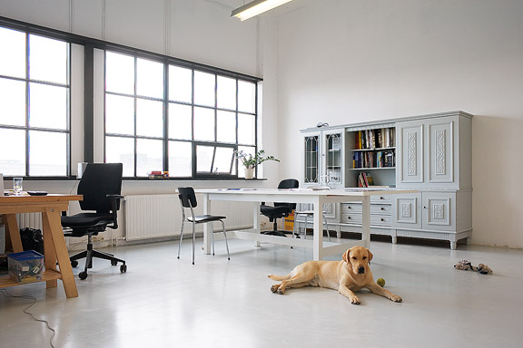
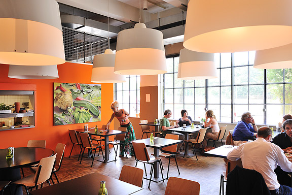
The Clock Building is a magnificent icon for Eindhoven. It is built as factory by Philips Electronics in 1928/1929. After having been used for years as office space by Philips, the building now transforms back to its original function: a factory.This time no series production. Trudo turned the building into a creative factory. Architects, designers, musicians, photographers, creative consultants: a colourful aggregation of creative talent took over this icon of the city Eindhoven.
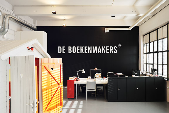
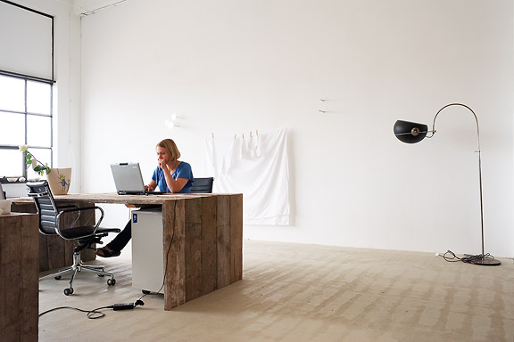
The building has been split into units of various proportions. They all share one common feature though. Huge window openings with delicate metal frames. The light that enters the building gives unity to the diversity of interiors.
I photographed numerous interiors of the Clock Building to give insight in the new use of the building. The transformation of the Clock Building is a starting point in the transformation of the city district Strijp-S, a new centre for the city of Eindhoven.
The pictured companies are from left to right: Architectuurcentrum Eindhoven, Little Mountain, Keukenconfessies (2x), Desque, FuturOn.net, De Boekenmakers, studio-OOK, Scherpontwerp, Lady Penelope, Dikgedrukt en PopEI
 Lost in Navigation
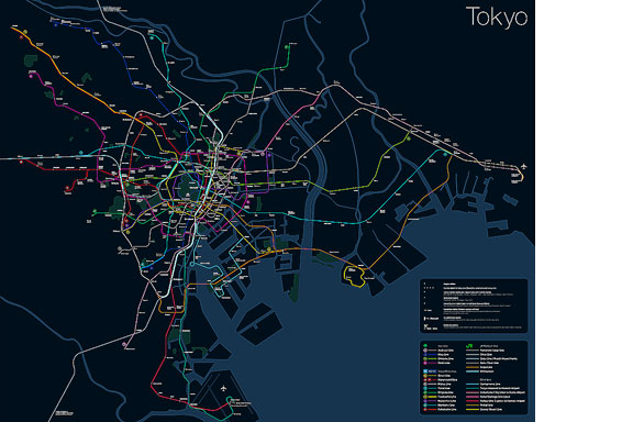
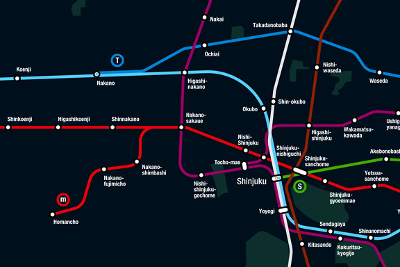
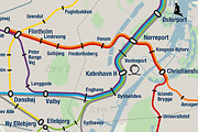
Tokyo is a breathtaking city. Most metropolises have 1 urban railway network. Easy. Tokyo, the biggest metropolis on Earth, is a lot more complex.The city has 2 official subway companies, the national railway operates several lines that can be considered metro lines as well, and there are tens of private operated railways that serve may areas just outside the central part of the city. Another problem is that many transfer stations use different station names on each line connected.
Creating a understandable subway map for this city is extremely complex. Should it be schematic, or geographic realistic? When is it easier to have a short walk than to switch lines?
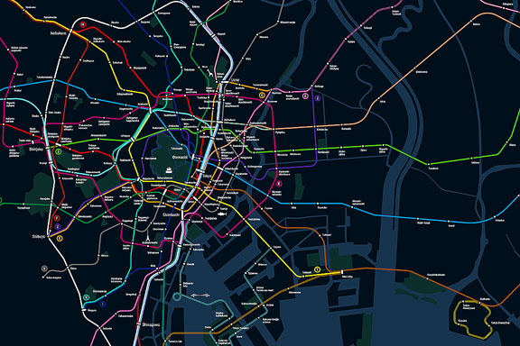
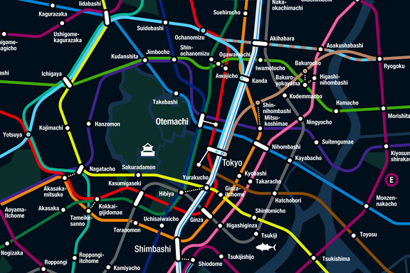
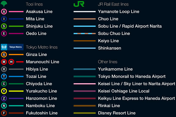
This metro map for Tokyo only shows the most important lines for visitors of the city. That is already 25 lines! All distances are realistic, and the connections to Airports and Shinkansen trains are clearly visible. The parks that give a good orientation in the grey urban mass of Tokyo are visible. Icons show the most important landmarks. Matching the million neon lights the map is drawn in a night situation with the lines as glowing neon tubes.
The map is printed on 100x75 cm photo paper in a limited run, an can be ordered. Send an e-mail or call if you are interested to order.
 XXL
XXL
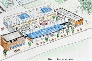
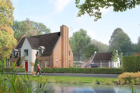
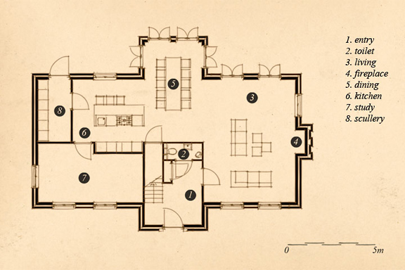
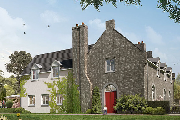
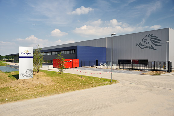
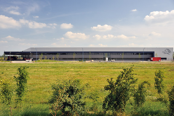
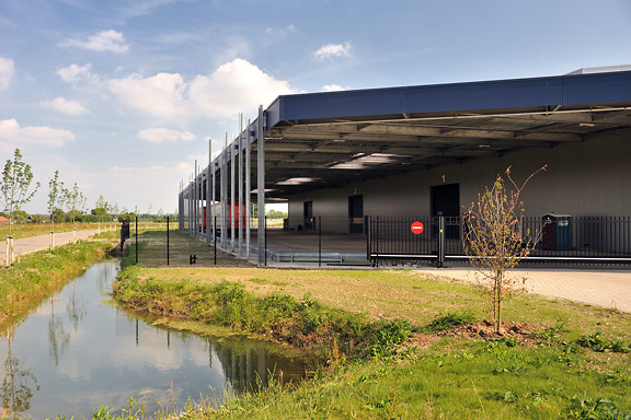
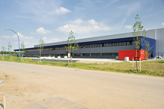
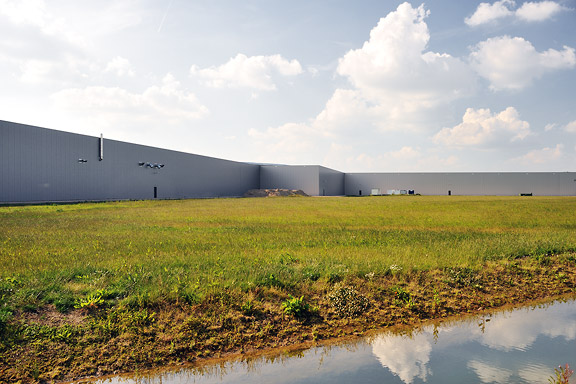
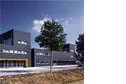
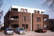
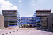
Kingspan Netherlands wanted to expand their factory for insulation panels in Kesteren, and to combine it with their distribution facility and offices in Dodewaard.At the new industrial zone Medel near Tiel the needed 700.000m2 plot was available. The area also allowed high risk production plants.
At the moment phase 1 is completed. The plot has room for expansion with 2 more production lines and 3 times the amount of distribution storage that is part of phase 1.
Kinspan asked construction and design firm Van Zeist to draw the design. As architect I was responsible for the design up to approval of the design by the urban supervisor and the local "beauty commission".
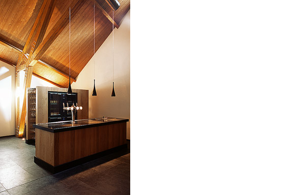
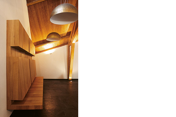
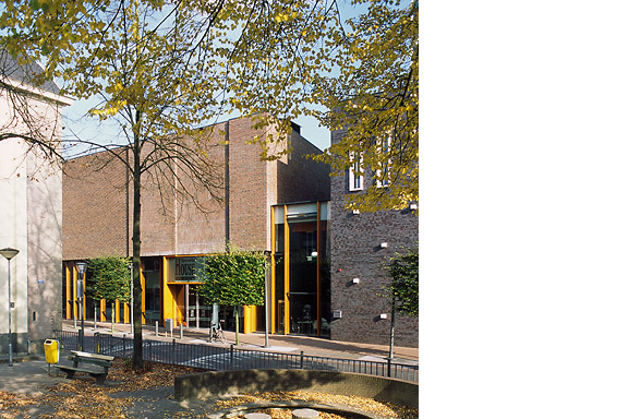
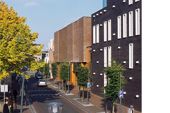
 Want some Beers?
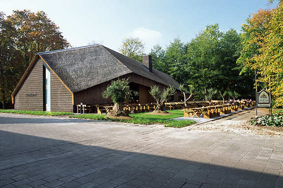
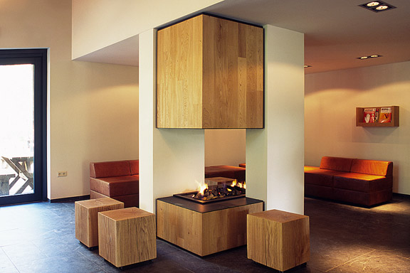
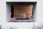
ZZEF asked me to photograph 2 projects designed by Johan van den Berkmortel for the architecture portfolio of ZZEF.One project is a beer cafe at the monk brewery Koningshoeve and the other is the Bavaria House in Helmond.
