
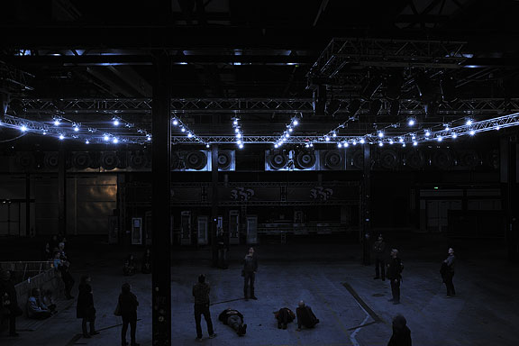
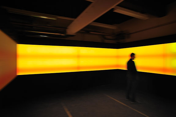
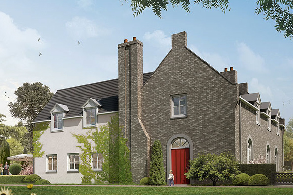
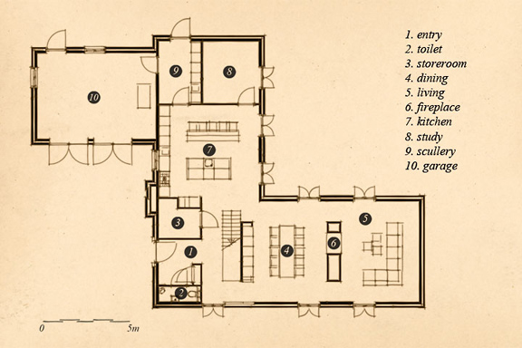
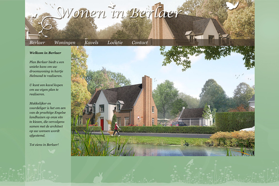
 STRP Festival 2011
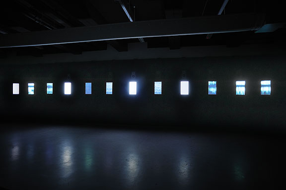
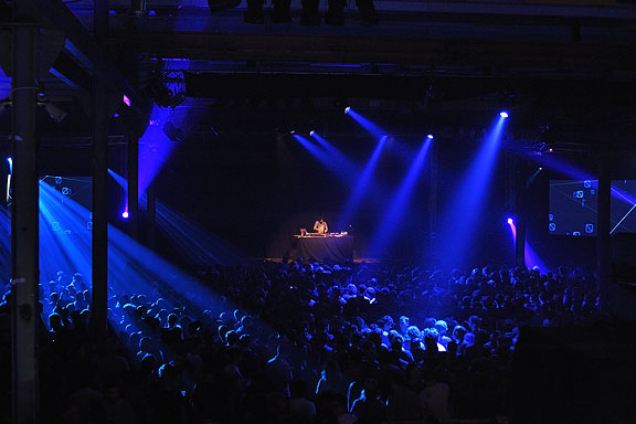
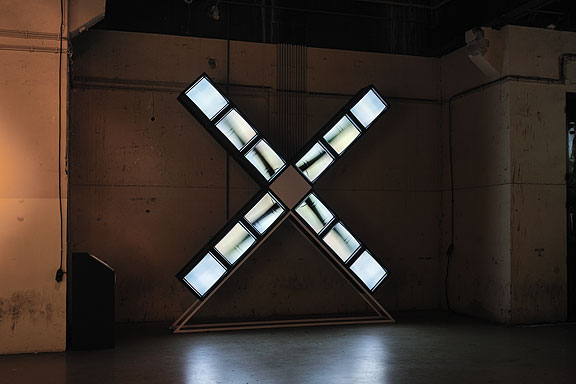
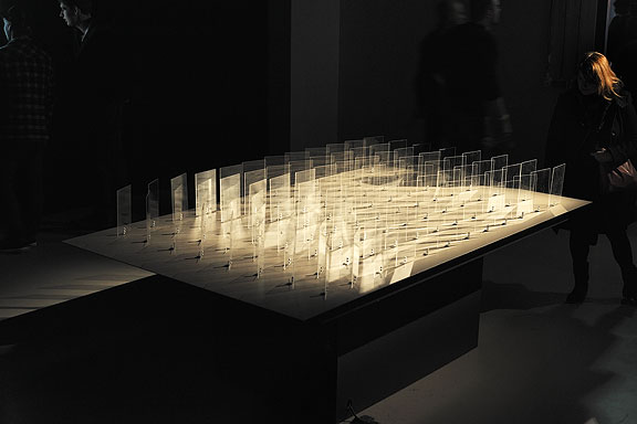
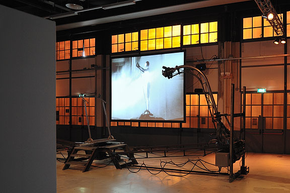
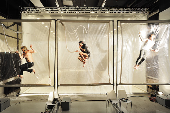
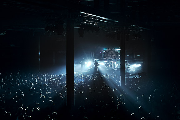
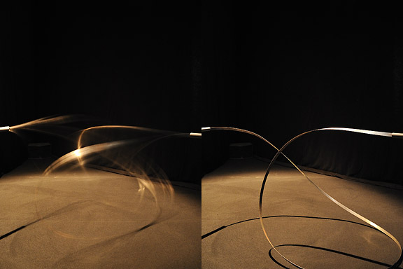
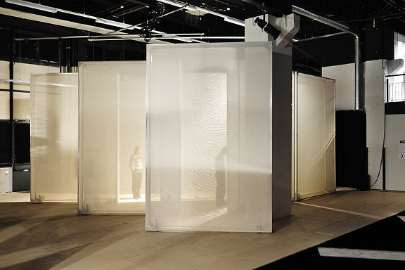
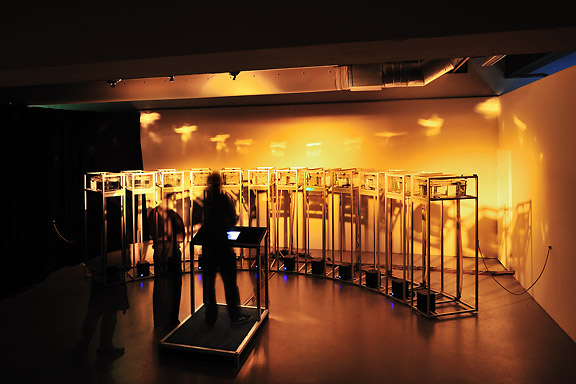
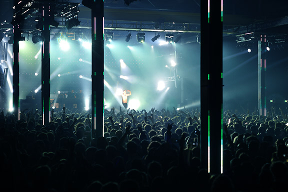
Mick Visser made a photo report of the STRP Festival 2011 in Eindhoven. I participate in the photography process as image editor. Our colaboration results in the best posible quality for the images.From left to right:
Bert Schutter - Mill X Molen - 1982
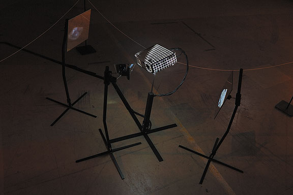
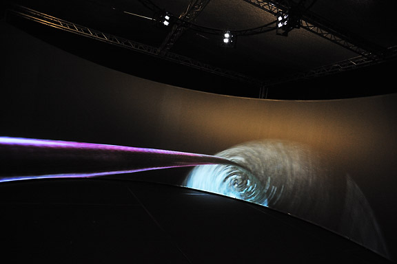
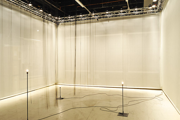
Edwin van der Heide - DSLE2 - 2011
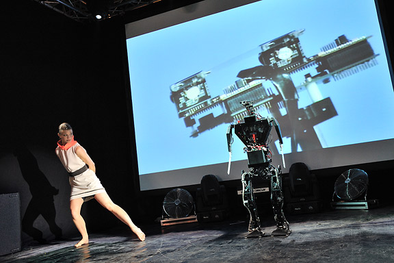
Telcosystems - 12_series - 2010
Kutmah - 26 November 2011
Edwin van der Heide - Evolving Spark Network - 2010/2011
Macular - Phase=Order - 2010
Bram Snijders, Carolien Teunisse - RE: - 2010
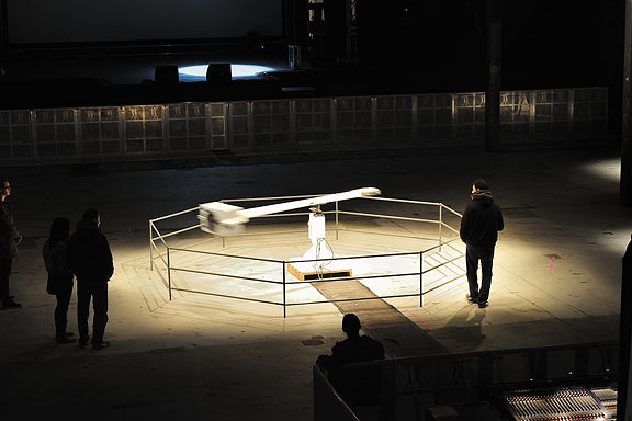
Marnix de Nijs, Edwin van der Heide - Spatial Sounds - 2000/2001
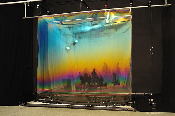
Nicky Assmann - Solace - 2011
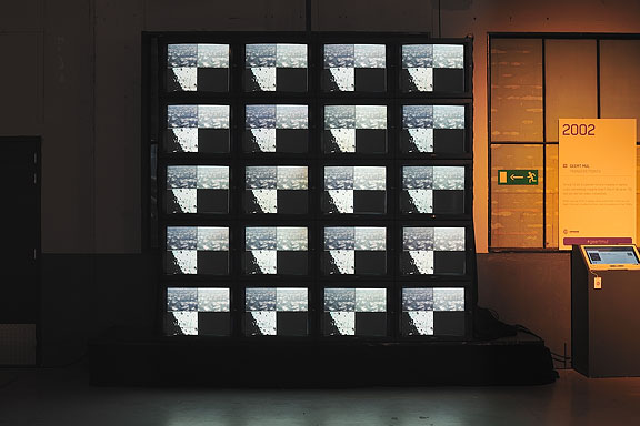
Geert Mul - Transfer Points - 2002
Erik Hobijn - The Delusion of Self Immolation - 1990
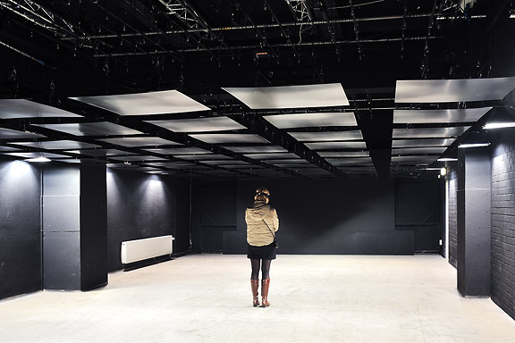
STRP Festival 2010
Mick Visser made a photo report of the STRP Festival 2010 in Eindhoven. I participate in the photography process as image editor. Our colaboration results in the best posible quality for the images.From left to right:
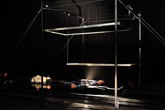
Christoph De Boeck - Staalhemel
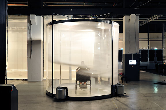
Lawrence Malstaf - Shrink
Jean Michel Bruyère - La Dispersion du Fils
Lawrence Malstaf - Nemo Observatorium
Lawrence Malstaf - Transporter
Roos van Berkel & TUlip - 2 of a kind
The Bloody Beetroots Death Crew 77
Lawrence Malstaf - Knot
Lawrence Malstaf - Nevel
Malcolm MacIver, Marlena Novak & Jay Alan Yim - Scale
Lawrence Malstaf - Territorium
Underworld


 Lost in Navigation
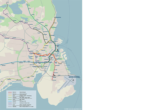
Tokyo is a breathtaking city. Most metropolises have 1 urban railway network. Easy. Tokyo, the biggest metropolis on Earth, is a lot more complex.The city has 2 official subway companies, the national railway operates several lines that can be considered metro lines as well, and there are tens of private operated railways that serve may areas just outside the central part of the city. Another problem is that many transfer stations use different station names on each line connected.
Creating a understandable subway map for this city is extremely complex. Should it be schematic, or geographic realistic? When is it easier to have a short walk than to switch lines?
This metro map for Tokyo only shows the most important lines for visitors of the city. That is already 25 lines! All distances are realistic, and the connections to Airports and Shinkansen trains are clearly visible. The parks that give a good orientation in the grey urban mass of Tokyo are visible. Icons show the most important landmarks. Matching the million neon lights the map is drawn in a night situation with the lines as glowing neon tubes.
The map is printed on 100x75 cm photo paper in a limited run, an can be ordered. Send an e-mail or call if you are interested to order.


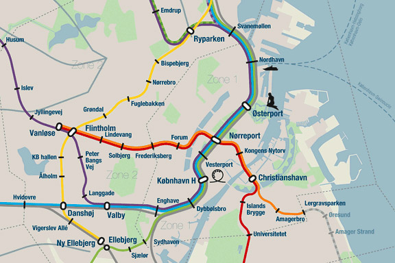
Little Mermaid
When we visited Copenhagen, I was surprised by the complex metro map for the very small network. It should be possible to draw a map easier to understand and graphically more appealing to visitors.I designed a new metro map that shows the relation with the city. It combines all trains with different schedules on similar routes to bring back overview.
Autonomous work
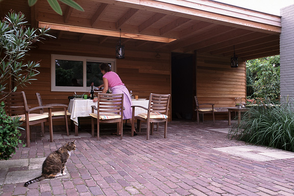
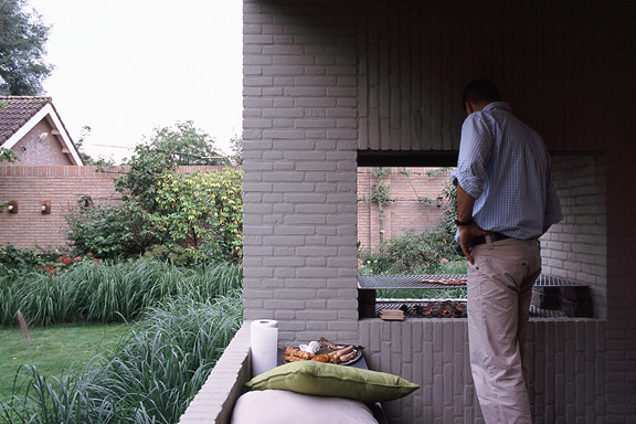
 BBQ XL
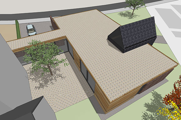
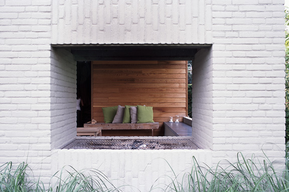
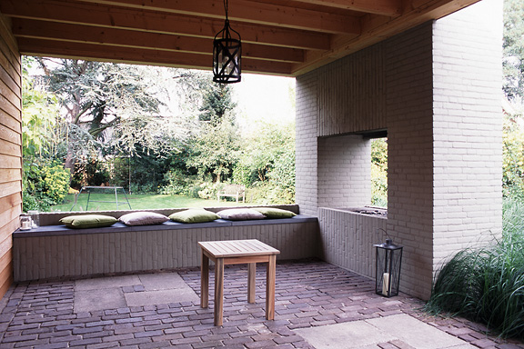
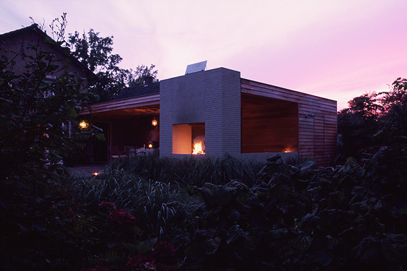
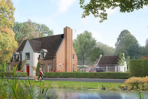
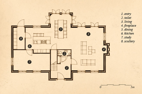
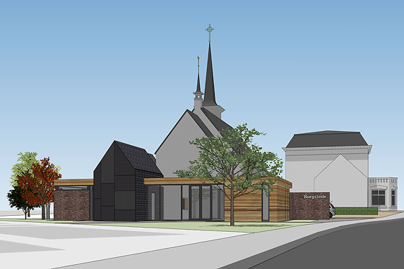
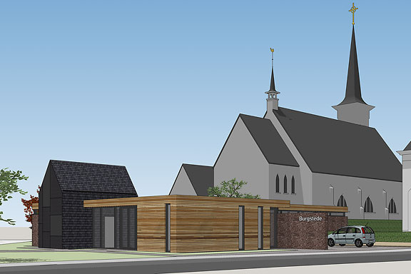
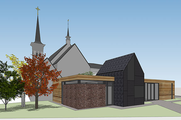
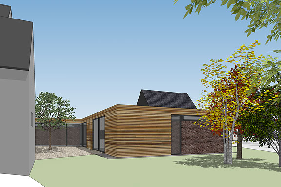
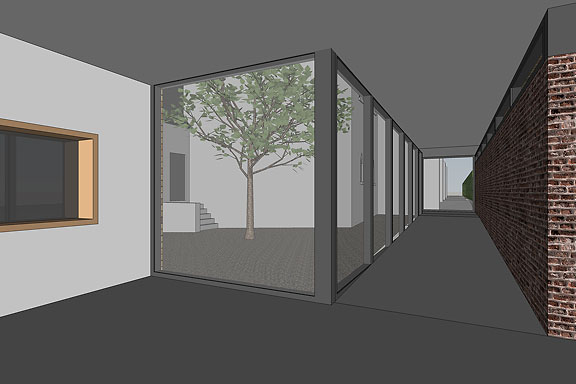
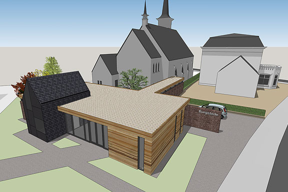
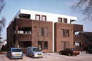
Frank en Chantal van den Eijnden asked Johan van der Berkmortel and me to design an extension to their house in Beek en Donk. It was supposed to replace a decrepit shed and to add a new veranda with a fireplace. Two L-shaped entities frame the view into the deep garden. The brick element contains the chimney and acts as a bench. The wooden part contains the new shed, a log storage and a tool shed, and continues into the ceiling of the veranda.This assignment is done in collaboration with Johan van den Berkmortel.
Wanda Wanders
The avatar Wanda Wanders was born in a chatconversation with Margot Scheltens. Wanda wanders around the World and shares her sharp opinion on various topics.I created the website both technically and graphically. Many of the articles are written by me too.
Wanda Wanders is a registered Benelux trademark.
http://
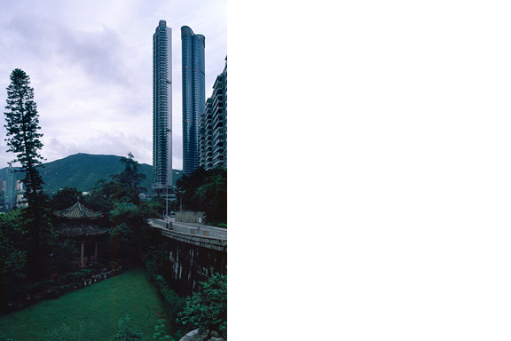
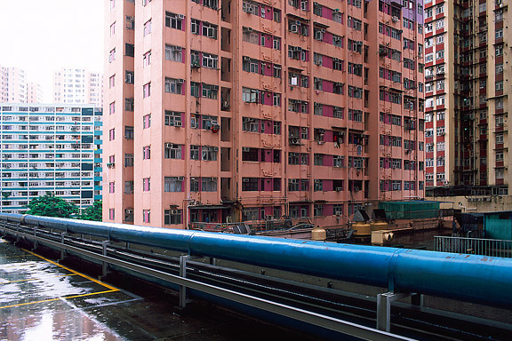
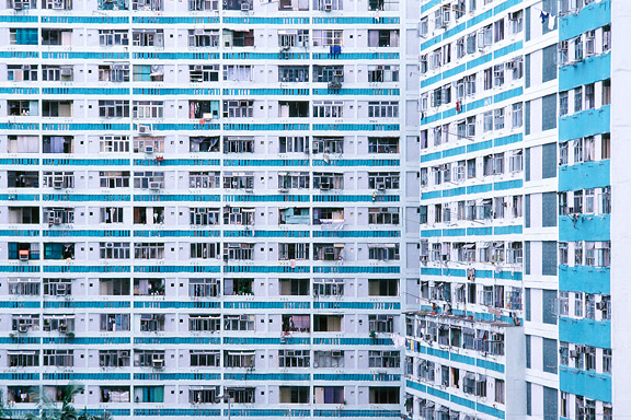
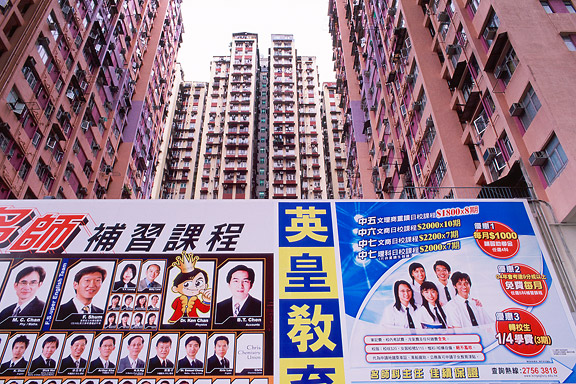
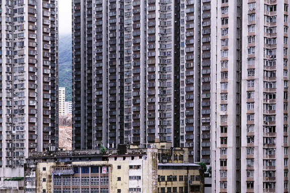
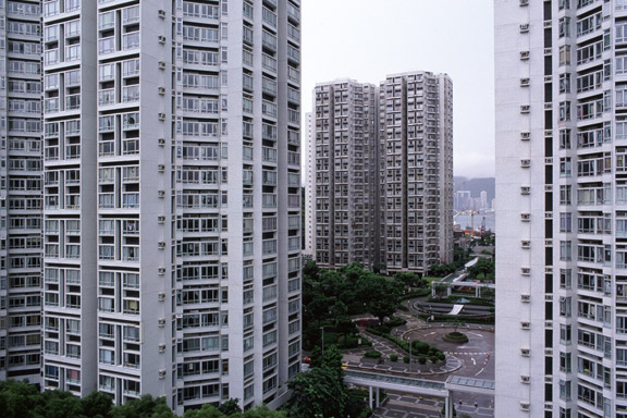
Ants Nest
Hong Kong has little room to built. There is a small piece of land to build on between the water and the mountains. The only option to house the millions of citizens is to use efficient towering blocks. Some area's have a FAR (floor to ground area aspect ratio) of 5 to 10.
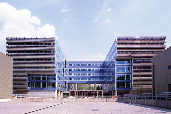
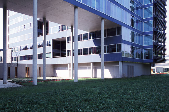
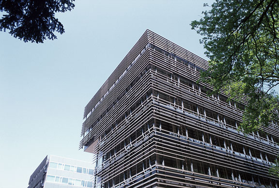
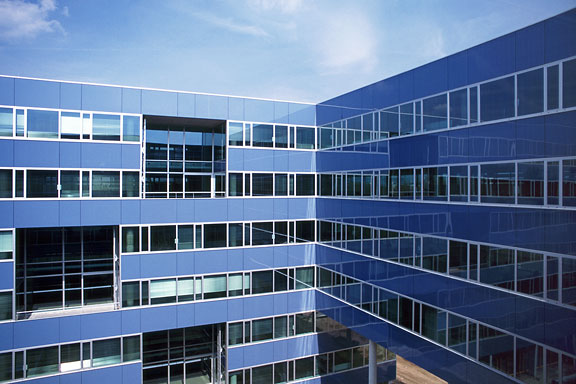
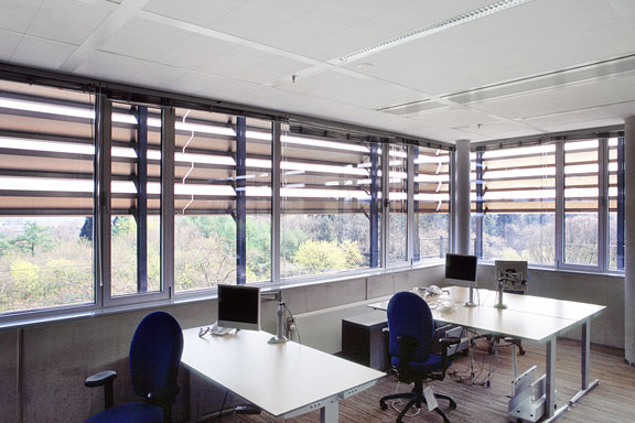
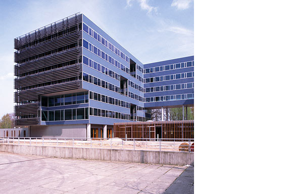
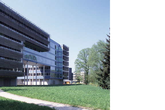
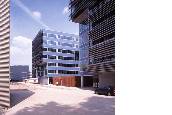
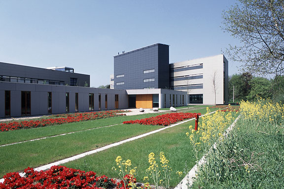
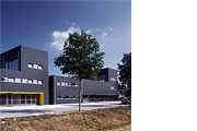
Blue Envelope
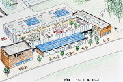
The Dutch Tax Administration feels like a family business. The atmosphere is open and relaxed. The organization is responsible for the total financial administration of The Netherlands Ltd. Dutch citizens expect professional civil servants. The office at the Quintax location in Apeldoorn expresses the two faces of the Dutch Tax Administration. The building looks severe and mimics the impregnability of Fort Knox. But internal, the building is totally transparent. Walls are exceptions, and voids open the floors to improve contact between employees.At JHK Architects, I was responsible for the concept of the building. I also worked out most of the technical details.