 80's T's
英語のみでの詳細For my Youtube channel 2kB of Fun, I made several T-shirts based on logo graphics from 80's video games and electronic gadgets.
Notice: Undefined variable: tekst in /home/w1512188/domains/martijnkoch.com/public_html/index.php on line 285
 ピクセルアート
Notice: Undefined variable: tekst in /home/w1512188/domains/martijnkoch.com/public_html/index.php on line 296
 2kB of Fun
1976年から1985年の初期の携帯ゲーム機で、これほど贅沢な種類のケースデザインを誰もみたことがありませんでした。これらの携帯ゲーム機がもつ本質をこれまで美しくシンプルに出したコンピューターゲームはありませんでした。2KBメモリーでこれほどまでの楽しみを提供できた例はなかったのです。1983年はアミダー、アストロサンダー7、バーガータイム、ディグダグ、ミズパックマン、キューバート、スーパーコブラ、ザクソンのようなゲームにとって最高の年でした。
オランダの建築家、マルタィン・コッホは200に及ぶ優れた携帯ゲームを購入し、撮影、解体したのちに技術分析をし、研究後、今まで誰もみたことがない、素晴らしいカタログのような本にしました。
 アーケード キャビネットそれを自分で行う
英語のみでの詳細By the end of January 2013, Dutch Dame Garden asked me for a new series of arcade cabinets. They had to be finished within 1.5 month, to have it shipped to the Game Developer Conference in San Francisco from March 25th-29th. They wanted a new design with their beloved silhouette. The new version should be easier to carry, transportable as flat pack and when possible a lot cheaper.
The new cabinet can be assembled DIY with a standard 4mm hex wrench, just like IKEA furniture. De parts are made from white laminated poplar plywood for light weight and nice finish. At the top the cabinet holds 2 smoked plexi sheets to protect both screens at the front and the back. The Dutch Game Garden wants games to be visible on two sides for their Indigo shows. It allows a more passive group of visitors to just look at the games being played. The bottom part is filled with 2 matte white sheets of plexi. If you put multi-colour LED lights inside the bottom part, you can illuminate these sheets with any colour you like. The version that is showed here does not have any controls on the control panel. This is because companies that show games at Indigo bring their own controls. They make games for all platforms like Playstation, Xbox, iPad, PC etc, so there is no standard set of controls.
At the moment we are finding out the best way to sell this version to those who are interested in a DIY arcade cabinet.
 STRPフェスティバル2011
ミック・ヴィッセルによる撮影マルタイン・コッホによる画像操作
左から右へ:
バート・シューター、風車Xモレン、1982
エドウィン・ファン・デル・ヘイデ、DSLE2、2011
テルコシステムズ、12シリーズ、2010
クートマ、2011年11月26日
エドウィン・ファン・デル・ヘイデ、スパークネットワークを進化、2010/2011
マクラル、位相=オーダー、2010
ブラム・スナイデレス、カロリーン・テウニッス、RE:、2010
マルニックス・デ・ナイス、エドウィン・ファン・デル・ヘイデ、空間的な音、2000/2001
ニッキー・アッスマン、ソレース、2011
ヘルト・ムル、転送ポイント、2002
エリック・ホバイン、自己いけにえの妄想、1990
Notice: Undefined variable: tekst in /home/w1512188/domains/martijnkoch.com/public_html/index.php on line 285
 カタカナコンバータ
Notice: Undefined variable: tekst in /home/w1512188/domains/martijnkoch.com/public_html/index.php on line 296
 ナビゲーションに失われた
英語のみでの詳細Tokyo is a breathtaking city. Most metropolises have 1 urban railway network. Easy. Tokyo, the biggest metropolis on Earth, is a lot more complex.
The city has 2 official subway companies, the national railway operates several lines that can be considered metro lines as well, and there are tens of private operated railways that serve may areas just outside the central part of the city. Another problem is that many transfer stations use different station names on each line connected.
Creating a understandable subway map for this city is extremely complex. Should it be schematic, or geographic realistic? When is it easier to have a short walk than to switch lines?
This metro map for Tokyo only shows the most important lines for visitors of the city. That is already 25 lines! All distances are realistic, and the connections to Airports and Shinkansen trains are clearly visible. The parks that give a good orientation in the grey urban mass of Tokyo are visible. Icons show the most important landmarks. Matching the million neon lights the map is drawn in a night situation with the lines as glowing neon tubes.
The map is printed on 100x75 cm photo paper in a limited run, an can be ordered. Send an e-mail or call if you are interested to order.
 男のトロフィー
英語のみでの詳細Result from a weekend workshop at WiSPER in Leuven: A trophy for real men, made from construction beams. The trophy is welded using MIG and metal arc welding (MAW) techniques.
 パックマン・ラック・ハック
英語のみでの詳細One of the most popular IKEA products is the LACK coffee table. It is so cheap, it must be hollow.
I opened the tables, I built in a retro TV computer game by Jakks and added real arcade controls to this game. This way the TV game has a longer life and the Ikea LACK is no longer the boring classic every household owns.
Thanks to Lara Verlaat for Playin Pac-Man.
 僧接着
僧接着
英語のみでの詳細When I started working at "bouwkundig ontwerp- en adviesburo Van Zeist" the preliminary design for these 8 apartments had been made already. I drew up the technical detailing.
One of the challenges was to draw the brickwork in monk bond, just like the classic houses in the same street.
To show the appartments are built in 2008, many details are modernized. The balconies for example look like old wooden porches, but in fact they are made of brown concrete and steel.
 レトロスペース
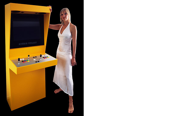
英語のみでの詳細In 1971 the first coin-op video gaming system was built: Computer Space.
Soon the video arcade as hangout was born. Many famous games as Pac-Man, Space Invaders, Streetfighter and Donkey Kong were filled with our quarters. Today the last arcades are closing down. The Wii, the Playstation and owner "mr. Counchpotato" have won. As an homage to this era and to keep all the classics playable Retro Space was created.
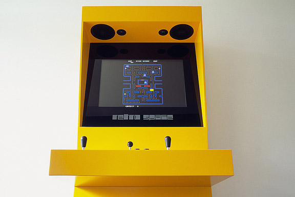
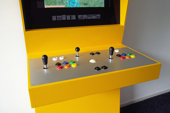
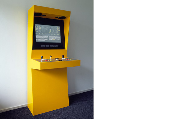
Retro Space is a modern arcade machine for at home or at work. It plays both all the arcade classics from Space Invaders up and all the console titles for your Nintendo, Sega or Atari. The system is made using modern technology and is flexible for future innovations. The system also is a perfect multimedia jukebox. Next to your favourite games, you can load Retro Space with your favourite music and movies. A full HD screen and a high quality speaker system ensure you to enjoy the best image and sound. And quarters are no longer needed.
Thanks to model Lara Verlaat for the imitation of the original Computer Space poster.
 人鱼姫
人鱼姫
英語のみでの詳細When we visited Copenhagen, I was surprised by the complex metro map for the very small network. It should be possible to draw a map easier to understand and graphically more appealing to visitors.
I designed a new metro map that shows the relation with the city. It combines all trains with different schedules on similar routes to bring back overview.
Autonomous work
 バーベキューXL
英語のみでの詳細Frank en Chantal van den Eijnden asked Johan van der Berkmortel and me to design an extension to their house in Beek en Donk. It was supposed to replace a decrepit shed and to add a new veranda with a fireplace. Two L-shaped entities frame the view into the deep garden. The brick element contains the chimney and acts as a bench. The wooden part contains the new shed, a log storage and a tool shed, and continues into the ceiling of the veranda.
This assignment is done in collaboration with Johan van den Berkmortel.
 シンデレラ
シンデレラ
英語のみでの詳細While doing a creative portfolio course at the CKE in Eindhoven I worked on a new interpretation of the story of Cinderella.
Thanks to model Christine Nabuurs, to Jeroen Roxs for the workshop location, and to John Körmeling for using his veranda.
 ワンダ・ワンデレス
英語のみでの詳細The avatar Wanda Wanders was born in a chatconversation with Margot Scheltens. Wanda wanders around the World and shares her sharp opinion on various topics.
I created the website both technically and graphically. Many of the articles are written by me too.
Wanda Wanders is a registered Benelux trademark.
http://
 不明なモダニズム
英語のみでの詳細For most tourists the city of Faro in southern Portugal is nothing more than an entrance by plane to the Algarve. Which is a pity. The biggest city of southern Portugal is probably the only one giving room to creativity. You will not see kitsch appartment blocks for Dutch and Germans, but subtile shaped private houses for the Portugese themselves. You will see images that remind of modernists like Gerrit Rietveld, Adolf Loos and Le Corbusier. You will wonder wheter MVRDV got inspiration here, or if Portugese architects checked out work of the Durch architecture firm.
 ミニチュア都市
英語のみでの詳細Brandevoort is one of the big suburban extensions according to the governmental document Vinex. Under supervision of Rob Krier, the city of Helmond tried to mimic the classic Dutch canal city for its big extension. Modern legislation on parking and the fact that a family in a suburban plan like this needs 2 cars to reach all daily facilities, resulted in weird interiors for the urban blocks. The gardens are petite, and most space is used for the cars.
 青い封筒
青い封筒
英語のみでの詳細The Dutch Tax Administration feels like a family business. The atmosphere is open and relaxed. The organization is responsible for the total financial administration of The Netherlands Ltd. Dutch citizens expect professional civil servants. The office at the Quintax location in Apeldoorn expresses the two faces of the Dutch Tax Administration. The building looks severe and mimics the impregnability of Fort Knox. But internal, the building is totally transparent. Walls are exceptions, and voids open the floors to improve contact between employees.
At JHK Architects, I was responsible for the concept of the building. I also worked out most of the technical details.


