 ついて
ついて
マルタインは1998年にアーキテクチャに卒業アイントホーフェン工科大学
マルタインは2008年1月以来、起業家として働く
マルタインは37歳です。彼は2人の息子の父であります
建築設計事務所マルタインはで働いていた
Bonnemayer Architecten in Uden
JHK Architecten in Utrecht
BO.2 architectuur en stedenbouw in Tilburg
マルタインの教え
アイントホーフェン工科大学
リヴォル実用的な学校、ティールの中で
フォンティッス応用科学大学
写真のためのイゴールフェルメールのおかげで
 非常に鋭い
非常に鋭い
英語のみでの詳細More and more people browse the internet with their tablets or mobile phones. These devices have display densities over 100 pixels per cm. Modern browsers are capable of dealing with these displays by loading high quality images.
This website is updated for this. As a first step all tile images have been doubled in resolution. In a later stadium, the images in the articles will be available in higher definition too.
Low resolution devices also benefit from this update. As older iPhone's and Android phones can zoom up to 200% via double-tap, the extra detail is served to these devices as well.
 日本語サイト
英語のみでの詳細Coming soon: a project strongly focussed at the Japanese market. As a preparation the website is translated in a third language.
Notice: Undefined variable: agent in /home/w1512188/domains/martijnkoch.com/public_html/info.php on line 111
Notice: Undefined variable: agent in /home/w1512188/domains/martijnkoch.com/public_html/info.php on line 111
Notice: Undefined variable: agent in /home/w1512188/domains/martijnkoch.com/public_html/info.php on line 111
Notice: Undefined variable: agent in /home/w1512188/domains/martijnkoch.com/public_html/info.php on line 111
 建設現場
建設現場
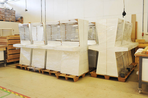
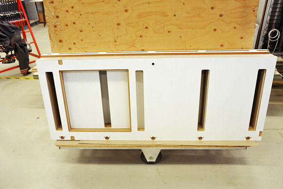
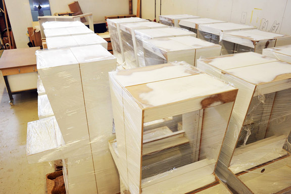
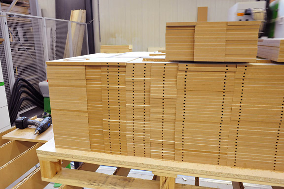
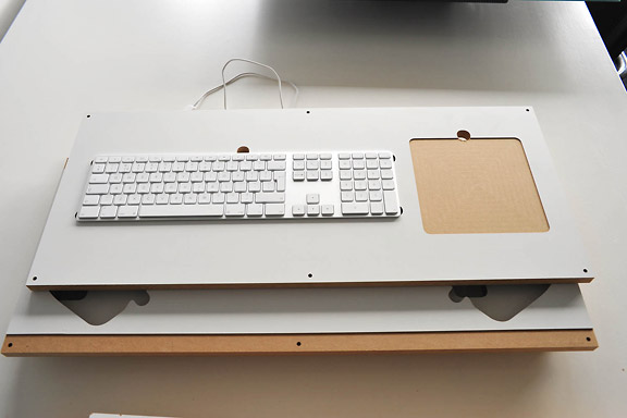
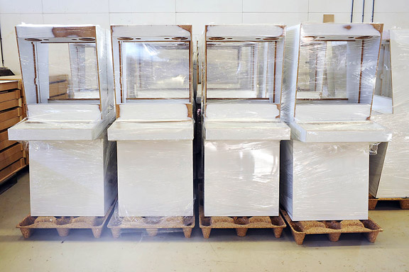
英語のみでの詳細Retro Space is currently being manufactured in a run of 33 pieces. Soon this site will give more information about where they will be used.
 奥付
奥付
英語のみでの詳細This website is fully developed by myself in PHP and CSS. The content is stored in a database. The site does not use Javascript. This is quite unique for a website that works like an AJAX website. And the bigger your screen, the more fun the site gets. Finally a website that makes maximum use of 1920x1200 or 2560x1600 resolutions.
The website is well suited for browsing on a tablet or mobile phone. The tap-zoom function works great with the grid layout, and if you have a high pixel density display, sharper images will be loaded automatically. The site is optimised for every resolution with the use of CSS Media Queries. Martijnkoch.com uses a so called "Responsive Layout".
All photographs, illustrations and texts on this website are under copyright of Martijn Koch. They cannot be republished without approval by Martijn Koch.
This website is powered by a super low power web server, fully powered by solar energy from our own production.


